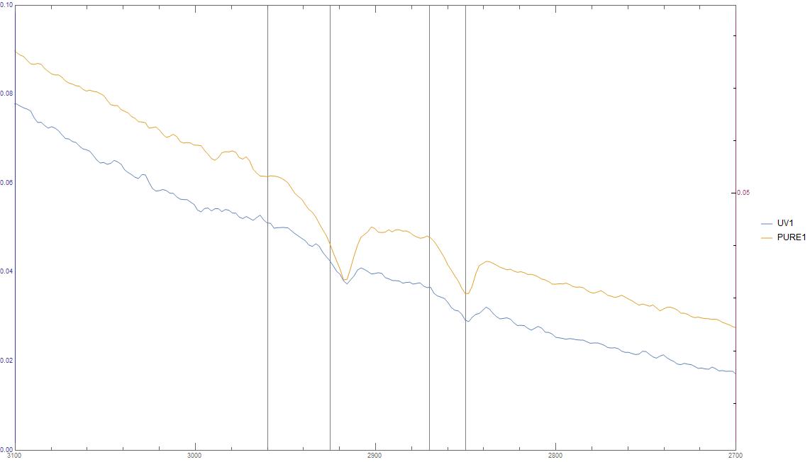
I am currently trying to interpret my FTIR data. But due to a lot of background noise, my spectrum is quite spiky and fluctuating at some points. I want to try to smoothen my function to make the peaks in the spectrum more apparent.
My code looks like this:
ListLinePlot[{q2, q1}, ScalingFunctions -> {"Reverse", Identity},
PlotRange -> {{3100, 2700}, Automatic},
PlotLegends -> {"UV1", "PURE1"}, ImageSize -> Full,
GridLines -> {{2870, 2960, 2925, 2850}, {}}, Black,
Bold, FontSize -> 16], Style["Absorbance", Black, Bold, FontSize -> 16]},
TicksStyle -> Directive[FontSize -> 14]]
Giving the following plot:
So I would like to make it more smooth. Any ideas on how to do this? I've tried to find something, but I only came across Interpolating, but that did not really work because my data set is not just a list of numbers.


q1andq2are lists of pairs you can use this form ofInterpolation. If you post a small portion of your actual data (for example,q1[[;;10]]andq2[[;;10]]), it will make it easier for people to help you. $\endgroup$MovingAverageorMovingMedianorFindPeakswill suit your needs. $\endgroup$