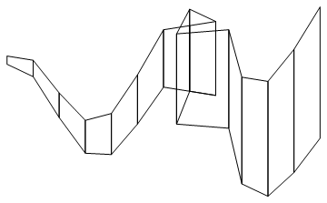
Suppose I have a data list
datx = Flatten[#, 1] &@{{#, Sin[#]} & /@
Range[-5, 0], {{1, 1}, {2, 1}, {3, 1}, {2, 1.2}, {1.5, 0.5}, {3.5,
  0.5}}, {#, Sin[#]} & /@ Range[4, 7]}
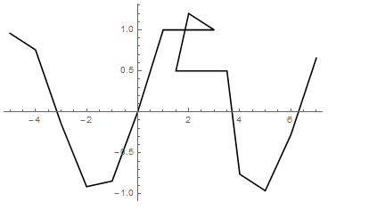
which looks like
ListLinePlot[{datx}, PlotStyle -> {Black}]
you see that datx runs backward at around x=2. Note that this short datx is only an example. The real data list I analyze and plot might longer than 1000.
suppose I have the error bar of the datx
err = 0.1*Range@Length@datx
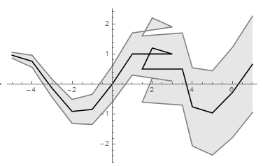
then I want to plot the uncertainty of datx by
ListLinePlot[{datx, datx + ({0, #} & /@ err),
 datx - ({0, #} & /@ err)}, PlotStyle -> {Black, Gray, Gray},
 Filling -> {2 -> {3}, Gray}]
this looks like
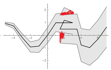
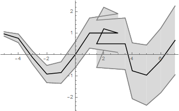
of course this will not satisfies me. What I want is something like this:
The red area should be filled If it represents the uncertainty of the data!
(and strangely that the Gray in PlotStyle and Filling is not the same color..)
What should I do? I'd like work with ListLinePlot which is convient but a general solution with many Graphics objects will also be accepted

