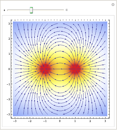
I'm trying to visualize electric fields.
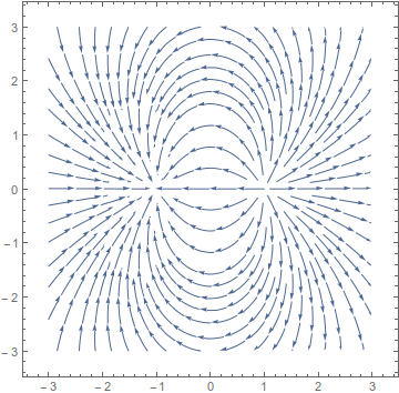
StreamPlot is helpful:
ef[q_, source_, at_] = (k q)/Norm[source - at]^3 (at - source)
myfield[x_, y_] =
   (ef[-1, {-1, 0}, {x, y}] + ef[+1, {+1, 0}, {x, y}]) /. k -> 8.99 10^9;
StreamPlot[myfield[x, y], {x, -3, 3}, {y, -3, 3}]
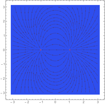
But when I want to see the strength of the field as well, StreamDensityPlot understandably chokes because $\lim_{(x,y) \to (\pm 1,0)} \lVert \texttt{myfield}[x,y] \rVert = \infty$.
This is what I get:
StreamDensityPlot[myfield[x, y], {x, -3, 3}, {y, -3, 3},
 ColorFunction -> "TemperatureMap"]
Now, I can adjust the scalar field by Mining the actual Norm with some fixed value:
StreamDensityPlot[{myfield[x, y],
  Min[Norm[myfield[x, y]], 10^11]}, {x, -3, 3}, {y, -3, 3},
 ColorFunction -> "TemperatureMap"]
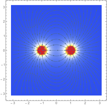
But this requires some trial and error to find a good value, and it still doesn't look particularly great (there's noticeable clipping). More importantly, there's really only two regions: the poles (red) and the farfield (blue); I don't really gain much insight into the field strength, at, say, $(0, \frac{1}{2})$.
Throwing a Log in there gives you more contrast, but you still have to fiddle with the clamp:
StreamDensityPlot[{myfield[x, y],
  Min[Log[Norm[myfield[x, y]]], 28]}, {x, -3, 3}, {y, -3, 3},
 ColorFunction -> "TemperatureMap"]
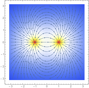
Hence my question.
How can I get StreamDensityPlot to
- yield nice output even when the domain contains singularities,
- such that I can clearly see both the singularities and the farfield, and the regions in between,
- while still retaining a reasonable degree of physical accuracy,
- and as automatically as possible? (e.g., I don't very much like having to manually specify the scalar field)
I read the main StreamDensityPlot documentation and skimmed the "Options" section (that's how I found that you can manually specify the scalar field) but didn't see anything pertinent.

