1
$\begingroup$

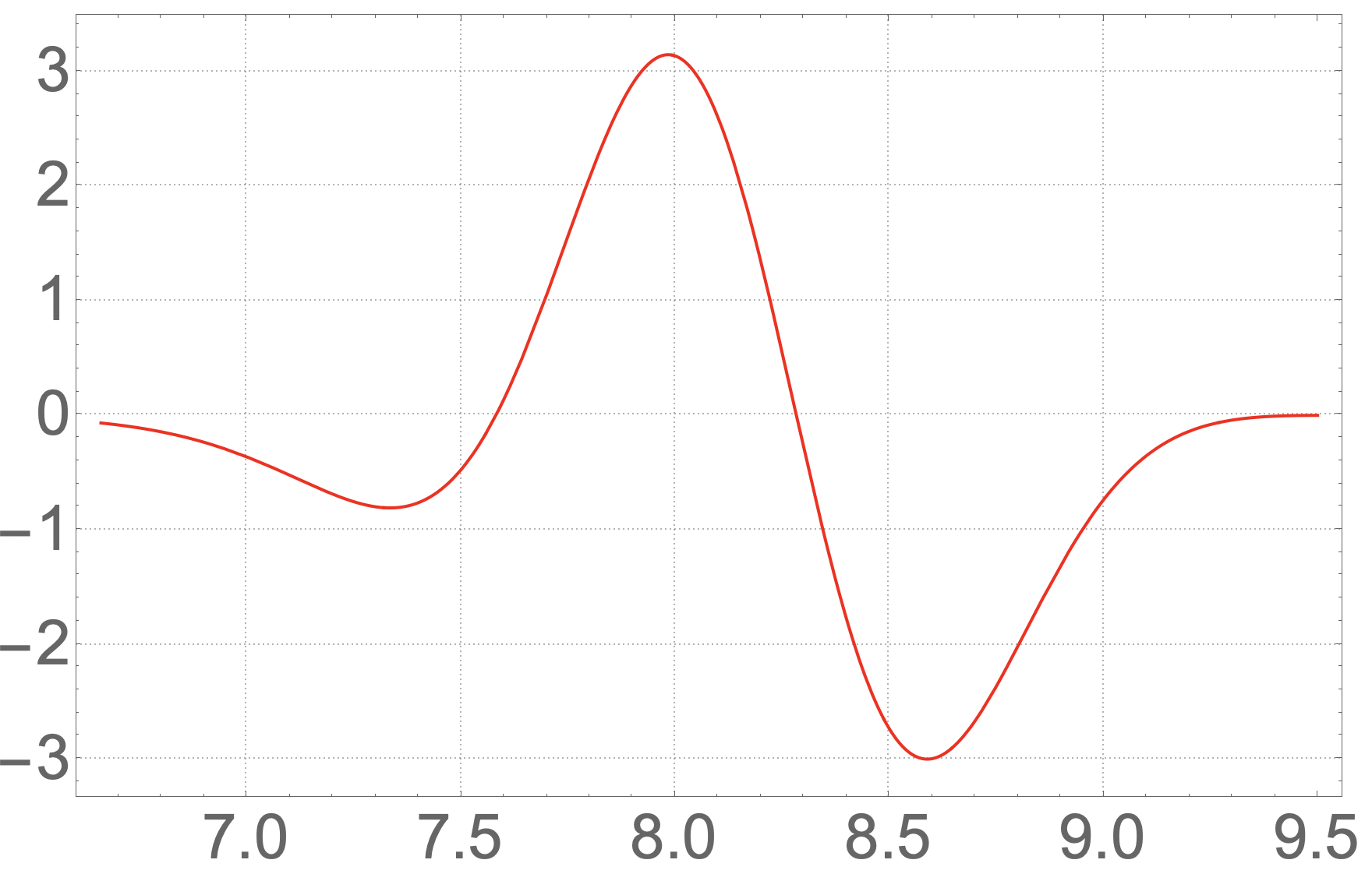
I have the following analytical plot.

i2k[i_] = 1/2 (i - 1) 
pixx = k^2 Exp[-2 k^2 Sin[(t)/2]^2 ](-Sin[2t] - Sin[t](1-k^2 Sin[t]^2));
piyy = k^2 Exp[ -2 k^2 Sin[(t)/2 ]^2 ](-4Sin[t]Sin[(t)/2]^2 - Sin[t](1-4k^2 Sin[(t)/2]^4));
pixy = k^2 Exp[-2k^2 Sin[(t)/2 ]^2 ](2Cos[t]Sin[(t)/2]^2 + Sin[t]^2 - 2 k^2 Sin[(t)/2]^2 Sin[t]^2);

xxrot = Cos[t + 2.0 - \[Pi] / 2]^2 pixx + 
   Sin[t + 2.0 - \[Pi] / 2]^2 piyy - 
   Sin[2 (t + 2.0 - \[Pi] / 2)] pixy;

xxrotplt = 
 Plot[ xxrot /. k -> -i2k[6] /. t -> t - 2 // Evaluate, {t, 666 0.01, 
   950 0.01}, PlotRange -> All, PlotTheme -> "Detailed", 
  LabelStyle -> Directive[FontSize -> 40], PlotStyle -> Red]

enter image description here

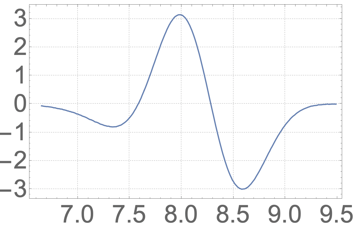
Then my code produced the following result. s11resp is the data from the code which I can not have here for some reasons. It is a {30000, 1, 512, 1} dimension list.

s11pltcc = 
 ListLinePlot[Re@s11resp[[666 ;; 950, 1, 6, 1]], PlotRange -> All,  
  DataRange -> {665 0.01, 949 0.01} , PlotTheme -> "Detailed", 
  LabelStyle -> Directive[FontSize -> 40]]

enter image description here

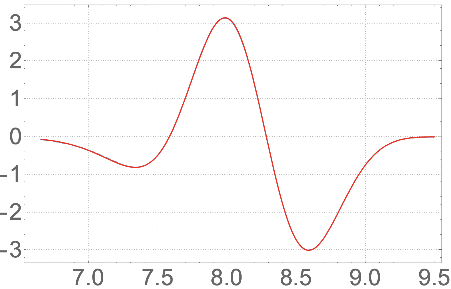
Now I should compare the code and analytic result. The problem is if we show them together the difference is invisible.

enter image description here

My question is how to make the difference between the code and analytical results visible? I appreciate it if you could help me.

$\endgroup$
3
  • 1
    $\begingroup$ You could use PlotStyle->Dashed in one plot and Show[...] $\endgroup$ Commented Nov 10, 2023 at 10:02
  • $\begingroup$ Is it also possible to somehow plot the subtraction of the two? My problem is then having a list of data and an analytical formula. It is not clear to me how to plot the subtraction. $\endgroup$
    – Lohrasb
    Commented Nov 10, 2023 at 10:08
  • $\begingroup$ If you know how the data was sampled, why not sample your analytic function at the same points, then compare the two? $\endgroup$
    – user87932
    Commented Nov 10, 2023 at 18:50

1 Answer 1

1
$\begingroup$

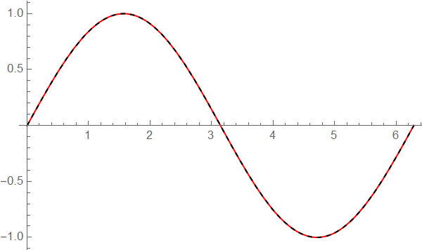
To compare two nearly identical plots

plot1=Plot[Sin[x],{x,0,2 Pi},PlotStyle->Red];
plot2=Plot[Sin[x],{x,0,2 Pi},PlotStyle->{Dashed,Black}];
Show[plot1,plot2]

enter image description here

addendum

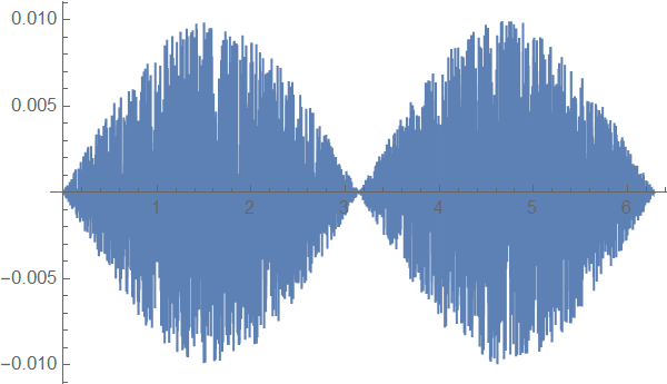
Suppose we have an approximation

sin = Function[x, Sin[x] (1 + RandomReal[{-.01, .01}])]

we can plot the difference easily

Plot[{Sin[x] - sin[x]}, {x, 0, 2 Pi} ]

enter image description here

If you want to compare with data try

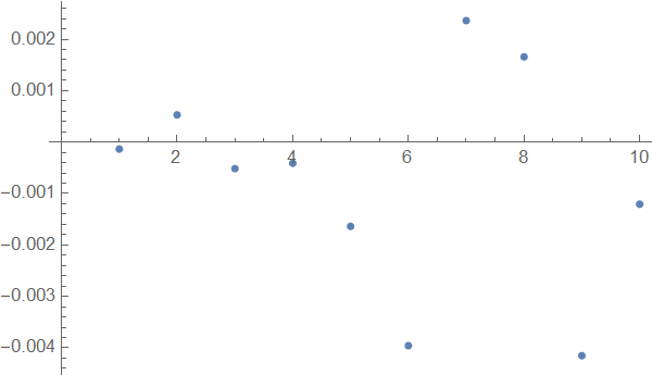
data=Table[{x,sin[x]},{x,RandomReal[{0,2Pi},10]}]; 
error=Map[Sin[#[[1]]]-#[[2]]&,data]&
ListPlot[error]

enter image description here

Perhaps Needs["ErrorBarPlots``"] might find your interest!

$\endgroup$
2
  • $\begingroup$ To show the accuracy of a code, this is not sufficient. I need to show the difference in a more robust way. Imagine you want to see the convergence of the code result for a bigger time step in your simulation. Then every time you produce the same comparison because the changes are so tiny. $\endgroup$
    – Lohrasb
    Commented Nov 10, 2023 at 10:13
  • $\begingroup$ In your question you compared the two plots not their difference! $\endgroup$ Commented Nov 10, 2023 at 10:31

Your Answer

By clicking “Post Your Answer”, you agree to our terms of service and acknowledge you have read our privacy policy.

Not the answer you're looking for? Browse other questions tagged or ask your own question.