15
$\begingroup$

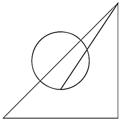
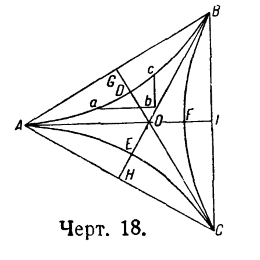
I'm writing a math textbook and use Mathematica to make figures. However, like all modern software, Mathematica produces perfectly crisp mathematically accurate figures. Meanwhile, I feel that old-fashioned figures from books that predate computers are in some ways better for educational purposes as they appear less cold and sterile. See, for example, the figure below.

enter image description here

I'm sure that part of the style is due to loss of quality due to compression. However, I'm fairly confident that those curves are mathematically inaccurate, i.e. "casual".

I'm sure I can make my figures 1% inaccurate so that's not an issue. I'm wonder if there is a way to "stroke" the lines to give them that more casual look. Also, I open to any other suggestion for making my Mathematica figures more effective for educational purposes.

$\endgroup$
3
  • 2
    $\begingroup$ xkcd style :D ?: mathematica.stackexchange.com/q/11350/1871 $\endgroup$
    – xzczd
    Commented Aug 8, 2021 at 2:34
  • $\begingroup$ I doubt that technical drawings creating can be completely automated. Why not using a proper tool for drawing, like Inkscape, or tikz. $\endgroup$
    – yarchik
    Commented Aug 8, 2021 at 6:09
  • 1
    $\begingroup$ "I feel that old-fashioned figures from books that predate computers... appear less cold and sterile. " - I was having a hard time explaining why I found the old diagrams nicer and I think its exactly this. They feel less sterile. $\endgroup$
    – akozi
    Commented Feb 12, 2022 at 21:33

3 Answers 3

25
$\begingroup$

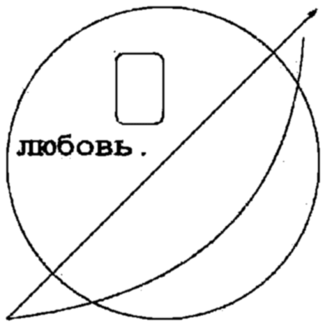
If you want grungy diagrams, you could always pass your graphics through JPEG export at a high level of compression, then re-import:

img = Rasterize[Graphics[{Thick, FaceForm[None], EdgeForm[Thick],
     Circle[],
     Rectangle[{-.3, .25}, {0, .7}, RoundingRadius -> .05],
     Text[
      Style["любовь.", FontSize -> 36, FontFamily -> "Courier", 
       FontWeight -> Bold], {-.5, .1}],
     Arrow[{{-1, -1}, {1, 1}}], 
     BezierCurve[{{-1, -1}, {.8, -.8}, {.9, .8}}]
     }], RasterSize -> {256, 256}];

imgexp = ExportString[img, "JPEG", "CompressionLevel" -> .8];
GaussianFilter[
 Binarize@ImageResize[ImportString[imgexp, "JPEG"], {512, 512}], 2]

grungy diagram

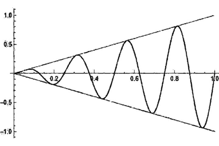
You can apply the effect to other Plot diagrams too and the result is actually quite aesthetically pleasing:

img = Rasterize[Plot[{Sin[8 Pi x] x, x, -x}, {x, 0, 1}], 
   RasterSize -> {480, 320}];
img = ImageAdd[img, RandomImage[.25, ImageDimensions[img]]];
imgexp = ExportString[img, "JPEG", "CompressionLevel" -> .85];
GaussianFilter[
 Binarize@ImageResize[ImportString[imgexp, "JPEG"], 
   ImageDimensions[img]*2], 2]

enter image description here

$\endgroup$
2
  • $\begingroup$ Which font are you using in the second example? It doesn't look like the Mathematica default or Courier. $\endgroup$ Commented Aug 9, 2021 at 2:00
  • $\begingroup$ @MichaelSeifert it's the default font - it just comes out looking that way. $\endgroup$
    – flinty
    Commented Aug 9, 2021 at 8:33
5
$\begingroup$

The key word you want in your search is "XKCD". These probably do much of what you want:

https://blog.wolfram.com/2012/10/05/automating-xkcd-diagrams-transforming-serious-to-funny/

xkcd-style Plots

$\endgroup$
0
4
$\begingroup$

Blurring the image doesn't do it much justice. So, as a better attempt, i convolved using randomly generated matrices (3x3) or (4x4) until something looks hand drawn.

sfx = {s1, s3};

{{{0.398698,-0.364446,-0.641229,-0.911284},
{-0.548265,0.909492,0.498542,0.713565},
{-0.597513,-0.179438,0.16953,0.875084},
{-0.0615662,0.56853,0.449008,0.494057}},

{{-0.899334,0.92734,-0.323124,0.921478},
{0.395261,0.322598,0.984112,0.12986},
{0.87857,-0.432671,-0.543319,-0.52283},
{0.327602,0.805195,-0.669803,-0.192092}}}

g1 can be replaced with any "Graphics".

ImageConvolve[g1, #] & /@ sfx

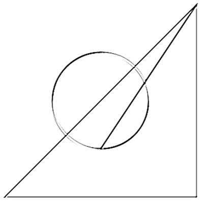
A bit more careless rendering:

enter image description here

Try:

ImageConvolve[g1,{{-1.4, 0, 0.5}, {0.1, 1, 0.2}, {0.4, 0.4, -0.1}}]

But since you are writing the book on Math, you are more qualified to come up with a suitable kernel. I would put it inside a lengthy manipulate to get just the right look. Over time a catalog of effects will emerge.

Observation: This picture seems to have been put together with a few "cut-paste" paper sections (or perhaps the scanner drive belt was malfunctioning).

Another method could be to do ImagePartition first. ImageAssemble can then put the image sections back with small and random translation/rotation effects; each section being slightly differently manipulated to replicate this retro effect.

Regards

$\endgroup$

Your Answer

By clicking “Post Your Answer”, you agree to our terms of service and acknowledge you have read our privacy policy.

Not the answer you're looking for? Browse other questions tagged or ask your own question.