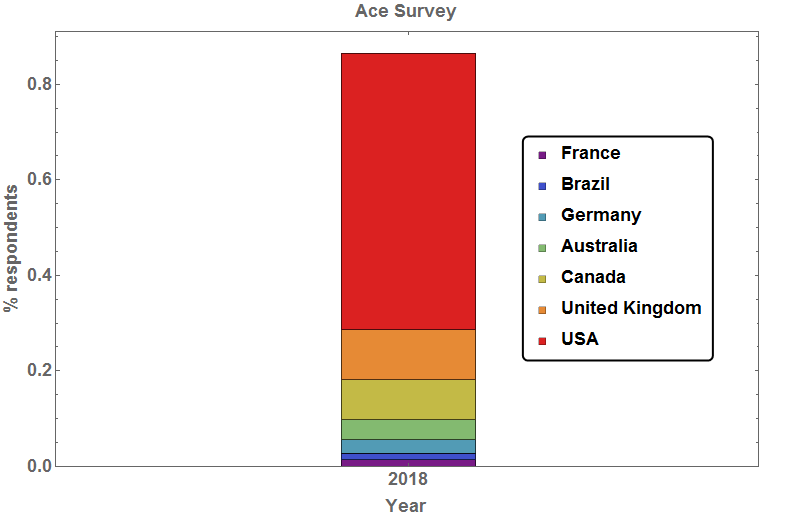
I am creating a stacked bar chart from 2017 using the following data set
top2017 = <|"France" -> 147/10640,
   "Brazil" -> 148/10640,
   "Germany" -> 293/10640,
   "Australia" -> 453/10640,
   "Canada" -> 883/10640,
   "United Kingdom" -> 1119/10640,
   "United States of America" -> 6163/10640|>;
and I currently create this bar chart
with the following code
BarChart[top2017, ChartLayout -> "Stacked", ChartStyle -> "Rainbow",
 Epilog ->
  Inset[Framed[
    PointLegend[
     "Rainbow", {"France", "Brazil", "Germany", "Australia", "Canada",
       "United Kingdom", "USA"},
     LegendMarkers -> {Graphics[Rectangle[]]}], RoundingRadius -> 5],
   Scaled[{0.8, 0.5}]], Frame -> True, ImageSize -> Scaled[0.5],
 ChartLabels -> {"2017"},
 BaseStyle -> {FontWeight -> "Bold", FontSize -> 18},
 FrameLabel -> {{"% respondents", ""}, {"Year", "Ace Survey"}}]
and then I also create another bar chart for 2018 using
top2018 = <|{"Italy"} -> 203/15177,
            {"Netherlands"} -> 210/15177,
            {"Australia"} -> 549/15177,
            {"France"} -> 243/15177,
            {"Germany"} -> 689/15177, {"Canada"} -> 1020/15177,
            {"United Kingdom"} -> 1338/15177,
            {"United States of America"} -> 8635/15177|>;
BarChart[top2018, ChartLayout -> "Stacked",
 ChartStyle -> "Rainbow",
 Epilog ->
  Inset[Framed[
    PointLegend[
     "Rainbow", {"Italy", "Netherlands", "Australia", "France",
      "Germany", "Canada", "United Kingdom", "USA"},
     LegendMarkers -> {Graphics[Rectangle[]]}], RoundingRadius -> 5],
   Scaled[{0.8, 0.5}]], Frame -> True, ImageSize -> Scaled[0.5],
 ChartLabels -> {"2018"},
 BaseStyle -> {FontWeight -> "Bold", FontSize -> 18},
 FrameLabel -> {{"% respondents", ""}, {"Year", "Ace Survey"}}]
This gives me a chart that looks pretty similar to the one already included. Initially I was going to continue using "Rainbow" in chart style, but now that I see that I have some different countries in different years, I decided against that. I was initially going to use a set color for specific countries---say, set USA to red, France to blue, Germany to yellow etc etc and use that for every year. But then I was wondering: is there a way to use country flags in chart style? Initially I used
EntityValue[Entity["Country", "USA"], {"Entity", "Flag"}]
To manually produce the flag for each country. Then I just copied the flags produced and pasted them in flags = {}; where each flag image went into flags. When I plot the following I get an error
BarChart[top2017, ChartLayout -> "Stacked", ChartStyle -> flags,
 Epilog ->
  Inset[Framed[
    PointLegend[
     "Rainbow", {"France", "Brazil", "Germany", "Australia", "Canada",
       "United Kingdom", "USA"},
     LegendMarkers -> {Graphics[Rectangle[]]}], RoundingRadius -> 5],
   Scaled[{0.8, 0.5}]], Frame -> True, ImageSize -> Scaled[0.5],
 ChartLabels -> {"2018"},
 BaseStyle -> {FontWeight -> "Bold", FontSize -> 18},
 FrameLabel -> {{"% respondents", ""}, {"Year", "Ace Survey"}}]
where it says that
Value of option ChartStyle -> {flags} is not a style or group of styles.
tl;dr How would one go about using a flags/flags in chart style for a bar chart?
EDIT: For reference I got the idea to use the flags from here
as well as here
Getting all the countries' flags and then using them as chart labels?
but neither were exactly what I need.


countries2017and no one else, why not copy the output oftop2017directly into your post? (Similarly fortop2018.) $\endgroup$Association[]with the actual numbers. $\endgroup$