0
$\begingroup$

So currently I have a graph of latitude, longitude, and Max Rainfall generated from the code below.

dallas = CityData[{"Dallas", "Texas", "UnitedStates"}, "Coordinates"];

With[{n = 400}, weatherStations = WeatherData[{dallas, n}]];
coordinates = Through[weatherStations["Coordinates"]];
rain =
WeatherData[#, "TotalPrecipitation", {{2017, 8, 17}, {2017, 9, 3}, "Day"}] & 
/@ 
weatherStations;
maxRain =
(Max /@ DeleteCases[Through[rain["Values"]], Missing[_], {-2}, Heads -> 
 True]) /. 
{"Values" -> 0., -∞ -> 0.};
data = MapThread[{Sequence @@ #1, #2} &, {coordinates, maxRain}];

Show[
ListPlot3D[data, PlotRange -> All, BoxRatios -> {1, 1, 1/2}],
Graphics3D[{Red, Ellipsoid[{32.7942, -96.7655, 2.}, .015 {16, 18, 80}]}],
ImageSize -> 600]

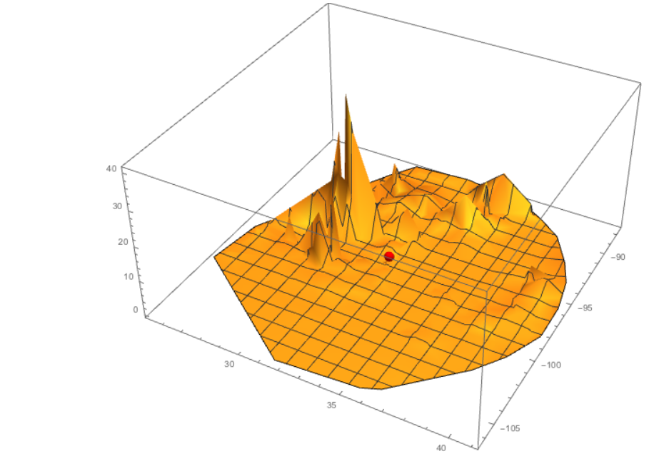
enter image description here

The red dot is Dallas and you can see the rainfall is accumulated mostly south-southeast. However, the graph isn't pretty enough to present. I want to color the surface of the graph based on values of WindSpeed. I want higher values of wind-speed red and lower values of wind speed yellow. The values of wind speed can probably be generated the same way as I have "TotalPrecipitation". Does anyone who how to do color the graph based on values of wind speed?

$\endgroup$

1 Answer 1

2
$\begingroup$

You can supply a pure function to ColorFunction. This function will be supplied the absolute (relative) coordinates when ColorFunctionScaling is set to False (True: default).

It is more convenient to work with absolute coordinates: we get x and y and simply look up the wind speed value. I'm using a simple scaling function for the color that interpolates between yellow and red.

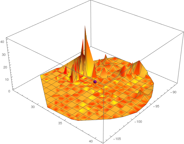
I've not unset the Mesh. On one hand it makes the plot look sorta' ugly. On the other hand, it is hard to get a sense of perspective without it since the colors don't match up with the heights (or maybe my eyes are just bad).

dallas = CityData[{"Dallas", "Texas", "UnitedStates"}, "Coordinates"];

With[{n = 400}, weatherStations = WeatherData[{dallas, n}]];
coordinates = Through[weatherStations["Coordinates"]];
getSeries[s_] := 
  WeatherData[#, s, {{2017, 8, 17}, {2017, 9, 3}, "Day"}] & /@ 
   weatherStations;

(* Warning: these will take a few minutes depending on your internet connection *)
rain = getSeries["TotalPrecipitation"];
windSpeed = getSeries["WindSpeed"];

maxValues[series_] := (Max /@ 
     DeleteCases[Through[series["Values"]], Missing[_], {-2}, 
      Heads -> True]) /. {"Values" -> 0., -∞ -> 0.};

maxRain = maxValues[rain];
maxWindSpeed = maxValues[windSpeed];
allMaxWindSpeed = Max@maxWindSpeed;

windSpeedTable = 
  Association[Rule @@@ Transpose[{coordinates, maxWindSpeed}]];

redYellow[t_] := RGBColor[1, 1 - t^(1/4), 0];
colorFn = redYellow[windSpeedTable[{#1, #2}]/allMaxWindSpeed] &;

rainData = MapThread[{Sequence @@ #1, #2} &, {coordinates, maxRain}]

Show[
 ListPlot3D[
  rainData
  , PlotRange -> All
  , BoxRatios -> {1, 1, 1/2}
  , ColorFunction -> colorFn
  , ColorFunctionScaling -> False
  ]
 , Graphics3D@{Purple, 
   Ellipsoid[{32.7942, -96.7655, 2.}, .015 {16, 18, 80}]}
 , ImageSize -> 600]

rain 3d plot colored with wind speed

One easy way to play with the "splotchiness" of the colors is by tweaking the power in t^(1/4); increasing the exponent will make the splotches stand out more.

$\endgroup$

Your Answer

By clicking “Post Your Answer”, you agree to our terms of service and acknowledge you have read our privacy policy.

Not the answer you're looking for? Browse other questions tagged or ask your own question.