3
$\begingroup$

Suppose I have plot a ListDensityPlot graph, the value of the density is between xmin and xmax, and the change of the plot color is given by Log[x/xmin]/Log[x/xmax]. Now I want to create a corresponding legend, how to achieve this?

Let xmin=0.3, xmax=15, the scaling of the color should vary according to the log scale, not linear, the effect should more or less look like this:

enter image description here

$\endgroup$
3
  • $\begingroup$ A concrete example might be useful here. Is the issue primarily the scaling in the legends or simply the desire for two legends, each of which you can figure out the details yourself? $\endgroup$
    – Mr.Wizard
    Commented Mar 3, 2017 at 3:10
  • $\begingroup$ @Mr.Wizard I mean the scaling. $\endgroup$ Commented Mar 3, 2017 at 6:19
  • $\begingroup$ I don't see a V10-specific issue here. The question is valid in all versions, and all answers so far work in versions 9 & up (that I can test). The version-10 does not seem justified. $\endgroup$
    – Michael E2
    Commented Mar 12, 2017 at 22:02

2 Answers 2

4
$\begingroup$

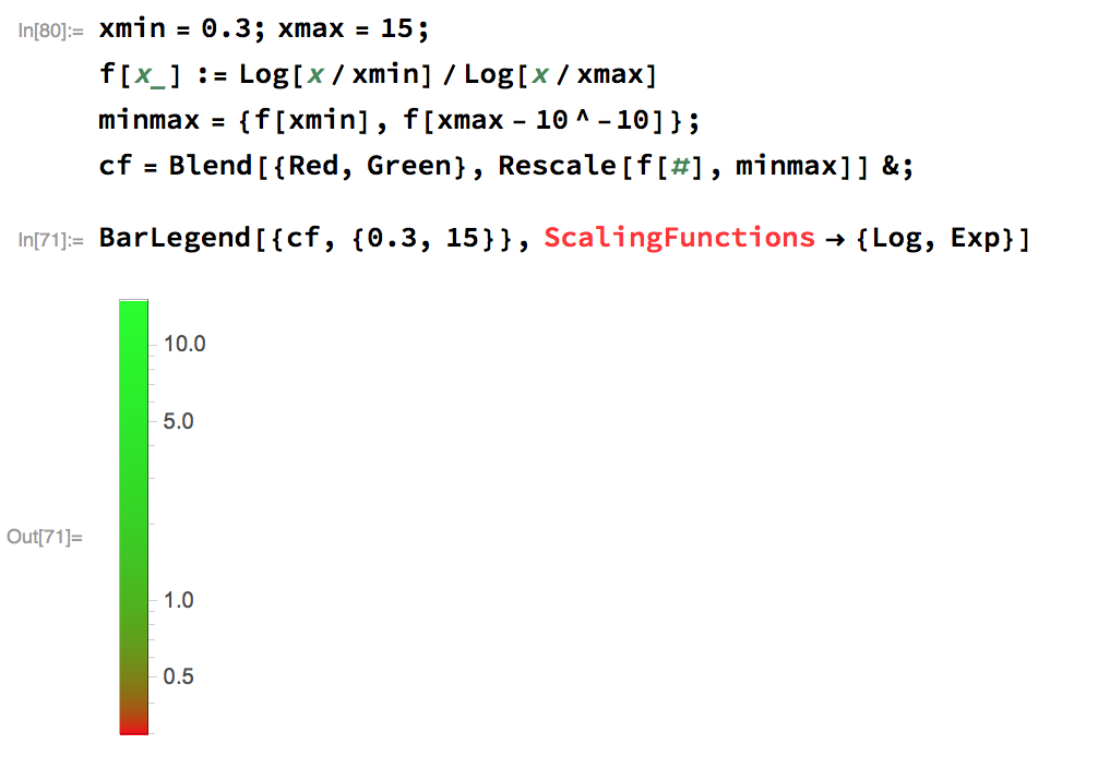
Not sure if this is what you meant, but

xmin = 0.3; xmax = 15;
f[x_] := Log[x/xmin]/Log[x/xmax]
minmax = {f[xmin], f[xmax - 10^-10]};
cf = Blend[{Red, Green}, Rescale[f[#], minmax]] &;

then

BarLegend[{cf, {0.3, 15}}, ScalingFunctions -> {Log, Exp}]

enter image description here

$\endgroup$
4
  • $\begingroup$ I have no ScalingFunctions, my version is 10. $\endgroup$ Commented Mar 4, 2017 at 0:56
  • $\begingroup$ @buzhidao This works in V10 & V9 for me. The automatic tick marks in V9 are a bit awkward, but BarLegend[{"SunsetColors", {0.3, 15}}, Ticks -> {0.3, 1, 3, 10, 15}, ScalingFunctions -> {Log, Exp}, LegendLayout -> "Row"] fixes that; and works in all versions V9-11. $\endgroup$
    – Michael E2
    Commented Mar 12, 2017 at 22:01
  • $\begingroup$ @MichaelE2 Thanks, it works with your modifications. $\endgroup$ Commented Mar 13, 2017 at 0:42
  • $\begingroup$ how was this answer accepted? The function f literally returns negative values for all x, so the BarLegend comes out all solid red, and even with a fixed f the ticks won't correspond to the correct colors returned by cf at all. $\endgroup$ Commented Oct 10, 2022 at 22:29
2
+50
$\begingroup$

You can also generate the contours yourself (second argument to BarLegend). Here's a way to make a function that preserves the syntax of BarLegend but uses sort-of log scale:

$scalingFactor = E/2;
$scalingRange =
  Rescale[
   ($scalingFactor^Range[1, 10, .1]),
   $scalingFactor^{1, 10}
   ];
barLeg[{cf_, {xmin_, xmax_}}, ops___] :=

 BarLegend[{(cf@Rescale[#, {xmin, xmax}] &), {xmin - .01, xmax + .01}},
  Round[Rescale[$scalingRange, {0, 1}, {xmin, xmax}], .01],
  ops
  ]

And since we have enough contours it uses a continuous gradient. Here's your gradient:

barLeg[{
  Blend[
    Thread[{
      Rescale[{.3, 1, 3, 10, 15}, {.3, 15}],
      {Hue[.5, .5, .5], Hue[.6, 1, .5], Hue[0, 1, .8], Yellow, White}
      }], #] &,
  {.3, 15}},
 LegendLayout -> "Row"
 ]

sample gradient

$\endgroup$

Your Answer

By clicking “Post Your Answer”, you agree to our terms of service and acknowledge you have read our privacy policy.

Not the answer you're looking for? Browse other questions tagged or ask your own question.