Here are two approaches.
We'll create a second dataset by shifting the given data by two months:
blossom = {{4, 3}, {4, 22}, {4, 15}, {4, 2}, {4, 18}, {4, 20}, {4,
    12}, {3, 30}, {4, 4}, {4, 24}, {4, 26}, {3, 4}, {4, 26}, {4,
    13}, {5, 1}, {4, 4}, {4, 8}, {4, 18}, {4, 9}, {4, 19}, {4,
    10}, {4, 20}, {4, 3}, {4, 4}, {3, 21}, {4, 19}, {4, 15}, {4,
    17}, {4, 9}, {4, 17}, {4, 9}, {4, 8}, {4, 23}, {4, 17}, {4,
    1}, {4, 10}, {4, 15}, {4, 15}, {4, 11}, {4, 15}, {4, 19}, {4,
    22}, {4, 11}, {4, 4}, {4, 12}, {3, 27}, {3, 24}, {4, 26}, {3,
    28}, {4, 16}};
ripen = TranslationTransform[{2, 0}][blossom];
The first method converts the {month, day} into the number of the day in the year (1 for January 1st, 32 for February 1st, etc...) and creates a histogram from that.
DayOfYear[{m_, d_}] :=
 First[DateDifference[{2011, 12, 31}, {2012, m, d}, "Day"]]

{DayOfYear[{1, 1}], DayOfYear[{2, 1}], DayOfYear[{3, 1}]}
{1, 32, 61}
Histogram[{DayOfYear /@ blossom, DayOfYear /@ ripen}, 20]
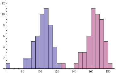
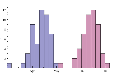
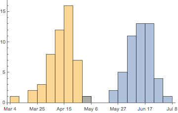
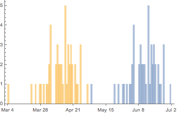
The second approach is more involved. We convert the {month, day} values into absolute times, and then use HistogramList on the combined datasets to get bins and counts without yet constructing the graphic. We then create a corresponding DateListPlot of the data, for the sole purpose of getting access to how it creates date axes. Finally we combine the ticks from the DateListPlot with an actual Histogram, reusing the bins but recalculating the bins for the different datasets, to get the final graphic.
MonthDayToTime[{m_, d_}] := AbsoluteTime[{2012, m, d}]

blossomtimes = MonthDayToTime /@ blossom;
ripentimes = MonthDayToTime /@ ripen;

{bins, counts} = HistogramList[Join[blossomtimes, ripentimes], 20]

points = Transpose[{Riffle[bins, bins], ArrayPad[Riffle[counts, counts], 1]}];
dateplot = DateListPlot[points, Frame -> False, Axes -> True, Joined -> True]

Show[Histogram[{blossomtimes, ripentimes}, {bins}], Options[dateplot, Ticks]]


{month, day}? $\endgroup$