73
$\begingroup$

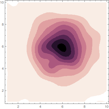
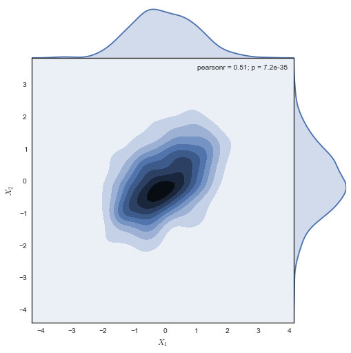
I love making plots in Mathematica. And I love to spend a lot of time making high-quality plots that maximize readability and aesthetics. For most cases, Mathematica can make very beautiful images, but when I see Python-seaborn plots I really love the aesthetics. For example, the density-contour plots. Here is a Python-seaborn example:
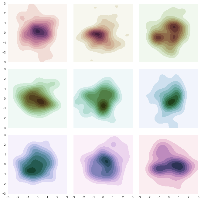
Python-seaborn image

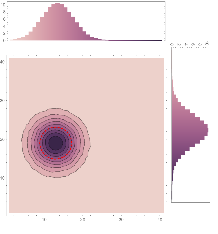
Python-seaborn image 2

I have spent too many hours trying to recreate this plots in Mathematica with no success. So my question is: Is there a way to recreate the whole style of these plots (at least the two in this question) in Mathematica?

You can check the seaborn page.


The color schemes are one of the things that I manage very bad. I understand that there is some opacity and transparency involved in the colors but I am really really bad at this, so I cannot help very much in this aspect.


Some example data for doing the plots:

data = BinCounts[
   Select[RandomReal[
     NormalDistribution[0, 1], {10^5, 
      2}], -3 <= #[[1]] <= 3 && -3 <= #[[2]] <= 3 &], 0.1, 0.1];

This data using ListContourPlot looks like:
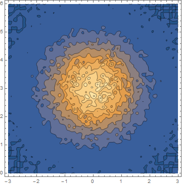
Starter data


As requested in the comments I attached a starter code to the second plot:

Defining a Gaussian-like dataset:

data1 = Table[
   1.*a E^(-(((-my + y) Cos[b] - (-mx + x) Sin[b])^2/(2 sy^2 + 
             RandomReal[{0, 1}])) - ((-mx + x) Cos[b] + (-my + y) Sin[
              b])^2/(2 sx^2 + RandomReal[{0, 1}])) /. {a -> 1, 
     my -> -1, mx -> -4, sx -> 2, sy -> 2, b -> 7 π/3}, {x, -10, 
    10, 1}, {y, -10, 10, 1}];

Defining the plotting function:

Coolplot[data1_] := 
 Module[{data, dataf, sx0, sy0, mx0, my0, fm, bsparameters, sigmaplot,
    marginal1, marginal2, final, central, c},

  data = Table[{x, y, data1[[x, y]]}, {x, 1, Length@data1[[1]]}, {y, 
     1, Length@data1[[All, 1]]}];
  dataf = Flatten[data, 1];
  sx0 = Max[Map[StandardDeviation[#[[All, 3]]] &, data]];
  sy0 = Max[Map[StandardDeviation[#[[All, 3]]] &, Transpose[data]]];
  {mx0, my0} = 
   Extract[dataf, Position[dataf[[All, 3]], Max[dataf[[All, 3]]]]][[
    1, {1, 2}]];
  fm = Quiet@
    NonlinearModelFit[dataf, 
     a E^(-(((-my + y) Cos[b] - (-mx + x) Sin[
                 b])^2/(2 sy^2)) - ((-mx + x) Cos[b] + (-my + y) Sin[
               b])^2/(2 sx^2)), {{a, 0.1}, {b, 0}, {mx, mx0}, {my, 
       my0}, {sx, sx0}, {sy, sy0}}, {x, y}];
  bsparameters = fm["BestFitParameters"];
  c[t_, n_] := {mx + Cos[b] (n sx Cos[t]) - Sin[b] (n sy Sin[t]), 
     my + (n sx Cos[t]) Sin[b] + Cos[b] (n sy Sin[t])} /. bsparameters;
  sigmaplot[n_, color_] := 
   ParametricPlot[c[t, n], {t, 0, 2 π}, 
    PlotStyle -> {Thick, color, Dashed}];


  central = 
   ListContourPlot[dataf, PlotRange -> All /. bsparameters, 
    ColorFunction -> "DeepSeaColors", 
    PlotLegends -> 
     Placed[BarLegend["DeepSeaColors", LegendLayout -> "Row", 
       LegendMarkerSize -> 390], Below], ImageSize -> 377];
  marginal1 = 
   ListLinePlot[
    Transpose[{Reverse@Map[#[[1, 2]] &, Transpose[data]], 
      Map[Total@#[[All, 3]] &, Transpose[data]]}], Frame -> True, 
    AspectRatio -> 1/4, PlotRange -> All, InterpolationOrder -> 0, 
    Filling -> Bottom, ColorFunction -> "DeepSeaColors", 
    FrameTicks -> {None, Automatic}];
  marginal2 = 
   ListLinePlot[Map[{#[[1, 1]], Total@#[[All, 3]]} &, data], 
    Frame -> True, AspectRatio -> 1/4, PlotRange -> All, 
    InterpolationOrder -> 0, Filling -> Bottom, 
    ColorFunction -> "DeepSeaColors", FrameTicks -> {None, Automatic}];
  final = 
   Graphics[{Inset[
      Show[{central, sigmaplot[1, Red](*,Epilog\[Rule]{Arrow[{c[0,
        1],.93c[0,1]}],Text[Style[Subscript[σ, 1],Red],.93c[0,
        1]]}*)}, PlotRange -> All], {101.5, 
       20 + 150 + 85 + 10}, {Center, Center}, {150, 170}], 
     Rotate[Inset[
       marginal1, {100 + 24, 150 + 85 + 45}, {Left, Center}, {145, 
        50}], 3 π/2], 
     Inset[marginal2, {101, 150 + 85 + 10 + 124}, {Center, 
       Center}, {148, 40}]}, ImageSize -> 500];
  Magnify[final, 1.5]
  ]

To spawn the plot use:

Coolplot[data1]
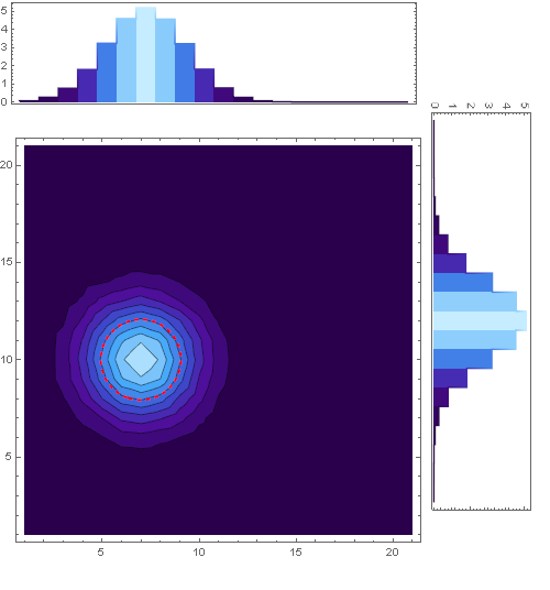
Cool plot

$\endgroup$
6
  • 2
    $\begingroup$ Since you've spent some time with this already you probably have Mathematica code for generating the data to create those contour plots, please include that and anything else that may help people get started. Maybe you also have some observations about the colors schemes for example. $\endgroup$
    – C. E.
    Commented May 31, 2015 at 23:45
  • $\begingroup$ @Pickett Thank you for your comment!! I have edited the question to add a starter piece of code to the second plot. I am very null at colors so i am so sorry but i feel that i cannot help so much in this aspect. $\endgroup$
    – Dargor
    Commented Jun 1, 2015 at 0:00
  • 2
    $\begingroup$ Two closely related posts (only regarding the color vs. lightness issue): Is there an easy way to use Matteo Niccoli's perceptual color maps for 2D plots in Mathematica? and Create colour with given lightness value. $\endgroup$
    – Jens
    Commented Jun 1, 2015 at 4:11
  • $\begingroup$ As you can see from the excellent answers, the issue here isn't really where you can, but whether it's worth the effort. The Python language, APIs, and packages are designed for (and continuously actively improved by) actual users, making whatever compromises and adjustments are effective in creating a powerful, easy to use and understand tool for actual use cases. Mathematica has a diametrically opposite design philosophy: it is a monolithic system that adheres to a very small set of rules. $\endgroup$
    – orome
    Commented Jun 4, 2015 at 12:10
  • 1
    $\begingroup$ @raxacoricofallapatorius That's correct. But i also find important to reduce your workflow scope to the minimum possible. And if you are confortable with a certain language, that's important too. At the end of the day knowing a lot of languages and possibilities is really good, but people like working with the tools they like....think for example in debugging a complicate plotting program in a language that you do not feel confortable. $\endgroup$
    – Dargor
    Commented Jun 4, 2015 at 14:56

3 Answers 3

62
$\begingroup$

In this answer, I will concentrate on the colors only to create something like this

Mathematica graphics


Copying the colors from python is a very fast way to get similar results. Nevertheless, the best way to understand what's happening is still to read the underlying publication that was used in seaborn:

There, you find exact explanations about what the author intended to create and how he achieved it. The whole point of such color schemes is to get a color gradient that starts from zero brightness (black) and ends in white. In between those two extremes, it tries to give the viewer the impression of a linearly growing brightness.

Making this way from black to white somewhat colorful is not easy, because the human eye has different perceptions for different colors. So what the author does is to choose a way in the rgb-color cube that spirals around the gray-line resulting in a nice color gradient with linearly growing perceived brightness.

Now, you can understand the name of the colors in python: cubehelix because the way inside the color-cube describes a helix around the gray line. Please read the publication.

Taking the essence out of it (eq. 2) and packing it in a Mathematica function gives:

astroIntensity[l_, s_, r_, h_, g_] := 
 With[{psi = 2 Pi (s/3 + r l), a = h l^g (1 - l^g)/2},
  l^g + a*{{-0.14861, 1.78277}, {-0.29227, -0.90649}, 
    {1.97294, 0.0}}.{Cos[psi], Sin[psi]}]

In short:

  • l ranges from 0 to 1 and gives the color-value. 0 is black, 1 is white and everything between is a color depending on the other settings
  • s is the color direction to start with
  • r defines how many rounds we circle around the gray line on our way to white
  • h defines how saturated the colors are
  • g is a gamma parameters that influences whether the color gradient is more dark or more bright

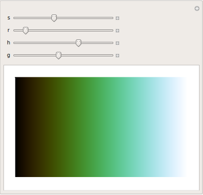
After calling astroIntensity you have to wrap RGBColor around it, but then, you can use it as color function. Try to play with this here

Manipulate[
 Plot[1/2, {x, 0, 1}, Filling -> Axis,
  ColorFunction -> (RGBColor[astroIntensity[#, s, r, h, g]] &), 
  Axes -> False, PlotRange -> All],
 {s, 0, 3},
 {r, 0, 5},
 {h, 0, 2},
 {{g, 1}, 0.1, 2}
]

Mathematica graphics

Or play with your example

data = BinCounts[
   Select[RandomReal[
     NormalDistribution[0, 1], {10^5, 
      2}], -3 <= #[[1]] <= 3 && -3 <= #[[2]] <= 3 &], 0.1, 0.1];

Manipulate[
 ListContourPlot[data, 
  ColorFunction -> (RGBColor[astroIntensity[1 - #, s, r, h, g]] &), 
  InterpolationOrder -> 3, ContourStyle -> None],
 {s, 0, 3},
 {r, 0, 5},
 {h, 0, 2},
 {{g, 1}, 0.1, 2}
 ]
$\endgroup$
1
  • $\begingroup$ Well, this is great. Very interesting reading! Thank you for all, the reference and the code. Using colors wisely was one of my pending things. I have readed this article (archive.org/stream/coordinatedcolor00kell/…) about using good color choices, but this is really a great solution. @halirutan Do you have some advice when aligning the subplots (Histogram-like plots) without having a headache when "hacking" the damn numbers? If you can enlighten this, i will gladly promote the answer to accepted answer. :) $\endgroup$
    – Dargor
    Commented Jun 1, 2015 at 1:14
43
$\begingroup$

Using color functions efficiently in data visualizations is more of an art than a recipe, so don't worry if you're not "good" at it yet. It's only a matter of time :)

Copying the color schemes from seaborn:

The best way to mimic those color schemes in Mathematica would be to copy the RGB values from seaborn for your preferred color scheme. You can find them like so (in python):

import seaborn as sns
cols = sns.cubehelix_palette(8)
sns.palplot(cols)

cols
#[[0.9312692223325372, 0.8201921796082118, 0.7971480974663592],
# [0.8822898168737189, 0.695820866705742, 0.7065457119485431],
# [0.8135380254700676, 0.5705055182357822, 0.639280859468155],
# [0.7195800708349119, 0.45537982893127477, 0.5861062995810926],
# [0.6046906802634469, 0.35739308184976665, 0.5337407853692406],
# [0.46496993672552045, 0.26868986121314253, 0.4636527763640647],
# [0.3210194743259347, 0.19303051265196464, 0.3707881677724792],
# [0.1750865648952205, 0.11840023306916837, 0.24215989137836502]]

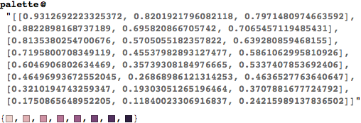
Now copy those RGB values (your terminal/ipython notebook won't have the #) and pass them as a string to the following function in Mathematica:

palette = RGBColor /@ ToExpression@StringReplace[#, {"[" -> "{", "]" -> "}"}] &;

Mathematica graphics

Now all that remains is to turn this into a color function:

cf = Blend[colors, #]&

where colors is the output of the palette function. Replace "DeepSeaColors" in your plot with cf and you should get this:

You can probably even write a wrapper function in Mathematica that runs a shell process, calls python, gets the RGB list from seaborn and converts it into a color function.

Lazily mimicking the color scheme in Mathematica:

If you're too lazy to dig into python/seaborn internals and get the triplets, you can take the easy route — DominantColors. This might work for any arbitrary color function as long as it's reasonably linear. Just take a tight screenshot of the color function you're interested in and use the following:

(I'm posting the code above as an image because the argument is a screenshot.)

Note that the first (lightest) color is white, which we don't want. So let's exclude that and create a color function with

cf = Blend[Rest@colors, #] &;

Using this in your code as before will give you a similar looking plot.

$\endgroup$
2
  • $\begingroup$ Wow! Thank you so much for this great answer. I have realized that using ContourStyle->None and Opacity in the Colorfunction helps a lot. Do you have some advice when aligning the subplots (Histogram-like plots) without having a headache when "hacking" the damn numbers? I want them to look like the second plot. $\endgroup$
    – Dargor
    Commented Jun 1, 2015 at 1:01
  • 1
    $\begingroup$ @PabloGalindoSalgado There's plenty of good solutions here: mathematica.stackexchange.com/q/2984/5 $\endgroup$
    – rm -rf
    Commented Jun 1, 2015 at 1:48
43
$\begingroup$

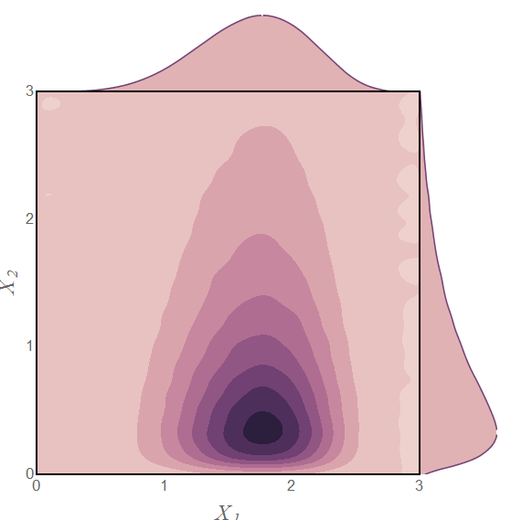
Styling closer to your example, using The Toad's colors:

colors = {RGBColor[{0.9312692223325372, 0.8201921796082118, 0.7971480974663592}], 
   RGBColor[{0.8822898168737189, 0.695820866705742, 0.7065457119485431}], 
   RGBColor[{0.8135380254700676, 0.5705055182357822, 0.639280859468155}], 
   RGBColor[{0.7195800708349119, 0.45537982893127477`, 0.5861062995810926}], 
   RGBColor[{0.6046906802634469, 0.35739308184976665`, 0.5337407853692406}], 
   RGBColor[{0.46496993672552045`, 0.26868986121314253`, 0.4636527763640647}], 
   RGBColor[{0.3210194743259347, 0.19303051265196464`, 0.3707881677724792}], 
   RGBColor[{0.1750865648952205, 0.11840023306916837`, 0.24215989137836502`}]};
colfn = colors /. x_ :> (Blend[x, #] &);

d1 = {RandomReal[LogNormalDistribution[0, 1], 10^6], 
    RandomReal[JohnsonDistribution["SB", -1, 2, 1.1, 1.5], 10^6]}\[Transpose];
data = BinCounts[Select[d1, 0 <= #[[1]] <= 3 && 0 <= #[[2]] <= 3 &], 0.1, 0.1];

{spX, spY} = 
  ListLinePlot[Mean@#, InterpolationOrder -> 2, PlotStyle -> colors[[6]], Filling -> 0, 
     FillingStyle -> colors[[2]], Frame -> False, Axes -> False, AspectRatio -> 1/5, 
     PlotRangePadding -> 0, ImageMargins -> 0, ImagePadding -> 0, 
     PlotRange -> Full] & /@ {data, Reverse@data\[Transpose]};

ListContourPlot[data, DataRange -> {{0, 3}, {0, 3}}, InterpolationOrder -> 3, 
   PlotRange -> All, ColorFunction -> colfn,
   PlotRangePadding -> 0, FrameStyle -> Thick, ContourStyle -> None,
   FrameTicksStyle -> Directive[Opacity[0], FontSize -> 14, FontOpacity -> 1], 
   FrameTicks -> {{Range[0, 3], None}, {Range[0, 3], None}},
   Prolog -> {Inset[spX, Scaled[{0, 1}], Scaled[{0, 0}], Scaled[{1, 1}]], 
   Inset[spY, Scaled[{1, 1}], Scaled[{0, 0}], Scaled[{1, 1}], {0, -1}]}, 
   ImagePadding -> {{40, 100}, {50, 100}}, PlotRangeClipping -> False,
   FrameLabel -> Array[Style[Subscript["X", #], 20, "TI"] &, 2]]

enter image description here

$\endgroup$
5
  • 1
    $\begingroup$ That's near perfect. I'm very very happy with all the answers. Being fair, yours is the nearest result but I am now really confused about what answer should I promote because all are great answers and every one uses something of the others....:/ Any thoughts? $\endgroup$
    – Dargor
    Commented Jun 1, 2015 at 6:18
  • 1
    $\begingroup$ @Pablo You're welcome. What you do with the Accept is entirely your prerogative. Having multiple good answers is a good problem to have. :-) $\endgroup$
    – Mr.Wizard
    Commented Jun 1, 2015 at 6:25
  • $\begingroup$ @Mr.Wizard It seems that at the initial picture of OP the image is somewhat blurred up, is not it? $\endgroup$ Commented Jun 1, 2015 at 7:56
  • 1
    $\begingroup$ @AlexeiBoulbitch That's because the colors are selected very very cleverly for that effect. It is a really well-designed library. $\endgroup$
    – percusse
    Commented Jun 1, 2015 at 13:04
  • $\begingroup$ @Alexei for some reason I forgot to turn off the contour lines; I'm not sure if that's what you meant but either way thanks for the reminder. $\endgroup$
    – Mr.Wizard
    Commented Jun 1, 2015 at 14:55

Your Answer

By clicking “Post Your Answer”, you agree to our terms of service and acknowledge you have read our privacy policy.

Not the answer you're looking for? Browse other questions tagged or ask your own question.