4
$\begingroup$

I have the followin data

llvaluefull = {{-10000, 0.9955201558795129`}, {-5000, 
0.9918661998405411`}, {-1000, 0.9689994447758001`}, {-750, 
0.960994816269547`}, {-500, 0.9464348207676564`}, {-400, 
0.9364572120784225`}, {-300, 0.9211596225765791`}, {-200, 
0.8942080072544306`}, {-100, 0.8309553835209477`}, {-75, 
0.797892513207336`}, {-50, 0.7452046521006773`}, {-40, 
0.713946015544555`}, {-30, 0.6727095338844533`}, {-20, 
0.6169570669713804`}, {-15, 0.5830218293040762`}, {-10, 
0.5491452142752082`}, {-5, 0.5330050345080709`}, {-3.5, 
0.5370096909263407`}, {-2.5, 0.5425758605796321`}, {-1.5, 
0.5501718631932083`}, {-2/3, 0.5576614234516881`}, {-0.25, 
0.5616729002916181`}, {-0.125, 0.5629013853879679`}, {-0.0125, 
0.5640017268531379`}, {-10^-2, 0.564051437097455`}, {-10^-3, 
0.56409191181635`}, {-10^-4, 0.5639969267400813`}, {-10^-5, 
0.5639866088126503`}, {10^-5, 0.5640044975410387`}, {10^-4, 
0.5639945512825674`}, {0.001, 0.5642321885539248`}, {0.01, 
0.564252028156347`}, {0.125, 0.5666028574308888`}, {0.25, 
0.5654228175723596`}, {2/3, 0.5708558542568287`}, {1.5, 
0.5793912853563281`}, {2.5, 0.5896754113240948`}, {3.5, 
0.5999259016520363`}, {4, 0.6050389881798164`}, {10, 
0.6644240081298314`}, {15, 0.7062425236595297`}, {20, 
0.7394977911965404`}, {30, 0.7870306109737224`}, {40, 
0.8188909726186043`}, {50, 0.8417288556450642`}, {75, 
0.8781587302178719`}, {100, 0.8998929170621898`}, {250, 
0.9488186518137977`}, {500, 0.9701978007543405`}, {1000, 
0.9829942727951643`}, {2500, 0.9920867688907514`}, {5000, 
0.9956233626141124`}};

I am able to plot this on the real line including negative numbers with

ListLinePlot[llvaluefull]

But I need x-axis to be logarithmic. Therefore I use

ListLogLinearPlot[llvaluefull, Joined -> True]

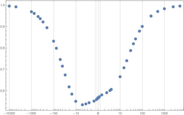
However, this gives me a figure only for the positive real numbers. Is there a way to have a logarithmic scale for the both positive and negative real numbers on the same figure?

By the way, I know that logarithm is defined on the positive numbers. I only need log scale in both directions.

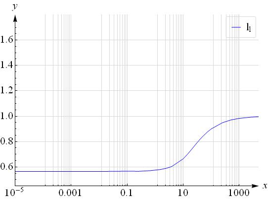
For the only positive part (by deleting the negative ones in the list) I get
$\endgroup$
3
  • $\begingroup$ "I know that logarithm is defined on the positive numbers. I only need log scale in both directions." -- okay, but what would happen in the area around zero? Should it simply be omitted from the plot? $\endgroup$
    – Mr.Wizard
    Commented Mar 29, 2015 at 16:09
  • 1
    $\begingroup$ okay. I had to be more clear. Assume we consider only the positive part of the data and forget the negative. Then we will get something as usual. Then consider only the negative part of the data and multiply all data elements (x-axis elements) by $-1$. Then, again Listloglinearplot but reversed plot, from right to the left. Then combination of both of them in one figure. I also dont know how to label the x-axis. But Obviously such a data can best be presented with such a figure. $\endgroup$ Commented Mar 29, 2015 at 16:25
  • $\begingroup$ Related: (9674) $\endgroup$
    – Mr.Wizard
    Commented Mar 31, 2015 at 15:51

2 Answers 2

8
$\begingroup$

According to the comment below your question I believe this does what you want:

scale    = Sign[#] Log[1 + Abs@#] &;
invscale = Sign[#] (Exp[Abs@#] - 1) &;

ListLinePlot[
 llvaluefull,
 ScalingFunctions -> {{scale, invscale}, Identity}
]

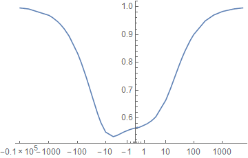
enter image description here

ScalingFunctions works in ListLinePlot in Mathematica 10.0.2, but it is not officially supported. It may not work in earlier versions.


Adapting the code I used for How do I make a log plot where the plot is logarithmic in the distance from the X-Axis (including negative values)? you can arbitrarily zoom the zero region with:

logify[_][x_ /; x == 0] := 0
logify[off_][x_] := Sign[x] Max[0, (off + Re@Log@x)/off]

inverse[off_][x_] := Sign[x] Exp[(Abs[x] - 1) off]

logscale[n_] := {logify[n], inverse[n]}

Examples:

ListLinePlot[llvaluefull, ScalingFunctions -> {logscale[1], Identity}]

enter image description here

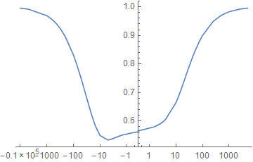
With logscale[7]:

enter image description here

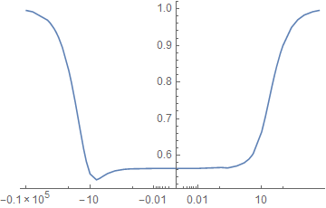
With logscale[22]:

enter image description here

$\endgroup$
5
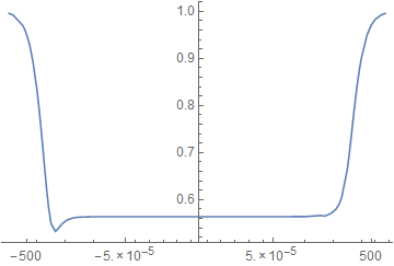
  • $\begingroup$ Unfortunately. This is exatly the same with the output of listlinearplot. The figure must stretch over the x-axis. Please see the edit. $\endgroup$ Commented Apr 2, 2015 at 20:57
  • $\begingroup$ Now I understand why you were asking about $0$. For such a scaling. Getting closer to $0$ is impossible in a finite grid.. horrible.. $\endgroup$ Commented Apr 2, 2015 at 21:46
  • $\begingroup$ @Seyhmus Please see the updated answer. $\endgroup$
    – Mr.Wizard
    Commented Apr 3, 2015 at 4:25
  • $\begingroup$ Thank you for the explanation. One last point. Would it be possible to add gridlines exactly the same as the ones in LogLinearLinePlot? $\endgroup$ Commented Apr 3, 2015 at 12:45
  • $\begingroup$ @Seyhmus Try: GridLines -> {Join @@ Array[10^# Range[-10, 10] &, 4, 0], Automatic}. You can adjust that as necessary. $\endgroup$
    – Mr.Wizard
    Commented Apr 3, 2015 at 14:05
6
$\begingroup$

One way is through a bilogarithmic plot.

Define

    bilog[val_, cut_: 1., ff_: .25] := Module[
   {out},
   out = If[Abs[val] <= cut,
     ff val,
     Sign[val] Log10[Abs[val]]
     ]
   ];

for the data and

 blvs[{rl_, rh_}, cut_: 1] := Module[
  {out, lin, lgn, lgp, lgt, lgm, lgo, tik, tkn, tkp},
  lin = Range[-.9 cut, .9 cut, cut/10];
  lgp = Range[Log10[cut], Log10[rh], 1];
  lgn = Range[Sign[rl] Log10[Abs@rl], Log10[cut], 1];
  lgm = {#, Sign[#] 10^(Abs@#)} & /@ Join[lgn, lgp];
  lgo = Log10[Range[1, 9, 1.]];
  tkn = Sort@-(lgo + # & /@ Sort@Abs@lgn);
  tkp = Sort@+(lgo + # & /@ Sort@Abs@lgp);
  tkn = {#, ""} & /@ Flatten@tkn;
  tkp = {#, ""} & /@ Flatten@tkp;
  tik = Join[tkn, tkp, lgm]
  ]

for the frame ticks, then

blv = {N@bilog[#[[1]], 1.], #[[2]]} & /@ llvaluefull;

and

ListPlot[blv, Frame->True,
 FrameTicks -> {{Automatic, None}, {blvs[{-10000, 10000}, 1], None}}]

gives you the plot I think you're after. Sans labels.

enter image description here

You'll also want to specify GridLines to make it clear that the region < Abs@cut has a linear scale.

The ff variable in the definition of bilog is cearly a fudge factor to scale the linear section so that it looks right.

Obviously, there are better ways of doing this job, and they are likely to involve the superposition of three properly-sized graphs for the appropriate regions. An exercise for the reader perhaps.

Another popular (at least in the geophysics community) transformation is through ArcSinh, but I'll leave definition of frame ticks as another exercise for the reader.

$\endgroup$
1
  • $\begingroup$ this is the same with the graph that I get using listlineplot. $\endgroup$ Commented Apr 2, 2015 at 20:55

Your Answer

By clicking “Post Your Answer”, you agree to our terms of service and acknowledge you have read our privacy policy.

Not the answer you're looking for? Browse other questions tagged or ask your own question.