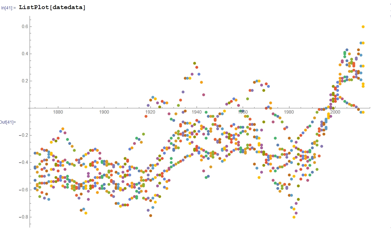
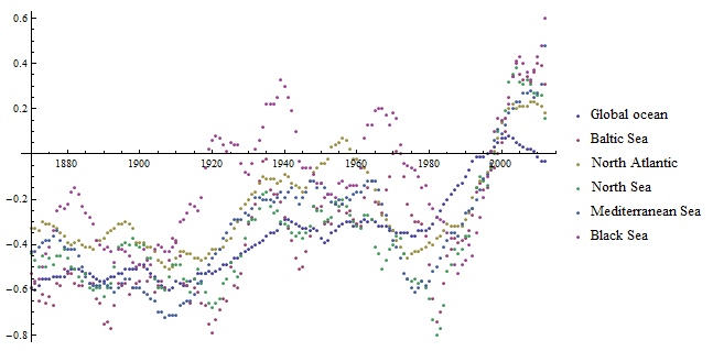
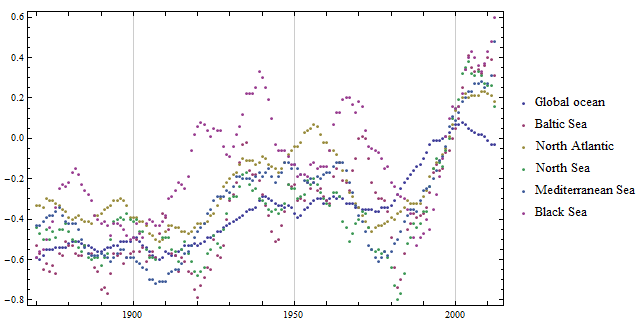
There is a dataset: for each year a single data for 6 seas. I would like to have a graph to visualize paralel changes.
This is what I attempted to reproduce http://www.eea.europa.eu/data-and-maps/daviz/annual-average-sea-surface-temperature-1#tab-chart_1
I imported tsv file, made some corrections.

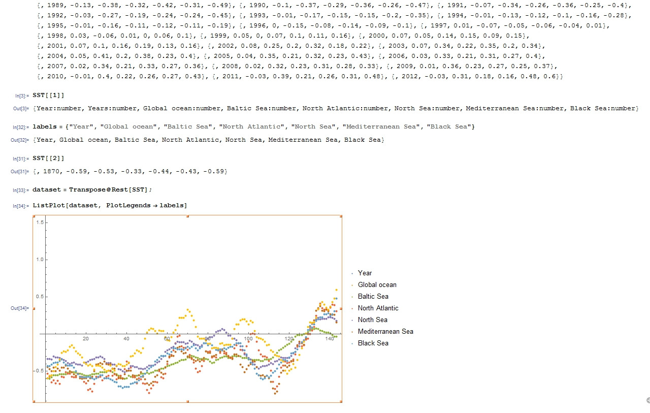
ListPlot looks almost nice, but on x-axis I have only natural numbers, not the years.
I also tried DateListPlot, but it did not accept just years.
datedata =
 Map[Rest,
   Rest@SST] /. {a_, b_, c_, d_, e_, f_,
    g_} -> {{a, b}, {a, c}, {a, d}, {a, e}, {a, f}, {a, g}}

{{{1870, -0.59}, {1870, -0.53}, {1870, -0.33}, {1870, -0.44}, {1870,
-0.43}, {1870, -0.59}}, {{1871, -0.6}, {1871, -0.57}, {1871, -0.33},
{1871, -0.47}, {1871, -0.43}, {1871, -0.56}}, {{1872, -0.58}, {1872,
-0.65}, {1872, -0.34}, {1872, -0.5}, {1872, -0.41}, {1872, -0.55}},
{{1873, -0.55}, {1873, -0.62}, {1873, -0.3}, {1873, -0.45}, {1873,
-0.39}, {1873, -0.5}}, ...
Inserting some fake month and day still not helped.
data[[1]]

{{{1870, 1, 1}, -0.59}, {{1870, 1, 1}, -0.53}, {{1870, 1,
   1}, -0.33}, {{1870, 1, 1}, -0.44}, {{1870, 1, 1}, -0.43}, {{1870,
   1, 1}, -0.59}}


ListPlotis{{x,y},{x,y},{x,y}...}.xin your case is the year corresponding to the measured anomalyy. For example plotting the list in your code block will actually work - if you plot that the year will appear on the x axis. $\endgroup$