12
$\begingroup$

Is it possible to use an image, rather than a color, or ColorFunction, as the filling for a plot?

For instance, I want to make a plot using DateListPlot, and have set Filling->Axis, and would like theFillingStyle to be something other than a solid color, gradient, hatching, or pattern. Instead, I'd like to use a simple jpg image using Import, and then have that image (scaled to fit) be the filling of the plot. I don't want to use Overlay because I only want the image to be the filling from the plotline to axis, nowhere else.

I've also tried using PlotStyle along with the Directive and Texture functions, however this causes the style that I've set for the plot line to be ignored, and the filling to default to white.

I'd show an example of this but can't find any images online, but, let's say I wanted the filling under the curve in this graph:
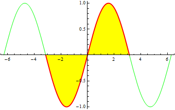
Example graph

using this:

Example filling image

Thanks!

EDIT: I should mention that I'm using Mathematica 9 on an Mac.

EDIT: Here is the raw code that produces the graph:

DateListPlot[{{{2012, 11, 6, 17, 0, 0.`}, 0}, {{2012, 11, 6, 18, 0, 0.`}, 0}, {{2012, 11, 6, 19, 4, 0.`}, 0}, {{2012, 11, 6, 19, 5, 0.`}, 0.013307611438183348`}, {{2012, 11, 6, 19, 14, 0.`}, 0.015586417157275023`}, {{2012, 11, 6, 19, 32, 0.`}, 0.015644028595458367`}, {{2012, 11, 6, 20, 0, 0.`}, 0.002057611438183348`}, {{2012, 11, 6, 20, 3, 0.`}, 0.03445164003364172`}, {{2012, 11, 6, 20, 7, 0.`}, 0.03823044575273339`}, {{2012, 11, 6, 20, 22, 0.`}, 0.04700925147182507`}, {{2012, 11, 6, 20, 30, 0.`}, 0.04578805719091674`}, {{2012, 11, 6, 20, 40, 0.`}, 0.04253805719091674`}, {{2012, 11, 6, 20, 52, 0.`}, 0.03503805719091674`}, {{2012, 11, 6, 21, 5, 0.`}, 0.027538057190916742`}, {{2012, 11, 6, 21, 16, 0.`}, 0.05668208578637511`}, {{2012, 11, 6, 21, 29, 0.`}, 0.04984566862910009`}, {{2012, 11, 6, 21, 33, 0.`}, 0.052624474348191765`}, {{2012, 11, 6, 21, 54, 0.`}, 0.03587447434819177`}, {{2012, 11, 6, 22, 5, 0.`}, 0.032345668629100086`}, {{2012, 11, 6, 22, 11, 0.`}, 0.03312447434819177`}, {{2012, 11, 6, 22, 34, 0.`}, 0.01945164003364172`}, {{2012, 11, 6, 22, 50, 0.`}, 0.01720164003364172`}, {{2012, 11, 6, 22, 56, 0.`}, 0.019480445752733392`}, {{2012, 11, 6, 23, 0, 0.`}, 0.022259251471825066`}, {{2012, 11, 6, 23, 1, 0.`}, 0.041345668629100094`}, {{2012, 11, 6, 23, 10, 0.`}, 0.03684566862910009`}, {{2012, 11, 6, 23, 13, 0.`}, 0.04590328006728343`}, {{2012, 11, 6, 23, 48, 0.`}, 0.01239402859545837`}, {{2012, 11, 6, 23, 51, 0.`}, 0.016922834314550043`}, {{2012, 11, 7, 0, 36, 0.`}, 0}, {{2012, 11, 7, 2, 0, 0.`}, 0}}, Joined -> True, AxesOrigin -> {{2012, 11, 6, 17}, 0}, PlotRange -> {{{2012, 11, 6, 16, 15}, {2012, 11, 7, 2}}, {-.009, .0725}}, Frame -> False, GridLines -> False, Filling -> Axis, FillingStyle -> None, Ticks -> {{{2012, 11, 6, 18}, {2012, 11, 6, 19}, {2012, 11, 6, 20}, {2012, 11, 6, 21}, {2012, 11, 6, 22}, {2012, 11, 6, 23}, {2012, 11, 7, 0}, {2012, 11, 7, 1}}, {0, 0.01, 0.02, 0.03, 0.04, 0.05, 0.06, 0.07}}]
$\endgroup$
2
  • $\begingroup$ @Artes That changes the entire background, whereas I want just the background between the plot curve and axis to be different. $\endgroup$
    – iwantmyphd
    Commented Oct 5, 2014 at 2:14
  • $\begingroup$ To avoid wasted effort, could you please include the code for the actual DateListPlot that you are working with? $\endgroup$
    – Jens
    Commented Oct 5, 2014 at 3:59

4 Answers 4

6
$\begingroup$

Edit: added simpler answer at the end.

My first answer addresses an issue I would have wanted you to have asked about... apparently I was overthinking it. The second answer is the result of actually reading the question (and the comment).

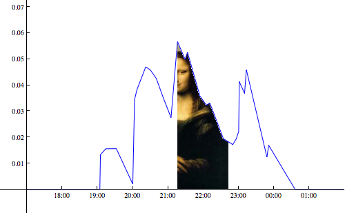
1. How to make an image background under a specific segment of a DateListPlot

You can create an image background by using the Filling option to obscure an existing background image in those regions where you don't want the image to show, and omitting any filling where you want the image to be visible.

This is how it can be done in DateListPlot (it would be different in Plot because there you don't have a list of data that can be partitioned, as I do below). First I'm defining the data separately, and also put all the unrelated options into a variable options to make the actual plot code easier to read:

data = {{{2012, 11, 6, 17, 0, 0.`}, 0}, {{2012, 11, 6, 18, 0, 0.`}, 
    0}, {{2012, 11, 6, 19, 4, 0.`}, 0}, {{2012, 11, 6, 19, 5, 0.`}, 
    0.013307611438183348`}, {{2012, 11, 6, 19, 14, 0.`}, 
    0.015586417157275023`}, {{2012, 11, 6, 19, 32, 0.`}, 
    0.015644028595458367`}, {{2012, 11, 6, 20, 0, 0.`}, 
    0.002057611438183348`}, {{2012, 11, 6, 20, 3, 0.`}, 
    0.03445164003364172`}, {{2012, 11, 6, 20, 7, 0.`}, 
    0.03823044575273339`}, {{2012, 11, 6, 20, 22, 0.`}, 
    0.04700925147182507`}, {{2012, 11, 6, 20, 30, 0.`}, 
    0.04578805719091674`}, {{2012, 11, 6, 20, 40, 0.`}, 
    0.04253805719091674`}, {{2012, 11, 6, 20, 52, 0.`}, 
    0.03503805719091674`}, {{2012, 11, 6, 21, 5, 0.`}, 
    0.027538057190916742`}, {{2012, 11, 6, 21, 16, 0.`}, 
    0.05668208578637511`}, {{2012, 11, 6, 21, 29, 0.`}, 
    0.04984566862910009`}, {{2012, 11, 6, 21, 33, 0.`}, 
    0.052624474348191765`}, {{2012, 11, 6, 21, 54, 0.`}, 
    0.03587447434819177`}, {{2012, 11, 6, 22, 5, 0.`}, 
    0.032345668629100086`}, {{2012, 11, 6, 22, 11, 0.`}, 
    0.03312447434819177`}, {{2012, 11, 6, 22, 34, 0.`}, 
    0.01945164003364172`}, {{2012, 11, 6, 22, 50, 0.`}, 
    0.01720164003364172`}, {{2012, 11, 6, 22, 56, 0.`}, 
    0.019480445752733392`}, {{2012, 11, 6, 23, 0, 0.`}, 
    0.022259251471825066`}, {{2012, 11, 6, 23, 1, 0.`}, 
    0.041345668629100094`}, {{2012, 11, 6, 23, 10, 0.`}, 
    0.03684566862910009`}, {{2012, 11, 6, 23, 13, 0.`}, 
    0.04590328006728343`}, {{2012, 11, 6, 23, 48, 0.`}, 
    0.01239402859545837`}, {{2012, 11, 6, 23, 51, 0.`}, 
    0.016922834314550043`}, {{2012, 11, 7, 0, 36, 0.`}, 
    0}, {{2012, 11, 7, 2, 0, 0.`}, 0}};

options = {Joined -> True, AxesOrigin -> {{2012, 11, 6, 17}, 0}, 
   PlotRange -> {{{2012, 11, 6, 16, 15}, {2012, 11, 7, 
       2}}, {-.009, .0725}}, Frame -> False, GridLines -> False, 
   Ticks -> {{{2012, 11, 6, 18}, {2012, 11, 6, 19}, {2012, 11, 6, 
       20}, {2012, 11, 6, 21}, {2012, 11, 6, 22}, {2012, 11, 6, 
       23}, {2012, 11, 7, 0}, {2012, 11, 7, 1}}, {0, 0.01, 0.02, 0.03,
       0.04, 0.05, 0.06, 0.07}}};

Up to here I just repeated what was defined in the question. Now the actual answer, using the Mona Lisa as a backround image img:

img = Import["https://i.sstatic.net/6m6ET.jpg"];

DateListPlot[
 {data[[;; 15]], data[[15 ;; 24]], data[[24 ;;]]},
 options,
 Filling -> {1 -> Axis, 1 -> Top, 2 -> Top, 3 -> Axis, 3 -> Top}, 
 FillingStyle -> Directive[Opacity[1], White], PlotStyle -> Blue, 
 Prolog -> Inset[img, {{2012, 11, 6, 20}, 0}, {Left, Bottom}], 
 ImageSize -> 500]

imagePlot

So all you need to do is divide the data into three lists, of which the middle one is the date range where the image should be visible. In the Filling option, I then set the first and third segments of the plot to have opaque White filling from the curve to the top and to the axis of the plot, which is indistinguishable from the background. For the middle segment, I use the same filling, but only to the Top and not to the axis. This leaves the space between the curve and the axis empty and therefore allows a background image to peek through.

Finally, the background image is added using Inset inside a Prologue. The positioning of the Inset had to be adjusted manually to make it look good at the given ImageSize. Ideally, you would choose an image that better fits the dimensions of the plot, of course.

In case the actual image you're using ends up showing through below the axis of the plot, you can obscure that part by adding another straight-line data curve with constant value 0 and giving it Filling from the curve to the Bottom.

2. Simpler answer to get image under entire curve

I think I misunderstood the question originally.

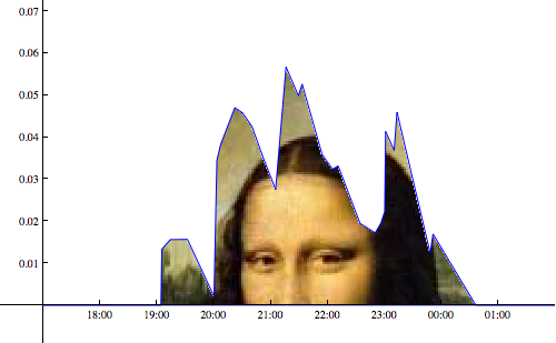
The above answer addressed the partial appearance of an image under a plot segment, as suggested by the example image shown in the question. If the goal is simply to have an image appear under the entire plot, it's much simpler:

DateListPlot[data, options, Filling -> Top, 
 FillingStyle -> Directive[Opacity[1], White], PlotStyle -> Blue, 
 Prolog -> 
  Inset[Show[img, ImageSize -> 500], {{2012, 11, 6, 17}, 0}, {Left, 
    Bottom}], ImageSize -> 500]

All I did is to make the bottom left corner of the background image coincide with the axis origin, and set its ImageSize equal to that of the plot. Controlling both image sizes explicitly is necessary to retain their relative positioning. The idea behind this method is the same as earlier: use Filling to hide the unwanted parts of the background.

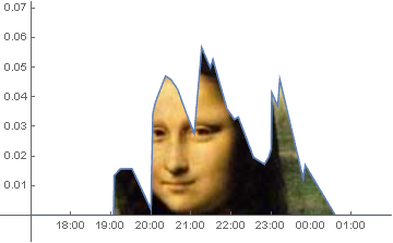
Now the issue is still that you may want to move the image up and down to make (in this case) the face show up under the relevant part of the curve. Here is a way to do that, using the method I already mentioned in my earlier answer:

DateListPlot[
 {data, {{data[[1, 1]], 0}, {data[[-1, 1]], 0}}},
 options,
 Filling -> {1 -> Top, 2 -> Bottom}, 
 FillingStyle -> Directive[Opacity[1], White], PlotStyle -> Blue, 
 Prolog -> 
  Inset[Show[img, ImageSize -> 500], {{2012, 11, 6, 17}, -.15}, {Left,
     Bottom}], ImageSize -> 500]

mona2

$\endgroup$
2
  • $\begingroup$ Not sure I follow why you only have the image in the center 1/3 of the graph.... how would you make it fill the entire area under the curve? $\endgroup$
    – iwantmyphd
    Commented Oct 5, 2014 at 6:14
  • $\begingroup$ I thought your main goal was to show the image only under part of the curve, like the colored regions in the sine plot you showed. If not, things are much easier (see other answers). To make the image fit the entire plot, you of course have to make sure that the aspect ratio of image and plot are identical. This could be done (a) by stretching the image, (b) by choosing an image with the right aspect ratio, or (c) by setting the aspect ratio of the plot equal to that of the image. You'd have to decide first which of these options you want. I mention option (a) in my answer. $\endgroup$
    – Jens
    Commented Oct 5, 2014 at 17:53
11
$\begingroup$

Since the filling in the original DateListPlot is a Polygon, you can post-process it to add a texture. The tricky bit is getting the scaling correct - I rescale the polygon coordinates relative to the PlotRange (so the texture coordinates run from 0 to 1 across the width and height of the plot) and crop the image to the correct aspect ratio:

imagefill[plot_, img_] := Module[{crop, scalefn},
  crop = 
   ImageCrop[img, ImageDimensions[img][[1]] {1, Options[plot, AspectRatio][[1, 2]]}, Bottom];
  scalefn = Transpose @ MapThread[Rescale, {Transpose @ #, PlotRange[plot]}] &;
  Normal[plot] /. Polygon[data___] :>
    {Texture[crop], Polygon[data, VertexTextureCoordinates -> scalefn @ data]}]

If dlp is your original DateListPlot then:

img = Import["https://i.sstatic.net/6m6ET.jpg"];

imagefill[dlp, img]

enter image description here

$\endgroup$
2
  • $\begingroup$ VERY close, the only issue is when I use your code along with mine, the background image and graph are both made roughly 50% transparent. Perhaps the graph is overlaying a white background on top of the image, making it look lighter than normal, and vice-versa, but the upshot is, yes it puts the image where I want it in the graph, but now both the graph and image are transparent/brightened. Can something be tweaked in imagefill? $\endgroup$
    – iwantmyphd
    Commented Oct 5, 2014 at 17:53
  • $\begingroup$ @iwantmyphd, I wonder if the filling polygon is partially transparent in version 9. You could try FillingStyle -> Black. Otherwise I'm not sure, I don't have version 9 to test with. $\endgroup$ Commented Oct 5, 2014 at 21:16
9
$\begingroup$
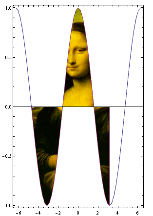
im2 = Import["https://i.sstatic.net/6m6ET.jpg"];

ParametricPlot[{{u, Cos[u]}, ConditionalExpression[{u, v Cos[u]}, -3 Pi/2 <= u <= Pi]},
 {u, -2 Pi, 2 Pi}, {v, 0, 1}, Mesh -> None, PlotRange -> All,
 PlotStyle -> Directive[{Opacity[1], Texture[ImageMultiply[im2, Yellow]]}],
 AspectRatio -> (1/Divide @@ ImageDimensions[im2]),
 TextureCoordinateFunction -> ({ #, #2} &), Axes -> {True, False},
 TextureCoordinateScaling -> True]

enter image description here

$\endgroup$
8
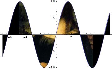
$\begingroup$

Would you mind using image process?

im1 = Plot[Sin[x], {x, -7, 7}, Filling -> {1 -> {Axis, Black}}, 
Axes -> False];
im2 = Import["D:\\MmaSE\\6m6ET.jpg"];(*your image*)
ImageMultiply[ImageAdd[im1, im2], Plot[Sin[x], {x, -7, 7}]]

the output:

enter image description here

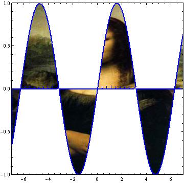
Or there is a RegionPlot approach:

RegionPlot[0 < y < Sin[x] || 0 > y > Sin[x], {x, -7, 7}, {y, -1, 1}, 
PlotRange -> {{-7, 7}, {-1, 1}}, 
BoundaryStyle -> Directive[Blue, Thick], PlotStyle -> Texture[im2]]

The output looks like:

enter image description here

$\endgroup$
2
  • 1
    $\begingroup$ I notice that Mona Lisa become fat in RegionPlot approach. $\endgroup$
    – Harry
    Commented Oct 5, 2014 at 3:10
  • $\begingroup$ ImageMultiply didn't work, unfortunately, and as you point out, it stretches the image in your example. RegionPlot does look better, however, I need to use DateListPlot for this plot, so the PlotStyle directive applies to the curve, not the area within. $\endgroup$
    – iwantmyphd
    Commented Oct 5, 2014 at 3:13

Your Answer

By clicking “Post Your Answer”, you agree to our terms of service and acknowledge you have read our privacy policy.

Not the answer you're looking for? Browse other questions tagged or ask your own question.