0
$\begingroup$

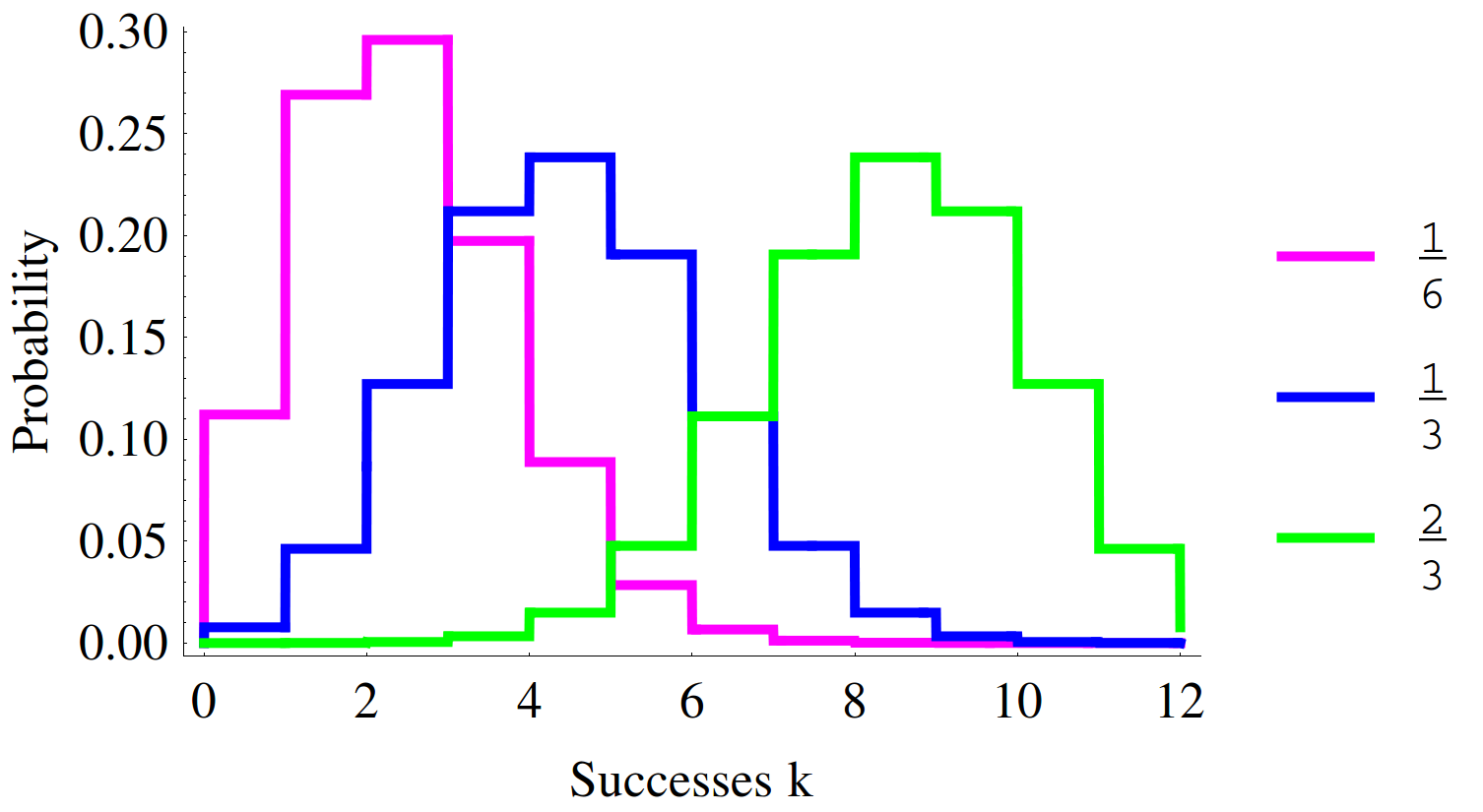
I often find myself trying to plot multiple PDFs for my courses. I find the default tools available to me are lacking and/or cumbersome. After readings some suggestions here, I have come up with the following code to plot 3 instances of the Binomial Distribution. I'm hoping this will prove useful to others (perhaps even myself). I'm also wondering if folks can improve on this.

n = 12;
plist = {1/6, 1/3, 2/3};
colorList = {Magenta, Blue, Green};
Plot[Evaluate[
  Map[PDF[BinomialDistribution[n, #], Floor[k]] &, 
   plist]], {k, -0.001, n + 0.001},
 Exclusions -> None,
 PlotStyle -> Map[{Thick, #} &, colorList],
 PlotLegends -> plist,
 Frame -> {True, True, False, False},
 FrameTicks -> {Table[i, {i, 0 , n, 2}], Automatic},
 FrameLabel -> {"Successes k", "Probability"}]

Here's the output plot of multiple histograms
$\endgroup$
7
  • 2
    $\begingroup$ For example, can you comment on what you don't like about your solution? $\endgroup$ Commented Jan 20, 2014 at 19:53
  • 1
    $\begingroup$ In my opinion there is a problem with this plot, in that the steps occur at integer values on the k axis. e.g. the value of the magenta curve at k=1 is both 0.12 and 0.27. Unless you know the code that was used to create the plot, there is no way to tell which is the correct value. $\endgroup$ Commented Jan 20, 2014 at 20:12
  • $\begingroup$ Seen DiscretePlot ? $\endgroup$ Commented Jan 20, 2014 at 21:54
  • $\begingroup$ @SjoerdC.deVries I tried using DiscretePlot, but I couldn't figure out an elegant way to get the lines the way I wanted instead of simple markers as is the default. $\endgroup$ Commented Jan 20, 2014 at 22:09
  • $\begingroup$ I agree with @SimonWoods that the location of the bin boundaries are ambiguous. It seems like this could be solved by replacing "k" in "Floor[k]" with "Floor[k+1/2]" and changing the lower bound of the range of k from "-0.001" to "-0.5001" $\endgroup$ Commented Jan 20, 2014 at 22:13

1 Answer 1

2
$\begingroup$

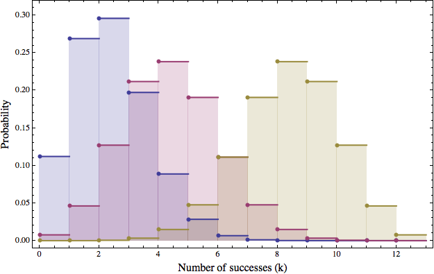
Here's my quick and dirty take on it using DiscretePlot. (As also suggested by Sjoerd in the comments above.) Playing around with ExtentSize and ExtentMarkers can give you a variety of choices for how the lines are displayed.

I'm not sure what constitutes "better" from your perspective, but the following code generates something similar to your solution:

DiscretePlot[
  {PDF[BinomialDistribution[12, 1/6], x], 
   PDF[BinomialDistribution[12, 1/3], x], 
   PDF[BinomialDistribution[12, 2/3], x]}, {x, 0, 12}, 
   ExtentSize -> Right,                            (* Lines extend to the right *)
   ExtentMarkers -> {Point, Null},                 (* Markers to resolve the ambiguity *)
   Frame -> True, 
   PlotRange -> {{-0.25, 13.25}, {-0.01, 0.32}},   (* Set "handraulically", could be automated *)
   BaseStyle -> {FontSize -> 12}, 
   FrameLabel -> {Style["Number of successes (k)", 16], 
      Style["Probability", 16]}, 
   PlotStyle -> Directive[AbsoluteThickness[2], AbsolutePointSize[6]], 
   ImageSize -> 625
]

The plot, in all its "glory":

enter image description here

Note that I have not included a legend for the plot as you have. In my production work (final figures for journal articles or internal tech reports), I tend to do plot legends or other labelling either via Epilog and direct graphics commands, or by post-editing in Adobe Illustrator, depending on the complexity of the desired annotations/markup. Not necessarily the most optimal workflow, but it gives me the greatest fine-grained control over the output.

$\endgroup$

Your Answer

By clicking “Post Your Answer”, you agree to our terms of service and acknowledge you have read our privacy policy.

Not the answer you're looking for? Browse other questions tagged or ask your own question.