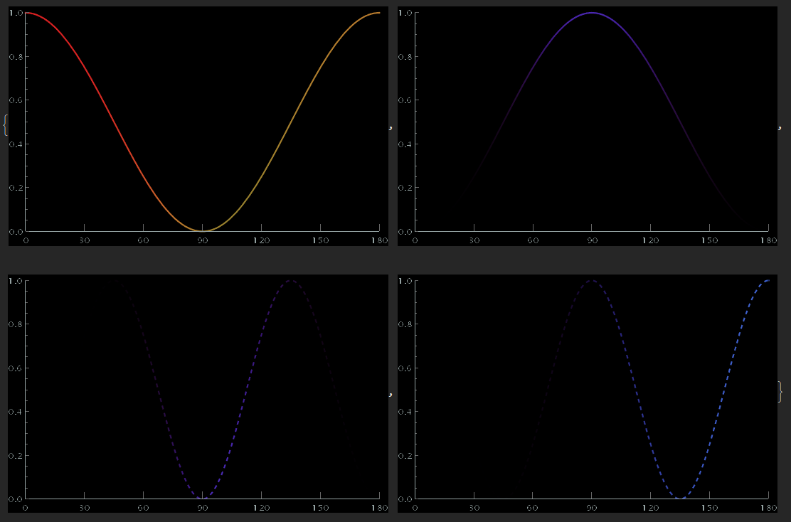
I have 4 plots, k1, k2, k3, and k4, that are generated using the code below. They currently look like this:
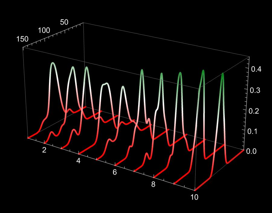
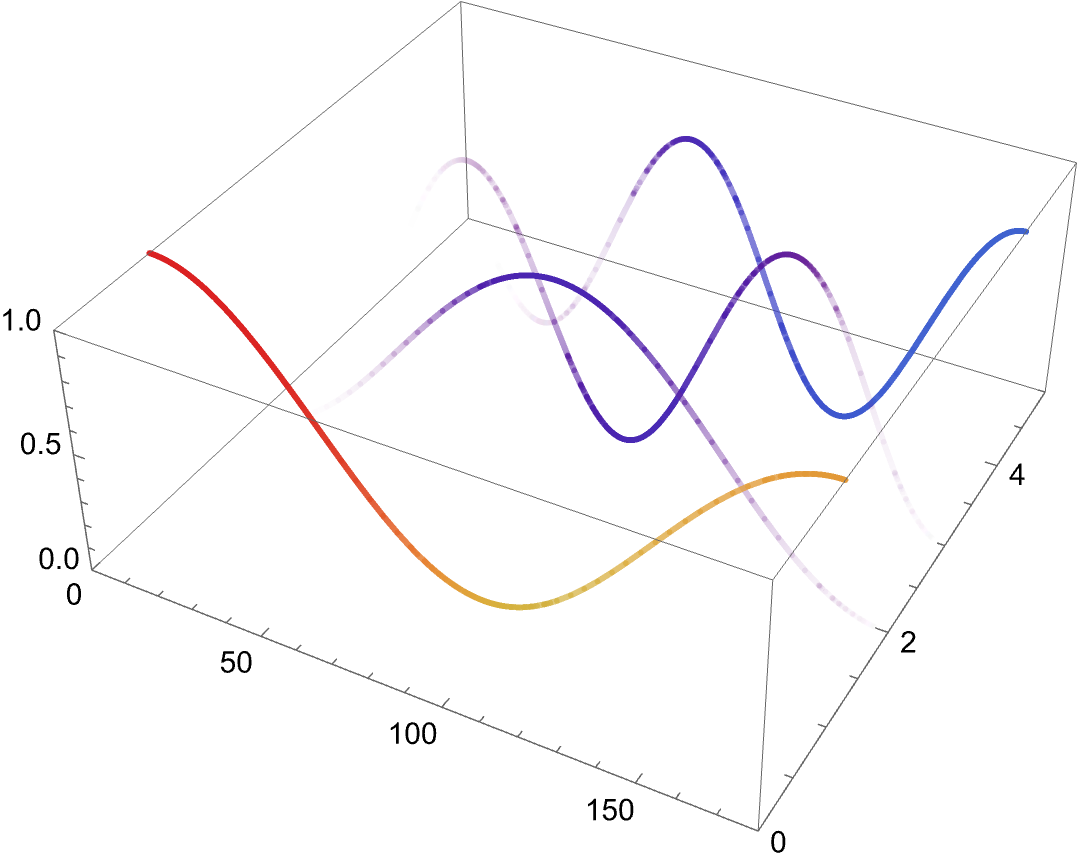
I would like to stack them vertically, similar to how it is shown in this example from another Stack Exchange post:
I am not sure how to adapt their approach to stack my specific plots. Below is the code I use to generate k1, k2, k3, and k4. Can someone please suggest how to vertically stack these plots while preserving their individual styles?
eval1a[x_] := -((60 - 44 Cos[x] + 20 Cos[2 x] - 4 Cos[3 x] +
       Sqrt[2] Sqrt[
        2154 - 2896 Cos[x] + 1915 Cos[2 x] - 888 Cos[3 x] +
         278 Cos[4 x] - 56 Cos[5 x] + 5 Cos[6 x]])/(8 (15 Cos[x] -
         6 (3 + Cos[2 x]) + Cos[3 x])));

eval2a[x_] := -((2 Sin[x/2]^2 Sin[x]^2)/(
   15 Cos[x] - 6 (3 + Cos[2 x]) + Cos[3 x]));

eval3a[x_] = (-60 + 44 Cos[x] - 20 Cos[2 x] + 4 Cos[3 x] +
     Sqrt[2] Sqrt[
       2154 - 2896 Cos[x] + 1915 Cos[2 x] - 888 Cos[3 x] +
        278 Cos[4 x] - 56 Cos[5 x] + 5 Cos[6 x]])/(8 (15 Cos[x] -
       6 (3 + Cos[2 x]) + Cos[3 x]));

eval4a[x_] := -((
   8 Sin[x/2]^6)/(-18 + 15 Cos[x] - 6 Cos[2 x] + Cos[3 x]));

max1 = 1;
max2 = FindMaximum[eval2a[x Degree], {x, 90}][[1]];
max3 = FindMaximum[eval3a[x Degree], {x, 90}][[1]];
max4 = FindMaximum[eval4a[x Degree], {x, 180}][[1]];

normEval1a[x_] = eval1a[x Degree]/max1;
normEval2a[x_] = eval2a[x Degree]/max2;
normEval3a[x_] = eval3a[x Degree]/max3;
normEval4a[x_] = eval4a[x Degree]/max4;

rangemin = 0;
rangemax = 1;
k1 = Plot[Cos[x Degree]^2, {x, 0, 180},
   ColorFunction ->
    Function[{x, y}, {Opacity[normEval1a[x]],
      ColorData["Rainbow"][eval1a[x Degree]]}],
   ColorFunctionScaling -> False, WorkingPrecision -> 20,
   PlotRange -> {{0, 180}, {rangemin, rangemax}}, Exclusions -> None,
   Ticks -> {Table[{i, i, {0, -0.02}}, {i, 0, 180, 30}], Automatic},
   Background -> Black, ImageSize -> 400];

k2 = Plot[Sin[x Degree]^2, {x, 0, 180},
   ColorFunction ->
    Function[{x, y}, {Opacity[normEval2a[x]],
      ColorData["Rainbow"][eval2a[x Degree]]}],
   ColorFunctionScaling -> False, WorkingPrecision -> 20,
   PlotRange -> {{0, 180}, {rangemin, rangemax}}, Exclusions -> None,
   Ticks -> {Table[{i, i, {0, -0.02}}, {i, 0, 180, 30}], Automatic},
   Background -> Black, ImageSize -> 400];

k3 = Plot[Sin[2 x Degree]^2, {x, 0, 180},
   ColorFunction ->
    Function[{x, y}, {Opacity[normEval3a[x]],
      ColorData["Rainbow"][eval3a[x Degree]]}],
   ColorFunctionScaling -> False, PlotStyle -> Dashed,
   WorkingPrecision -> 20,
   PlotRange -> {{0, 180}, {rangemin, rangemax}}, Exclusions -> None,
   Ticks -> {Table[{i, i, {0, -0.02}}, {i, 0, 180, 30}], Automatic},
   ColorFunction -> Function[{x, y}, ColorData["Rainbow"][eval3a[x]]],
    ColorFunctionScaling -> False, Background -> Black,
   ImageSize -> 400];

k4 = Plot[Cos[2 x Degree]^2, {x, 0, 180},
   ColorFunction ->
    Function[{x, y}, {Opacity[normEval4a[x]],
      ColorData["Rainbow"][eval4a[x Degree]]}],
   ColorFunctionScaling -> False, PlotStyle -> Dashed,
   WorkingPrecision -> 20,
   PlotRange -> {{0, 180}, {rangemin, rangemax}}, Exclusions -> None,
   Ticks -> {Table[{i, i, {0, -0.02}}, {i, 0, 180, 30}], Automatic},
   Background -> Black, ImageSize -> 400];

{k1, k2, k3, k4}
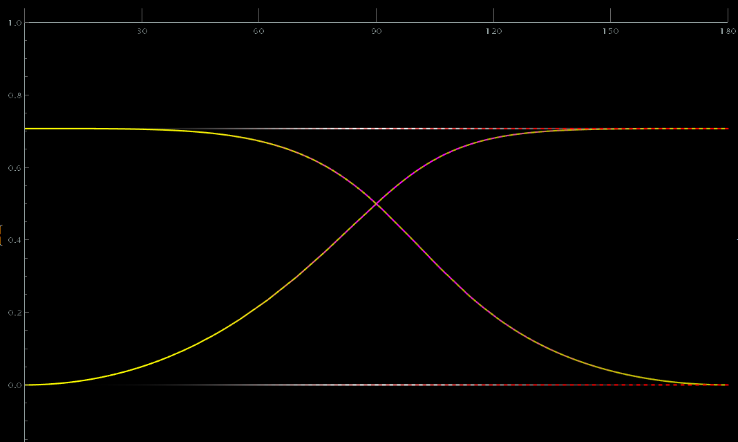
The reason why I want to stack them this way is because the actual equations I’m plotting overlap, making it difficult to distinguish where one ends and another begins. For your convenience, I’ve included the actual figures below.
As you can see, there are dashed curves on top of solid curves. The dashed curves and some of the solid curves do not span the entire x range, but in this format it's hard to tell where they begin and end. For this reason, to improve clarity, I thought separating them in 3D space might make the visualization easier to follow.
UPDATE
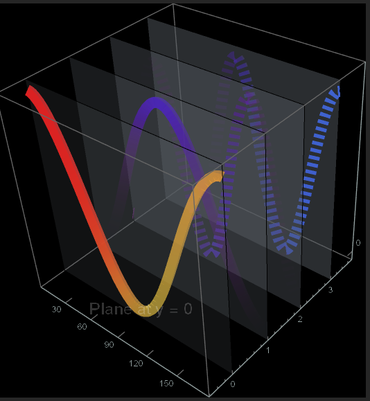
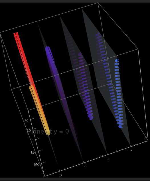
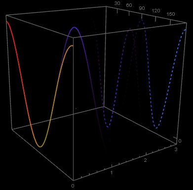
Using one of the solutions provided below, it is possible to add planes at the location of each graph and adjust the line thickness accordingly. However, when rotating the graphics, the plot lines no longer stay aligned with the planes, which becomes especially noticeable when the line thickness is increased. Additionally, I would like to place text on each plane, but I encounter a similar issue: the text does not remain fixed to the plane during rotation.
Any suggestions or solutions to address these problems would be greatly appreciated.
lineThickness = 0.03;

Show[
 Show[
  MapThread[
   ParametricPlot3D[{x, #1, #2},
     {x, 0, 180},
     ColorFunction ->
      Function[{x, y}, {Opacity[#3[x]],
        ColorData["Rainbow"][#4[x Degree]]}],
     ColorFunctionScaling -> False,
     PlotStyle -> {#5, Thickness[#6]},
     WorkingPrecision -> 20,
     PlotRange -> {{0, 180}, {rangemin, rangemax}},
     Exclusions -> None,
     Ticks -> {Table[{i, i, {0, -0.02}}, {i, 0, 180, 30}], Automatic},
     Background -> Black,
     ImageSize -> 400] &, {{0, 1, 2, 3}, {Cos[x Degree]^2,
     Sin[x Degree]^2, Sin[2 x Degree]^2,
     Cos[2 x Degree]^2}, {normEval1a, normEval2a, normEval3a,
     normEval4a}, {eval1a, eval2a, eval3a, eval4a}, {Automatic,
     Automatic, Dashed, Dashed}, {lineThickness, lineThickness,
     lineThickness, lineThickness}}], PlotRange -> All,
  BoxRatios -> {1, 1, 1}],
 Graphics3D[
  {
   {Opacity[0.2], LightBlue,
    InfinitePlane[{{10, 0, -10}, {170, 0, -10}, {170, 0, 10}}],
    Text[Style["Plane at y = 0", White, 18], {90, 0,
      0}]},(*Plane at y=0*)
   {Opacity[0.3], LightBlue,
    InfinitePlane[{{10, 1, -10}, {170, 1, -10}, {170, 1,
       10}}]},(*Plane at y=1*)
   {Opacity[0.4], LightBlue,
    InfinitePlane[{{10, 2, -10}, {170, 2, -10}, {170, 2,
       10}}]},(*Plane at y=2*)
   {Opacity[0.5], LightBlue,
    InfinitePlane[{{10, 3, -10}, {170, 3, -10}, {170, 3,
       10}}]}  (*Plane at y=3*)
   }
  ]
 ]

