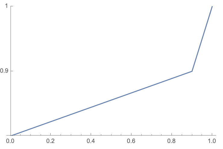
You can use the option ScalingFunctions! They're easy to use but a bit tricky to understand. I'll be honest: I don't know what the second function it asks for does, but the documentation says to use the inverse function of the first one, so that's what I'll do. I'd love for someone to explain it.
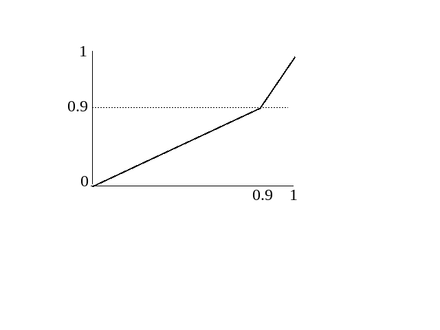
So, I used a piecewise function that sends the interval $[0,0.9]$ to $[0,0.5]$ linearly, and sends $[0.9,1]$ to $[0.5,1]$ linearly. If you're rusty on how to do this, just look up point-slope form or any other method of graphing a line given two points on the line.
Note the explicit specification of Ticks to create the ticks at 0, 0.9, and 1 on the y-axis.
ListPlot[Table[x, {x, 0, 1, 0.01}],
    Joined -> True, DataRange -> {0, 1}, PlotRange -> {0, 1},
    ScalingFunctions ->
        {Piecewise[{{0.5 #/0.9, # <= 0.9}, {(0.5/0.1) (# - 0.9) + 0.5, # > 0.9}}] &,
         (*The next element in the list is just InverseFunction surrounding the above function: *)
         InverseFunction[Piecewise[{{0.5 #/0.9, # <= 0.9}, {(0.5/0.1) (# - 0.9) + 0.5, # > 0.9}}] &]},
    Ticks -> {Automatic, {0, 0.9, 1}}]

You could also use your above solution of making two separate graphs, but you'd need to combine them with Show, play with the ticks by giving each of them explicit labels that differed from their "actual" values, and use PlotRange to expand the x-axis of the first one (which determines the overall settings) to include the domain of the second one. To my taste, it's more complicated and ad-hoc, but doable, and perhaps preferable depending on what you're comfortable with!
EDIT: About the second list element in ScalingFunctions: from searching SE, it seems to be the case that inverse functions are simply hard to compute, so it asks the user if they have an optimized one that it can use. I'm not sure exactly which parts of the graph are affected, though, as changing it seems to produce no visible difference here.


