4
$\begingroup$

Possible Duplicate:
Difference in Plot when using Evaluate vs when not using Evaluate

I am plotting galaxies and I would like to color them according to their redshift values using a temperature map as a metaphor for shifted wavelengths. Here, I will assume that a circle has a redshift value corresponding to its radius. How would one assign a different color to each circle using a temperature map with hue from blue to red corresponding to increasing size?

circle[Theta_, r_] := {r*Cos[Theta], r*Sin[Theta]};
ParametricPlot[Table[circle[Theta, r], {r, 1, 5}], {Theta, 0, 2 Pi}]
$\endgroup$
1
  • 1
    $\begingroup$ ParametricPlot[Table[circle[Theta, r], {r, 1, 5}] // Evaluate, {Theta, 0, 2 Pi}] $\endgroup$ Commented Nov 2, 2012 at 21:19

2 Answers 2

5
$\begingroup$

Just to be more "Astro"physical:

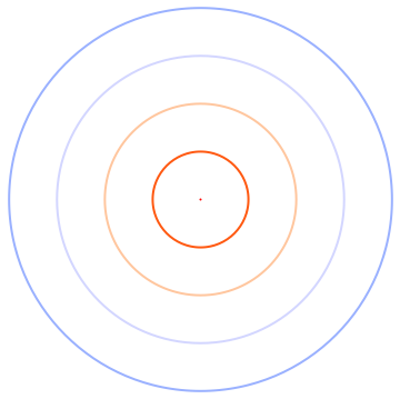
  Table[{Thick, ColorData["BlackBodySpectrum"][10000*i], 
  Circle[{0, 0}, i]}, {i, 0, 1, 1/4}] // Graphics

Mathematica graphics

i.e. you can use Kelvin as a colour index ;-)

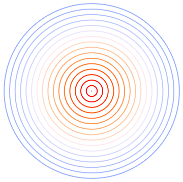
  Table[{Thick, ColorData["BlackBodySpectrum"][10000*i], 
  Circle[{0, 0}, i]}, {i, 0, 1, 1/16}] // Graphics

Mathematica graphics

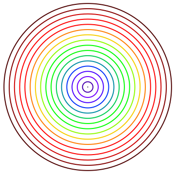
or for the visible spectrum

 Table[{Thick, ColorData["VisibleSpectrum"][380 + i*350], 
 Circle[{0, 0}, i]}, {i, 0, 1, 1/16}] // Graphics

Mathematica graphics

and if you want to use ParametricPlot

 ParametricPlot[
 Table[circle[θ , r], {r, 5}] // Evaluate, {θ , 0, 2 Pi }, 
 PlotStyle -> 
 Map[Directive[ColorData["BlackBodySpectrum"][#], Thick] &, 
 Range[1000, 9000, 2000]]]
$\endgroup$
4
  • 1
    $\begingroup$ Whoever upvoted me for this so difficult plot thanks: now that I reached 3000 pts, I really need to go through a mathematica.SE detoxication session ;-) $\endgroup$
    – chris
    Commented Nov 3, 2012 at 9:31
  • $\begingroup$ This is terrific. It's especially useful to have three different solutions in such succinct expressions. I understood the general idea that you use a table of points followed by PlotStyle -> {list of Directive or ColorData} and I must have tried two dozen variations, and I tried the {Color, Point} structure as well. For reasons I don't understand, none of them worked. If I had better programming discipline, I would have kept a record. $\endgroup$
    – Gary
    Commented Nov 3, 2012 at 16:45
  • $\begingroup$ I wanted ParametricPlot because I will be drawing spiral icons and other shapes and that is the only method I am familiar with. $\endgroup$
    – Gary
    Commented Nov 3, 2012 at 16:54
  • $\begingroup$ I see that @J.M. actually provided a solution first in a comment, and so should perhaps the first answer should have been the one upvoted. Well chris offered illustrations and nice variations. I'm not sure what is conventional or what you can buy with the prestige points, but like a weasily politician, I will say "I am truly sorry if I have unknowingly offended anyone with my innocent blunders". $\endgroup$
    – Gary
    Commented Nov 3, 2012 at 17:10
6
$\begingroup$
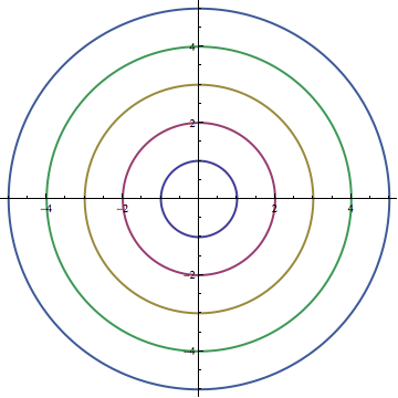
ParametricPlot[
 Evaluate@Table[{r*Cos[Theta], r*Sin[Theta]}, {r, 1, 5}], {Theta, 0, 
  2 Pi}]

Mathematica graphics

Why? Try Trace[] on both your version and the one with Evaluate. You see that, without Evaluate, you ParametricPlot sees Table[{r Cos[Theta], r Sin[Theta]}, {r, 1, 5}] as its first argument (ParametricPlot has attribute HoldAll), while with Evaluate it receives {{Cos[Theta], Sin[Theta]}, {2 Cos[Theta], 2 Sin[Theta]}, {3 Cos[Theta], 3 Sin[Theta]}, {4 Cos[Theta], 4 Sin[Theta]}, {5 Cos[Theta], 5 Sin[Theta]}} as its first argument.

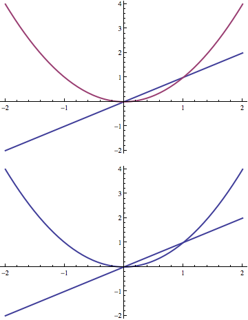
ParametricPlot (as well as Plot) seem to colour things differently or not depending on the head of their first argument. Example:

g[x___] := List[x]
Plot[{x, x^2}, {x, -2, 2}]
Plot[g[x, x^2], {x, -2, 2}]

Mathematica graphics

$\endgroup$
5
  • 2
    $\begingroup$ A sometimes useful trick: Plot[{Sin[x], Sequence[x, x^2]}, {x, -2, 2}] $\endgroup$ Commented Nov 3, 2012 at 0:42
  • $\begingroup$ Definitely useful information, but I did not formulate the question very well. I really want to know how to apply a color map so that each circle is assigned a color on the temperature spectrum from red to blue by increasing radius. I hate to withhold acceptance, but I don't want to start another question. $\endgroup$
    – Gary
    Commented Nov 3, 2012 at 4:46
  • $\begingroup$ Ain't our fault for having a suboptimally formulated question, @Gary. ;) Anyway, try ParametricPlot[Table[circle[θ, r], {r, 5}] // Evaluate, {θ, 0, 2 π}, PlotStyle -> Map[ColorData["TemperatureMap"], Range[0, 1, 1/4]]] $\endgroup$ Commented Nov 3, 2012 at 5:46
  • $\begingroup$ @J.M. why don't you post that as an answer? (Gary, no problem) $\endgroup$
    – acl
    Commented Nov 3, 2012 at 12:35
  • $\begingroup$ @acl, it'd seem that chris already said what I wanted to say... :) $\endgroup$ Commented Nov 3, 2012 at 13:31

Not the answer you're looking for? Browse other questions tagged or ask your own question.