51
$\begingroup$

Bug introduced in 10.0 or earlier and fixed in 11.1


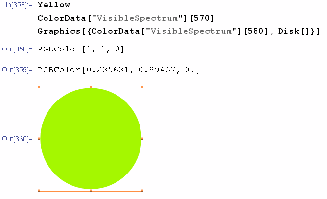
I am trying to visualize the visible spectrum using the built-in ColorData["VisibleSpectrum"] function which "colors based on light wavelength in nanometers". But I get wrong results for well-known pure colors. For example the yellow color has wavelength of 570–590 nm but ColorData["VisibleSpectrum"][580] returns green:

screenshot

Is it a bug? How to visualize the visible spectrum in Mathematica correctly?

$\endgroup$
8
  • 2
    $\begingroup$ The myriad of color spaces, conversions between them, monitor calibrations, our color perception... there are entire books on this. $\endgroup$
    – VLC
    Commented Oct 3, 2012 at 14:52
  • 1
    $\begingroup$ @VLC I understand but should not we expect to get the Yellow color when using such a function with its argument set to yellow wavelength? There already is the built-in color mapping and it works pretty well. $\endgroup$ Commented Oct 3, 2012 at 14:58
  • 1
    $\begingroup$ Related: CIE Chromaticity Diagram $\endgroup$ Commented Oct 4, 2012 at 10:05
  • $\begingroup$ The Java source code for generating the diagram in your edit seems to be using a linear interpolation... $\endgroup$ Commented Oct 7, 2012 at 13:51
  • 2
    $\begingroup$ This is still green in version 9. It's not surprising as just changing this built in colour gradient would be annoying for those who used it for graphics, even if it is incorrect. $\endgroup$
    – Szabolcs
    Commented Dec 3, 2012 at 0:45

6 Answers 6

22
$\begingroup$

(too long for a comment)

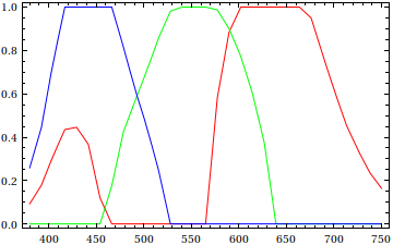
Plot[{ColorData["VisibleSpectrum"][x][[1]],
      ColorData["VisibleSpectrum"][x][[2]],
      ColorData["VisibleSpectrum"][x][[3]]}, {x, 380, 750}, PlotStyle -> {Red, Green, Blue}]

RGB components of visible spectrum

It doesn't seem that you'll be able to obtain Yellow (RGBColor[1, 1, 0]) from ColorData["VisibleSpectrum"]; unfortunately, the docs say nothing about how they're blending the colors to produce "VisibleSpectrum".


Addendum:

Just to make this post less useless, here's a Mathematica implementation of Bruton's conversion algorithm:

brutonIntensity = Interpolation[{{380, 3/10}, {420, 1}, {700, 1}, {780, 3/10}},
                                InterpolationOrder -> 1];

brutonLambda[x_, γ_: 4/5] := Map[N[brutonIntensity[x] #]^γ &, 
    Blend[{{0, Magenta}, {3/20, Blue}, {11/40, Cyan}, {13/40, Green}, {1/2, Yellow},
           {53/80, Red}, {1, Red}}, Rescale[x, {380, 780}]]] /;
    380 <= x <= 780 && 0 < γ <= 1

Here's a gradient plot:

gradient plot for Bruton's scheme

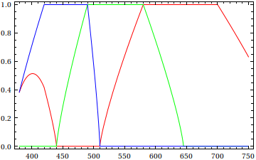
and an RGB component plot:

RGB components for Bruton's scheme

For converting wavelengths to CIE xyz coordinates, see this thread; the current version of Mathematica now has built-in (but undocumented) functionality for the CIE CMFs. Alternatively, I also posted serviceable approximations of the CMFs as well in there.

$\endgroup$
15
  • 3
    $\begingroup$ What others think that should look like: Approximate RGB values for Visible Wavelengths. Their code allows for RGBColor[1, 1, 0]. $\endgroup$
    – sebhofer
    Commented Oct 3, 2012 at 16:16
  • $\begingroup$ @seb, translating the FORTRAN code to Mathematica would be quite the project... :) $\endgroup$ Commented Oct 3, 2012 at 16:23
  • 2
    $\begingroup$ No, it's really quite easy if you look at this SO question :) It just boils down to defining a piecewise function. I was tempted to do it but I'm quite busy atm. $\endgroup$
    – sebhofer
    Commented Oct 3, 2012 at 16:33
  • $\begingroup$ @J.M. having had experience in translating FORTRAN to Mathematica, it isn't bad. All the constructs are present, including Label and Goto; it just takes a little time. Even better: that code is pretty clean, the code I translated was far from it. $\endgroup$
    – rcollyer
    Commented Oct 3, 2012 at 16:39
  • 2
    $\begingroup$ Or more compactly: ListLinePlot[{ColorData["VisibleSpectrum"][#] /. RGBColor -> Sequence} & /@ Range[380, 750] // Transpose, PlotStyle -> {Red, Green, Blue}] $\endgroup$
    – rm -rf
    Commented Oct 3, 2012 at 21:58
21
+100
$\begingroup$

Update

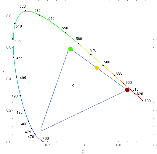
Mathematica 10 introduced ChromaticityPlot which provides internal evidence of a discrepancy. Consider:

ChromaticityPlot[
 {"RGB", ColorData["VisibleSpectrum"] /@ {570, 600, 700}}, 
 Appearance -> {"VisibleSpectrum", "Wavelengths" -> True},
 BaseStyle -> PointSize[0.03]
]

enter image description here

Clearly the three values are offset from the labeled wavelengths along the perimeter. The position of ColorData["VisibleSpectrum"][700] can be explained by the fact that gamut is compressed. Based on the positioning I propose that the other values along that edge were offset by a similar degree resulting in the distortion of color that is the topic of discussion.

If you would to use the data embedded in ChromaticityPlot in place of ColorData["VisibleSpectrum"] please see:


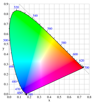
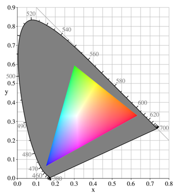
That's a good question. There does seem to be a considerable discrepancy versus the 1931 CIE diagram:

GraphicsGrid @ List @ Table[
   Graphics @ {ColorData["VisibleSpectrum"][i], Disk[], White, Text[i]},
   {i, 380, 700, 10}
]

Mathematica graphics

enter image description here

Perhaps there was a miscalculation made in reducing the very large CIE color space values to sRGB triplets? sRGB, the standard display space, is the inset triangle below:

enter image description here

$\endgroup$
6
  • $\begingroup$ I was about to ask you if you created the diagrams yourself... than I took a look at wikipedia :) $\endgroup$
    – sebhofer
    Commented Oct 3, 2012 at 14:54
  • $\begingroup$ @sebhofer No, I'm not that knowledgeable in the subject. $\endgroup$
    – Mr.Wizard
    Commented Oct 3, 2012 at 14:55
  • 1
    $\begingroup$ @seb: it should not be too hard to reproduce these diagrams in Mathematica, tho. :) $\endgroup$ Commented Oct 3, 2012 at 15:38
  • 1
    $\begingroup$ @J.M. the tricky part is the tick marks along the surface of the region. $\endgroup$
    – rcollyer
    Commented Oct 3, 2012 at 15:56
  • $\begingroup$ @J.M. I suspected that much but I was to timid to ask for it directly ;) $\endgroup$
    – sebhofer
    Commented Oct 3, 2012 at 15:59
17
$\begingroup$

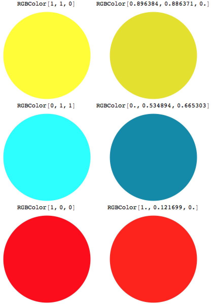
I just had a look at the colours as they are produced on my screen. I have been working with lasers for many (30+) years and can assure you that a 591nm laser line is fairly yellow, around 635nm is fairly red and 488nm appears as cyan, which resembles the colours of the disks well. Are you sure you are not confusing the wavelength of the maximum of black body radiation and its apparent colour with that of single lines? A perfect match of the numbers is not required but their ratios should be close.

With[{colors = {
    {Yellow, ColorData["VisibleSpectrum"][591]}, 
    {Cyan, ColorData["VisibleSpectrum"][488]}, 
    {Red, ColorData["VisibleSpectrum"][635]}}
    },
    ({#, Graphics[{#, Disk[]}] & /@ #} & /@ colors)~Flatten~1 // Grid
]

enter image description here

$\endgroup$
6
  • 4
    $\begingroup$ “which resembles the colours of the disks well” — looking at your examples, I would actually say it does not match well at all. $\endgroup$
    – F'x
    Commented Oct 6, 2012 at 13:35
  • 1
    $\begingroup$ I agree with you; the 488 and 635nm images definitely look quite close to correct. What laser operates at 591nm? I've never used a yellow laser myself except as a by-product (idler wave of an OPO) of producing light around 430nm. $\endgroup$ Commented Oct 8, 2012 at 9:24
  • 2
    $\begingroup$ @F'x the proper comparison is not with the approximate descriptions but with the laser lines themselves. I'm pretty sure Ernst just included the discs on the LHS for the benefit of people who don't often work with lasers. $\endgroup$ Commented Oct 8, 2012 at 9:28
  • 4
    $\begingroup$ Of course it is only a proper comparison with a laser if the monitor is properly calibrated. For example, if his monitor is set to a lower colour temperature than 6500K, then a colour given in sRGB will look more "red shifted". However, I've now looked in the Mathematica documentation what RGB model Mathematica uses, and it doesn't seem to say anywhere; it's actually just an assumption that it uses sRGB. Of course, the exact RGB values corresponding to frequencies depend on the exact RGB model used. If it is really not documented, the RGB values for a given frequency are not well defined. $\endgroup$
    – celtschk
    Commented Oct 8, 2012 at 12:26
  • 1
    $\begingroup$ Following CIE's stuff, normalized RGB values of your 591nm laser, at gamma 2.4 are: R = 255 G = -10 B = -139 but you say it's fairly yellow, I assume your M & L cones get saturated with photons... $\endgroup$ Commented Aug 11, 2013 at 20:38
17
$\begingroup$

This is a bug (or an imperfection) of ColorData["VisibleSpectrum"].

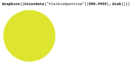
Others have delved into its root, but in my answer I simply will make it clear by a comparison with an experimental, known single wavelength color[1]: sodium’s D-line at 589.0 nm.

Here is Mathematica’s idea of the color of this wavelength, using default settings (no color profile conversion applied, default MMA settings on my MacBook Pro, Mac OS X 10.8.2):

enter image description here

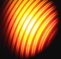
Anyone who has observed the sodium D-line during as a student will know that it doesn't have that greenish hue seen above. Now, here are spectroscopic observations of this same color, for those who have never seen it:

In conclusion: sure, color conversions are tricky… but here, Mathematica is well outside the margin of error :)


[1] Well, almost single color… the two lines are not that far apart.

$\endgroup$
7
  • $\begingroup$ Nice! Did you take those interferograms yourself? $\endgroup$ Commented Oct 6, 2012 at 13:53
  • $\begingroup$ @J.M. no, I did not (links are given in my answer)… I have set up these two types of interferometers in the past, but I never took pictures. Also, once you have the Michelson set up, it is much more beautiful to gaze at white light fringes than monochrome ones :) $\endgroup$
    – F'x
    Commented Oct 6, 2012 at 13:58
  • 1
    $\begingroup$ Perhaps I'm missing your point, but comparison with digital photographs made using the Na D-line is not going to give meaningful results; one should compare instead with actual sodium light. I tend to agree with Ernst; Mathematica's idea of what 514 or 532nm radiation look like is quite close to what they really do look like from a laser (less saturated in the former case, admittedly, but the sRGB color space is missing a huge chunk in this region, so that's not too surprising). $\endgroup$ Commented Oct 8, 2012 at 9:11
  • 1
    $\begingroup$ @OleksandrR. I agree: the physical observation with one's eyes are the point I am trying to make, and digital photographs are only here to help as a comparison. But, I can tell from experience that the sodium D-line is not greenish at all, and very unlike Mathematica’s appearance on my screen. The images are much closer, proving that (for this particular wavelength), it's not so much a limitation of the sRGB color space. $\endgroup$
    – F'x
    Commented Oct 8, 2012 at 9:25
  • 1
    $\begingroup$ Human perception of yellowish colors changes quite strongly with intensity, and sodium lights are typically quite bright. I agree that there is no green tinge to the Na D-line, but I'm not sure that Mathematica's representation of it looks all that greenish either. So far I'm not convinced as far as the yellow goes, but the other colors seem okay. $\endgroup$ Commented Oct 8, 2012 at 9:37
15
$\begingroup$

One hypothesis:

If mathematica's using this set of formulae to convert from XYZ to RGB:

//This is coming from www.easyrgb.com

var_X = X / 100        //X from 0 to  95.047      (Observer = 2°, Illuminant = D65)
var_Y = Y / 100        //Y from 0 to 100.000
var_Z = Z / 100        //Z from 0 to 108.883

var_R = var_X *  3.2406 + var_Y * -1.5372 + var_Z * -0.4986
var_G = var_X * -0.9689 + var_Y *  1.8758 + var_Z *  0.0415
var_B = var_X *  0.0557 + var_Y * -0.2040 + var_Z *  1.0570

if ( var_R > 0.0031308 ) var_R = 1.055 * ( var_R ^ ( 1 / 2.4 ) ) - 0.055
else                     var_R = 12.92 * var_R
if ( var_G > 0.0031308 ) var_G = 1.055 * ( var_G ^ ( 1 / 2.4 ) ) - 0.055
else                     var_G = 12.92 * var_G
if ( var_B > 0.0031308 ) var_B = 1.055 * ( var_B ^ ( 1 / 2.4 ) ) - 0.055
else                     var_B = 12.92 * var_B

R = var_R * 255
G = var_G * 255
B = var_B * 255 

AND, if their algorithm tries to normalize the result to have the highest R or G or B value to be equal to 255

AND, if any RGB value below 0 is simply ignored and set to 0

THEN, 570 nm having the CIE xy coordinates:

x = 0.4441
y = 0.5547

Should give, after following these rules, the XYZ values:

X = 72.77  // this is proportionnal to Y
Y = 90.89  // this is to give the value 255 to the G value
Z = 0.2    // this is proportionnal to Y (and extremely low!)

These values give the following rounded RGB values at gamma = 2.4

R = 230
G = 255
B = - 471

Of course, if you cut the - 471 and replace it with 0, that makes quite a difference, let's see what CIE L*a*b* basic delta E color difference formulae will say (the delta E is just the Cartesian distance between 2 points in the CIE L*a*b* colorspace)

We call C the original conversion an C' the 'minus-cut' value

C    L*= 96.367
     a*= -26.924
     b*= 163.337

C'   L*= 95.305
     a*= -31.712
     b*= 92.307

The delta E is:

D = sqrt((96.367-95.305)^2+(-26.924+31.712)^2+(163.337-92.307)^2)

D = -71.199   (!!!!)

Knowing that a delta E superior to 1~2 is supposed to be perceptible, we see that here the color difference is supposed to be HUGE

One can argue that a color difference formula applied in this context might not be appropriated, and be right thinking so, but it is still a good illustration of what cutting negative values will produce...

Strangely, the software from EasyRGB is giving the following values, which are more yellowish:

R = 250.46
G = 255
B = 0

Couldn't find why...

**

EDIT:

Anyway,

Never forget that fact that it is simply impossible to display any spectral color on a screen!

Spectral colors in RGB will produce Red/Green/Blue values above 255 or below 0, When it's RED = 380 or -600, the difference between what's displayed and what it should be is SIGNIFICANT.

A better way I know to render the color spectra on a computer screen is to compute a mixture of white light + spectral colors, like this guy Nick Spiker did:
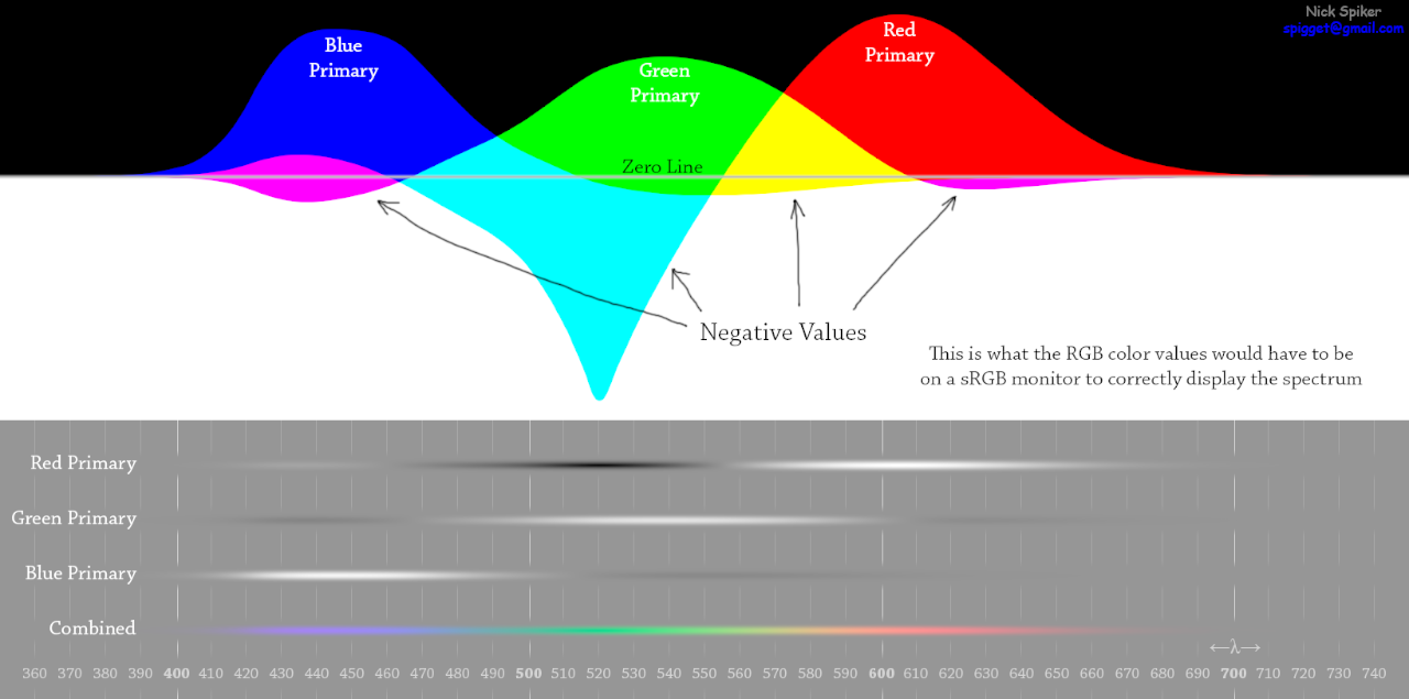
spectra avg with white light

The principle is: white light is added until the negative values become positive or 0 and until the RGB values are below or equal to 255

This rendering gives you a visual result which is close to what spectral lights viewed in daylight conditions look like, and it is more exact than anything else I.M.Opinion.

EDIT 2 Example:

You can download Mr Pointer's material-colors gamut data here: http://www.cis.rit.edu/mcsl/online/cie.php

This database is my source for the CIE x,y coordinates of the spctral colors at a resolution of 1 nm (the spectrum locus)

The most simple way to render spectra + white light at the maximal saturation (or highest chroma) level is pick a white light (either illuminant D75, D65, D50, or C, or anything else you have at your disposal...)

I take D65, which has normalized CIE XYZ coordinates:

X = 95.047
Y = 100
Z = 108.883

Then I take all the xy coordinates of the spectrum locus and I transform them in normalized XYZ with the Y value given by the Y colorimetric function multiplied by the D65 curve (so this is the D65 spectrum), and normalized at: Ymax = Y 555nm = 100

Finally, I average the two values (XYZ D65)*a and (XYZ locus)*b, with a, b being weighted such as the RGB conversion of the result will have: min R or/and min G or/and min B = 0 and max R or/and max G or/and max B = 255

That's the basic idea
$\endgroup$
7
  • $\begingroup$ Why did you delete your other answer? (I have not voted for or against either of them; I'm just starting to look.) $\endgroup$
    – Mr.Wizard
    Commented Aug 12, 2013 at 12:29
  • $\begingroup$ @ Mr.Wizard Well, the other answer was out of line since I started from the hypothesis that it wasn't a bug, before figuring out it should be one... I will update this answer with relevant information from the other, best. $\endgroup$ Commented Aug 12, 2013 at 15:22
  • 2
    $\begingroup$ It's polite to include a link to the source that you took the image from: repairfaq.org/sam/repspec $\endgroup$
    – user484
    Commented Aug 12, 2013 at 16:19
  • $\begingroup$ I didn't follow the "A better way I know to render the color spectra on a computer screen is ..." part. Are you planning to give an example of that rendering? $\endgroup$
    – Mr.Wizard
    Commented Aug 12, 2013 at 22:13
  • $\begingroup$ @Rahul I added that link; thanks. $\endgroup$
    – Mr.Wizard
    Commented Aug 12, 2013 at 22:16
12
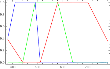
$\begingroup$

The code in the article linked by Alexey produces something similar to this (gradient plot inspired by J.M.'s comment) :

rgb enter image description here

Note though that the description of the code does not seem consistent too me, so I had to change it in some places to get this result. Still I hope that I transcribed it more or less correctly. (I wouldn't use this for scientific purposes though!)

The code that creates the above figure is given below.

rgbSpec[x_] := 
RGBColor@@Piecewise[{
 {{19/100 + 19/3000 (410 - x), 0, 1 - 6/300 (410 - x)}, 380 <= x < 410}, 
 {{19/3000 (440 - x), 0, 1}, 410 <= x < 440},
 {{0, 1 - (490 - x)/50, 1}, 440 <= x < 490},
 {{0, 1, (510 - x)/20}, 490 <= x < 510},
 {{1 - (580 - x)/70, 1, 0},510 <= x < 580},
 {{1, (640 - x)/60, 0}, 580 <= x < 640},
 {{1, 0, 0}, 640 <= x < 700},
 {{35/100 + 65/8000 (780 - x), 0, 0}, 700 <= x <= 780}}]

(*rgb components*)
Plot[{rgbSpec[x][[1]], rgbSpec[x][[2]], rgbSpec[x][[3]]}, {x,380,780}, PlotStyle -> {Red, Green, Blue}, PlotRange -> All, Frame -> True]

(*gradient plot*)
DensityPlot[x, {x, 380, 780}, {y, 0, 1}, ColorFunction -> (rgbSpec[#] &), ColorFunctionScaling -> False,AspectRatio -> 1/10, FrameTicks -> {{None, None}, {Automatic, None}},Frame -> Automatic, PlotRangePadding -> None]

(If someone actually bothers to check, feel free to correct any mistakes!)

$\endgroup$
4
  • 5
    $\begingroup$ Here's a compact version: rgbSpec[x_] := Blend[{{0, RGBColor[19/50, 0, 2/5]}, {3/40, RGBColor[19/100, 0, 1]}, {3/20, Blue}, {11/40, Cyan}, {13/40, Green}, {1/2, Yellow}, {13/20, Red}, {4/5, Red}, {1, RGBColor[7/20, 0, 0]}}, Rescale[x, {380, 780}]]. Here is a gradient plot of the proposed color scheme. $\endgroup$ Commented Oct 5, 2012 at 11:37
  • 1
    $\begingroup$ +1 but please include the code that produces the plot shown, just for completeness. $\endgroup$
    – Mr.Wizard
    Commented Oct 5, 2012 at 11:37
  • 1
    $\begingroup$ @Mr.Wizard sorry for that... edited $\endgroup$
    – sebhofer
    Commented Oct 5, 2012 at 12:10
  • $\begingroup$ @J.M. definitely a nicer way to do it! $\endgroup$
    – sebhofer
    Commented Oct 5, 2012 at 12:10

Your Answer

By clicking “Post Your Answer”, you agree to our terms of service and acknowledge you have read our privacy policy.

Not the answer you're looking for? Browse other questions tagged or ask your own question.