2
$\begingroup$

I am making some density and contour plots in Mathematica. These plots have very high peaks which saturate with color and prevent me from seeing differences in the peaks. Is there a way I can tone down the color scale so my peaks are not just white blobs?

Trying other color schemes has not worked out, and playing with the range of color data has not been very useful. Is there some way to have the colors on a log scale???

Here is my code.

ListDensityPlot[photo, PlotLegends -> Automatic, Frame -> {True}, 
FrameLabel -> {"Electron Bunch Energy (MeV)", "Photon Energy (keV)", 
"", "Yield (Photons/Sr e-KeV)" }, LabelStyle -> {15}, 
InterpolationOrder -> 10]
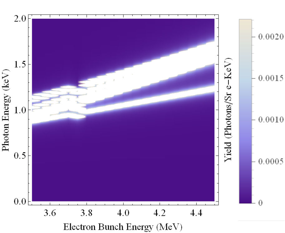
enter image description here

Cheers, Ben

$\endgroup$
9
  • 1
    $\begingroup$ Have you tried ColorFunctionScaling -> False ? $\endgroup$
    – Artes
    Commented Aug 22, 2013 at 21:58
  • 2
    $\begingroup$ How about plotting Log[photo] instead? $\endgroup$
    – user484
    Commented Aug 22, 2013 at 21:59
  • 1
    $\begingroup$ Welcome, Ben. I have added your image. I would be very helpful if you could include the photo data or something smaller that is representative. $\endgroup$
    – Mr.Wizard
    Commented Aug 22, 2013 at 22:11
  • $\begingroup$ photo is a table of data with 3 columns, taking log[photo] does not work well, but maybe if I could just take the log of the third column. Any thought on how to do this? (I am very new to mathematica) $\endgroup$ Commented Aug 22, 2013 at 22:18
  • 1
    $\begingroup$ {#, #2, Log@#3} & @@@ data or MapAt[Log, data, {All, 3}] $\endgroup$
    – Kuba
    Commented Aug 22, 2013 at 22:37

3 Answers 3

5
$\begingroup$

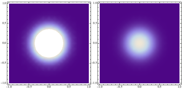
It's difficult to help without photo data, but I'm almost sure that PlotRange can solve your problem. Try to control Z coordinate in PlotRange as in this example, to find a better range to your plot.

pSaturated=DensityPlot[Exp[-10(x^2+y^2)],{x,-1,1},{y,-1,1},ImageSize->400];
pOK=DensityPlot[Exp[-10(x^2+y^2)],{x,-1,1},{y,-1,1},PlotRange->{All,All,{0,1}},ImageSize->400];
Row[{pSaturated,pOK}]

enter image description here

$\endgroup$
5
  • $\begingroup$ This is very helpful but by limiting my plotting range I would be losing information. But, I appreciate the thought! $\endgroup$ Commented Aug 22, 2013 at 23:05
  • 1
    $\begingroup$ You are not limiting you are extending for beyond the saturation zone. :) $\endgroup$
    – Murta
    Commented Aug 22, 2013 at 23:24
  • $\begingroup$ This worked out very well, I was able to make some excellent plots! Any thoughts on how to get rid of the the discontinuous nature and extrapolate the plot? $\endgroup$ Commented Aug 23, 2013 at 2:47
  • $\begingroup$ I'm glad that it has helped you! Maybe in PlotRange->{All,All,{0,1}} you can make it more generic using PlotRange->{All,All,{0,Max[photo[[All,3]]]}}. $\endgroup$
    – Murta
    Commented Aug 23, 2013 at 3:05
  • $\begingroup$ As @Kuba suggests PlotRange->All is much more elegant. See if it works for you. There are some cases that it's necessary to specify manually. $\endgroup$
    – Murta
    Commented Aug 23, 2013 at 14:21
1
$\begingroup$

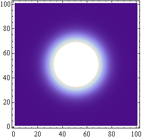
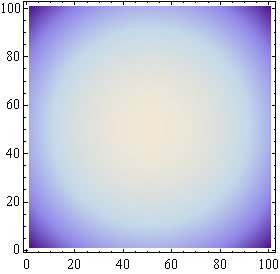
Borrowing Murta's data we can also try out Rahul Narain's Log recommendation:

data = Table[Exp[-10 (x^2 + y^2)], {x, -1, 1, 0.02}, {y, -1, 1, 0.02}];

ListDensityPlot[data]

ListDensityPlot[Log @ data]

enter image description here enter image description here

If your data is in the (x,y,z) form you will need something like {#, #2, Log@#3} & @@@ data as Kuba comments above.

$\endgroup$
1
$\begingroup$

Sorry for the delay but I had net gap.

I wanted to write that sometimes Mathematica is doing things we are not expecting in order to do them fast for example.

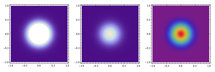
It seems in this case default ColorFunctionScalling is not so bad, it's just the issue of not all is plotted.

Sometimes it is also useful to choose more colorful palette:

data = Table[{x, y, 10^6 Exp[-10 (x^2 + y^2)]}, {x, -1, 1, 0.02}, {y, -1, 1, 0.02}
            ] // Flatten[#, 1] &;

SetOptions[ListDensityPlot, ImageSize -> 250]

GraphicsRow[{
   ListDensityPlot[data],
   ListDensityPlot[data, PlotRange -> All],
   ListDensityPlot[data, PlotRange -> All, ColorFunction -> "Rainbow"]
   }]

So basicaly it is what @Murta showed but without checking the range.

enter image description here

$\endgroup$

Your Answer

By clicking “Post Your Answer”, you agree to our terms of service and acknowledge you have read our privacy policy.

Not the answer you're looking for? Browse other questions tagged or ask your own question.