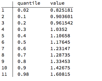
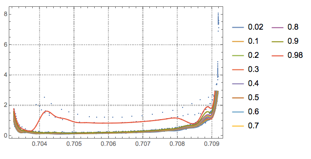
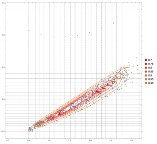
I have a function that generates a set of 2D points that form a curve when interpolated. The arguments that this function uses are subject to uncertainties, and I've run a couple of Monte Carlo simulations to propagate uncertainties - this gives me a list of such sets of 2D points, each set of points forming a curve.
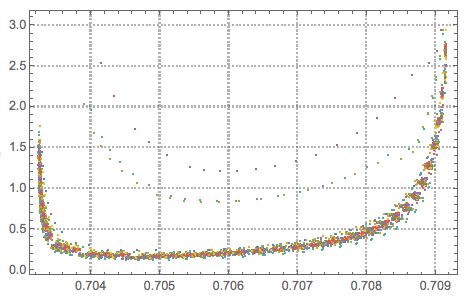
An example data set with 100 simulations is available here. I can display all of these curves using
ListLinePlot[output]
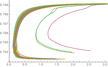
Now I want to plot a confidence region from these curves. Normally, I use quantiles to estimate the confidence intervals if I use Monte Carlo simulations - but this won't work if the output are curves, as here.
The best idea I came up with so far is just filtering the "outliers" (should be easy enough) and plotting the remaining curves with relatively thick lines in the same color using ListLinePlot as above, so that they form a solid black region... Obviously, this is not ideal and only a rough estimate for the confidence region.
I also tried SmoothDensityHistogram with various settings on the flattened-out list of points - but this doesn't work very well because the points in the curve are not very evenly spread, and because of the varying "thickness" of the confidence region.
Does anyone have a better idea?
(I realize that this could also be a question for https://stats.stackexchange.com/, but I'm mainly interested on how to calculate & display this in Mathematica, so I thought it might be better here?)
EDIT:
Anton Antonov's answer - transposing the data and then using a quantile regression - works fine in this case. However, the function generating the output can generate curves/paths with more complex shapes, so that even transposing the data does not help, and the curve still can't be approximated by a function as x=f(x).
In the original post, I didn't mention that the data set contains another variable for each data point - so let's say every data point is composed of {a,b,c} (the original data linked above only contains b and c). Plotting a vs. b and a vs. c can always be approximated by a function, b=f(a) and c=f(a), and I want to plot b vs. c.
So I could, in a first step, calculate confidence intervals for b and c as functions of a. How this is done in detail, or what statistical model is used, is not the purpose of this question... For example, let's take another set of curves, which now includes the values for a as well (first element of the data points). Using, for example, the QuantileRegression package from Anton Antonov:
<< QuantileRegression`;
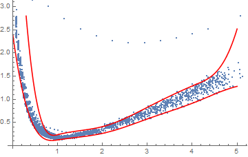
Qfunsx = QuantileRegression[output2[[All, {1, 2}]], 5, {0.025, 1 - 0.025}];
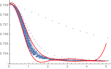
Qfunsy = QuantileRegression[output2[[All, {1, 3}]], 5, {0.005, 1 - 0.025}];

Show[
  ListPlot[output2[[All,{1,2}]]],
  Plot[Evaluate[#[x]&/@Qfunsx],{x,0,5},PlotStyle->Red]
]
For a vs. b:
And similarly for a vs. c:
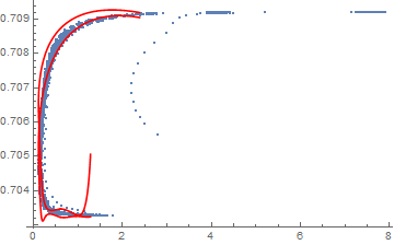
This leaves the problem of how to plot these quantiles in a plot of b vs. c (in the case where they cannot be estimated directly by transposing the data). I tried using ParametricPlot - but this doesn't help as simply plotting something like this:
Show[
ListPlot[output2[[All,{2,3}]],PlotRange->All],
ParametricPlot[{{Qfunsx[[1]][i],Qfunsy[[1]][i]},{Qfunsx[[1]][i],Qfunsy[[2]][i]}},{i,0,5},PlotStyle->Red]
]
does not show the correct confidence region. Maybe generating a set of ellipses based on Qfunsx & Qfunsy for a range of a and plotting these would help - but I could imagine there are better ways to do this?
EDIT 2: Some information on the function generating the output (cf. comment by Chris Baldwin).
The first variable in the output2 (the one ranging from ~ 0 to 5) could, in a first step, be approximated as a predictor variable - but this is not completely true I think: The function I use to generate the output uses two steps:
First, the upper limit (lower limit is always 0) for this "predictor variable" is calculated based on a set of independent variables which are themselves subject to uncertainties/random variation.
The second step involves integrating a differential process, dependent on this variable (& involving other parameters, also subject to uncertainties). I do this iteratively, using a certain number of steps, which generate the individual points of the curves. The step size (and therefore also the number of steps) is adjusted according to the changes in the dependent variables. This is similar to solving a set of differential equations using NDSolve, which would give an InterpolationFunction - but I do this manually (mainly because the functions involved in the equations are relatively complex & call an external program - so not sure how well NDSolve would handle this, but maybe this would be better?).
So the number of steps, as well as the individual values & the upper limit of the "predictor variable" is not completely constant.

