I stumbled upon this problem when I was trying to make some nice smooth ListDensityPlots of my numerical data. In short, my problem is that I let Mathematica plot two copies of basically the exact same data points, however, only one half of the plot looks smooth (which is actually the copied half of my data).
To be more concrete, I'll give an example where the same problem occurs. Suppose I have the a table of datapoints, which looks as follows:
Table1=Table[{x, y, 0}, {x, 0, 1, 1/10}, {y, 0, 1, 1/10}] //
Flatten[#, 1] &;
Table2 = Select[Table1, #[[1]] != #[[2]] &];
data=Join[Table2, Table[{x, x, 1}, {x, 0, 1, 1/10}]];
Then I can make a ListDensityPlot with
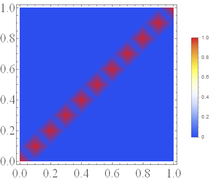
ListDensityPlot[data, ColorFunction -> "TemperatureMap", PlotLegends -> Automatic]
which gives
This does not look so smooth because the lack of data points, but that's not the problem. Now, I know that my data should be symmetric, so I create a table which gives the same $z$ values for negative values of $x$:
data2 = SortBy[Join[Table[{data[[i]][[1]], data[[i]][[2]], data[[i]][[3]]},
{i, 1, Length[data]}], Table[{-data[[i]][[1]], data[[i]][[2]], data[[i]][[3]]},
{i, 1, Length[data]}]], {First, #[[2]]} &];
So basically, I just made a copy of my data, but reflected in the $y$-axis. However, if I now make a ListDensityPlot with
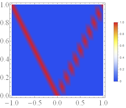
ListDensityPlot[data2, ColorFunction -> "TemperatureMap", PlotLegends -> Automatic]
it looks like this:
Somehow, the copied half of the data looks much smoother than the original data! Why?
To be specific, I have the following questions about this:
- Why is the left half of the second plot smooth, in contrast to the right part?
- Is there a way to make both parts as smooth as the left half is now? I tried InterpolationOrder, which didn't work.
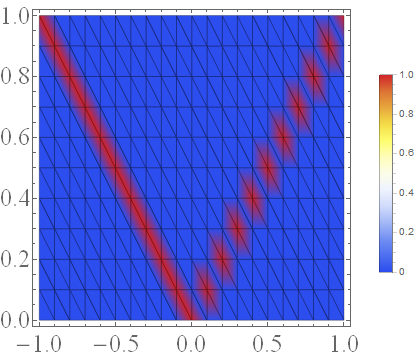
What I further noticed is that when I define data2 as above, but without the SortBy command, the left part does not become smooth. Furthermore, when I add the command Mesh -> All to the second plot, I obtain this:
It seems as if the left half is smooth because there are diagonal lines going to the upper left rather than the upper right. I have no idea what these lines mean and why they are there though! However, I think if I might be able to solve my problem if I could make these lines go to the upper right and define data2 without SortBy...
I hope anyone can shed some light on this and explain me why Mathematica plots my data in this way. Thanks in advance.
EDIT: oneEDIT:
One solution I found is taking the data from only the left part in the second figure, reflect this to the right part WITHOUT using SortBy and plotting it. Somehow the diagonal Mesh lines are reflected as well then. I have no idea why though, and why Mathematica seems to pick this preferred direction for interpolating in the first place.


