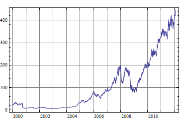
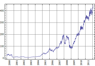
This is the obvious solution, but it requires a lot of fussing with the details. I hope that you can use my code as a starting point. I am explicitly using years as the basic unit, so the code I give only works well if the data spans several years.
aapl = FinancialData["AAPL", {2000}];

(* extract start and end years  *)
{startYear, endYear} = aapl[[{1, -1}, 1, 1]]

(* these are tick mark and grid line locations *)
marks = Range[startYear, endYear];

(* these are label locations (all on Jun 15);
   I only show every second year for lack of space,
   change it to fit your needs *)
labels = Table[{{year, 6, 15}, year, 0}, {year, startYear, endYear, 2}];

DateListPlot[aapl, Joined -> True,
 GridLines -> {List /@ marks, Automatic},
 FrameTicks -> {
   Join[labels, {{#, 1, 1}, Null} & /@ marks],
   Automatic,
   {{#, 1, 1}, Null} & /@ marks,
   Automatic}]

You can consider rotated labels for better space usage:
labels = Table[{{year, 6, 15}, Rotate[year, 90 Degree], 0},
            {year, startYear, endYear}];

