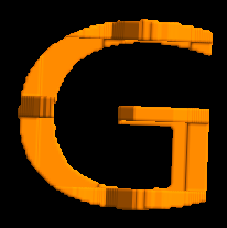
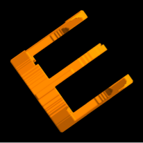
The reason the B appears incorrectly is not because of the shape of G, but rather because the horizontal length of G is less than the vertical length of B, resulting in B being decapitated. Here's how the letters look at present when one is laid on top of the other at 90º:

Notice that in the actual GEB logo, they use a squarish font, which solves this problem. So a possible solution, in the absence of a square font, is to set the aspect ratio of each of the letter shapes to 1, so that they sit well with each other.
Here is a solution that uses Vitaliy's solution for extracting the outlines from letters.
letter[s_String] := ImageData@ Binarize@Graphics[{EdgeForm[None], FaceForm[Black],
     First[First[ImportString[ExportString[Style[s, FontSize -> 24], "PDF"],
        "PDF", "TextMode" -> "Outlines"]]]}, AspectRatio -> 1, ImageSize -> 100]
Now you can see that the shapes now line up correctly:

Proceeding with your RegionPlot3D code, but with slight modifications,
{g, e, b} = letter /@ {"G", "E", "B"};
RegionPlot3D[
 g[[Round[i], Round[j]]] == 0 && e[[Round[i], Round[k]]] == 0 &&
  b[[Round[j], Round[k]]] == 0, {i, 1, 100}, {j, 1, 100}, {k, 1, 100}]
we get a nice and pretty GEB logo that reproduces the B and all the other letters correctly.


