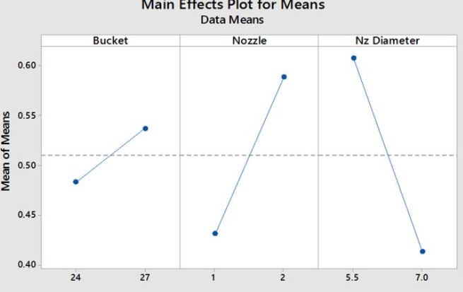
I'm trying to make a "main effect" type chart but I haven't found a way to do it in Mathematica. The main effect plots are the graphs plotting the means for each value of a categorical variable, ploted side by side. Example as follows.
Dataset: Bucket = {{24, 48}, {28, 53}}
Nozzle = {{1, 42}, {2, 58}}
NzD = {{5.5, 61}, {7, 41}}

