1
$\begingroup$

I am trying to use Mathematica to plot a surface chart similar to the ones that are created from Microsoft Excel. The point is to be able to easily colorize and manipulate the plot by free 3D rotation, so to choose the best angle to present the data (ideally fitting it to a function). The data comes from an XLSX file which contains data labels in the first row and the first column, for a 6 by 50 matrix of data points, presented as percentages.

So far I managed to import and plot the data into a notepad by:

data = Import[
   "Activ.xlsx"][[1]]
dims = Dimensions[data]
axisx = Transpose[data][[1]][[2 ;; dims[[1]]]]
axisy = data[[1]][[2 ;; dims[[2]]]]
plotdata = Take[data, -dims[[1]] + 1, -dims[[2]] + 1];
ListPlot3D[plotdata, InterpolationOrder -> 3, 
 DataRange -> {{First[axisx], Last[axisx]}, {First[axisy], 
    Last[axisy]}, Automatic}, MeshStyle -> Opacity[0.4], 
 InterpolationOrder -> 3, ColorFunction -> "Rainbow"]

But when plotting, the Range is invalid and the axis labels (which are categorical, non-numerical) are not shown. I assume that data range in the table needs to be Flattened, Selected or somehow parsed (perhaps with HeaderLines) before plotting it, since when trying ListPlot3D one gets an array error.

Optionally after that, the surface could be ideally fitted to a bivariate function, and both plotted on top of one another with a 50% transparency.

So the basic procedure would be to:

  • a) Import data from Excel with column labels for plotting purposes
  • b) Convert the data into an array
  • c) Perform the 3D plotting
  • d) Assign labels
  • e) -Optional- Fit data to bivariate function
  • f) -Optional- Plot both surfaces (date and fitted function)

Can anyone help in finishing this? Thanks

UPDATE:

It's almost done but not really there: Still getting some wrong labels and overlapping. Also I had to manually edit some labels because for some unknown reason these were not shown (maybe using 'ñ' or because of spacing). Here's the code:

data = Import[
   "C:\\path\\Activ.xlsx"][[1]]
dims = Dimensions[data]
Out[]={6, 54}

axisx = Transpose[data][[1]][[2 ;; dims[[1]]]]
{"    De 16 a 24 años", "    De 25 a 34 años", "    De 35 a 44 años", \
"    De 45 a 54 años", "    De 55 y más años"}

axisy = data[[1]][[2 ;; dims[[2]]]]
Out[]={"2002TI", "2002TII", "2002TIII", "2002TIV", "2003TI", "2003TII", \
"2003TIII", "2003TIV", "2004TI", "2004TII", "2004TIII", "2004TIV", \
"2005TI", "2005TII", "2005TIII", "2005TIV", "2006TI", "2006TII", \
"2006TIII", "2006TIV", "2007TI", "2007TII", "2007TIII", "2007TIV", \
"2008TI", "2008TII", "2008TIII", "2008TIV", "2009TI", "2009TII", \
"2009TIII", "2009TIV", "2010TI", "2010TII", "2010TIII", "2010TIV", \
"2011TI", "2011TII", "2011TIII", "2011TIV", "2012TI", "2012TII", \
"2012TIII", "2012TIV", "2013TI", "2013TII", "2013TIII", "2013TIV", \
"2014TI", "2014TII", "2014T3", "2014T4", "2015T1"}

Flatten@Table[
  ToString@year <> "Q1" <> ToString@quarter, {year, 2002, 2015, 
   1}]; firstquarters = Transpose@{Range[1, 4 Length@%, 4], %}

Table[ToString@n <> "-" <> ToString@(n + 9), {n, 15, 45, 10}]~
  Join~{"55+"};
agegroups = Transpose@{Range[Length@%], %}

plotdata = Take[data, -dims[[1]] + 1, -dims[[2]] + 1];

And here comes the (styled) plot:

ListPlot3D[plotdata, 
 PlotStyle -> Directive[GrayLevel[0], Opacity[0.75]], 
 Mesh -> Automatic, MeshFunctions -> Automatic,
 InterpolationOrder -> Automatic, AspectRatio -> .5, 
 ImageSize -> Full, PlotRangePadding -> 0,
 PlotRange -> {Automatic, Automatic, {0, 100}}, 
 Ticks -> {firstquarters, 
   agegroups, {{0, "0%"}, {20, "20%"}, {40, "40%"}, {60, "60%"}, {80, 
     "80%"}, {100, "100%"}}, Automatic, Axis -> True, 
   FrameTicks -> All, FaceGrids -> All}, 
 TicksStyle -> {Directive[Smaller], Automatic, Automatic}, 
 MeshStyle -> Automatic, ColorFunction -> "Rainbow", 
 AxesLabel -> {"\nAños 2002-2015", "\nFranja de edad", 
   Rotate[Text[Style["Cuantía\n", 14]], \[Pi]/2]}, 
 Lighting -> {{"Ambient", White}}, 
 PlotLabel -> Framed@"Actividad laboral (España)"]

ListPlot3D: Actividad laboral en España

$\endgroup$
5
  • $\begingroup$ Could you post the data itself, a representative subset, or a link to the data file? It is hard to guess what might have gone wrong without knowing the structure of the data file. $\endgroup$
    – MarcoB
    Commented May 4, 2015 at 15:59
  • $\begingroup$ DataRange expects numerical parameters, but you mentioned that your data labels in your first row and column are categorical. You should look into using Ticks instead, which allows you to specify the position of tick marks, and a text label for each mark as well. $\endgroup$
    – MarcoB
    Commented May 4, 2015 at 16:40
  • $\begingroup$ Alright, I gave it a shot in an answer below. Let me know if that is what you were after. $\endgroup$
    – MarcoB
    Commented May 4, 2015 at 17:30
  • $\begingroup$ This question has been updated. $\endgroup$ Commented May 7, 2015 at 15:28
  • $\begingroup$ Alfonso, what steps are you seeking help with? You may want to consider writing up another question, starting from where you are already and stating what problems you are encountering and what you are seeking help with. This might generate more interest from other contributors as well. I don't know that I could help much with the fitting without access to your dataset or a similar mockup. For the labels in your plot, I wonder if you could make them shorter to minimize overlap: maybe something like 02T4 instead of 2002TIV. For the special characters, you could try to enter it as \[NTilde]. $\endgroup$
    – MarcoB
    Commented May 7, 2015 at 17:09

1 Answer 1

3
$\begingroup$

Since you did not include your data, I am generating some fake data to play with:

fakedata =
  Transpose@
   Insert[
    Transpose@
     Insert[
      RandomReal[{0, 1}, {6, 50}],
      Array["y lbl " <> ToString@# &, 50],
      1
      ],
    {""}~Join~Array["x lbl " <> ToString@# &, 6],
    1
   ];

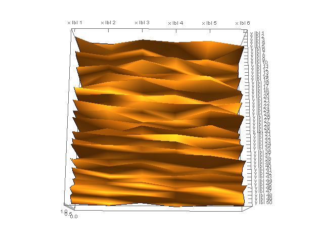
The code first generates a 6-row by 50-column array of random real numbers in the $(0,1)$ interval, to look like your percentages. It then generates a list of text labels for both the $x$ and $y$ direction, and appends them to the numerical dataset. The final array has 7 rows x 51 columns. The first row contains $y$ labels; the first column contains $x$ labels.

In order to have those labels used as tick marks in your 3D plot, I use the Ticks option, whose documentation is linked. As you can see in the docs, we need to generate a list of tick specifications such as { {numerical position of tick, "tick label"}, ...}. This is what the following expressions accomplish:

xticks = MapThread[
           ({#1, #2} &),
           {Range@Length@fakedata[[1, 2 ;;]], fakedata[[1, 2 ;;]]}
         ];

yticks = MapThread[
           ({#1, #2} &), 
           {Range@Length@fakedata[[2 ;;, 1]], fakedata[[2 ;;, 1]]}
         ];

Now we are ready to plot the data. In passing, you ask for a contour plot in your question, but from the linked questions and my general understanding of what you are asking, I don't think you actually want a contour plot: you just want a plain 3D plot.

ListPlot3D[
  fakedata[[2 ;;, 2 ;;]], 
  Ticks -> {xticks, yticks, Automatic}, 
  Mesh -> None
]

Mathematica graphics

One last comment: the 50 labels for the $y$ direction are very crowded in this presentation. You might want to consider either selecting a few of those only, or changing the AspectRatio of the plot to elongate it along that direction to have more space.

UPDATE:

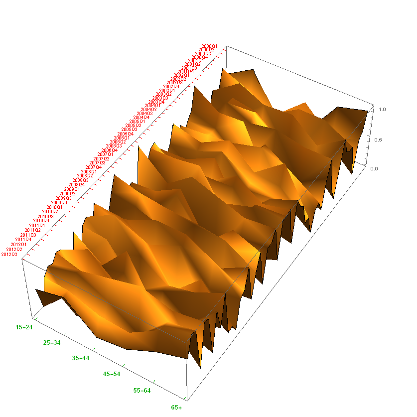
The OP mentioned that the "long" dimension is a list of yearly quarters, the "short" dimension is a list of age groups. That can be incorporated as well:

Flatten@Table[
   ToString@year <> "Q" <> ToString@quarter,
   {year, 2000, 2014, 1}, {quarter, 1, 4, 1}
];
quarters = Transpose@{Range[Length@%], %}

Table[ToString@n <> "-" <> ToString@(n + 9), {n, 15, 55, 10}]~Join~{"65+"};
agegroups = Transpose@{Range[Length@%], %}


ListPlot3D[fakedata[[2 ;;, 2 ;;]],
 Ticks -> {quarters, agegroups, Automatic},
 TicksStyle -> {
   Directive[Small, Red],
   Directive[Medium, Bold, Darker@Green],
   Automatic
 },
 Mesh -> None, BoxRatios -> {4, 2, 1}, ImageSize -> Full
]

3D plot with new tick definitions specified by OP

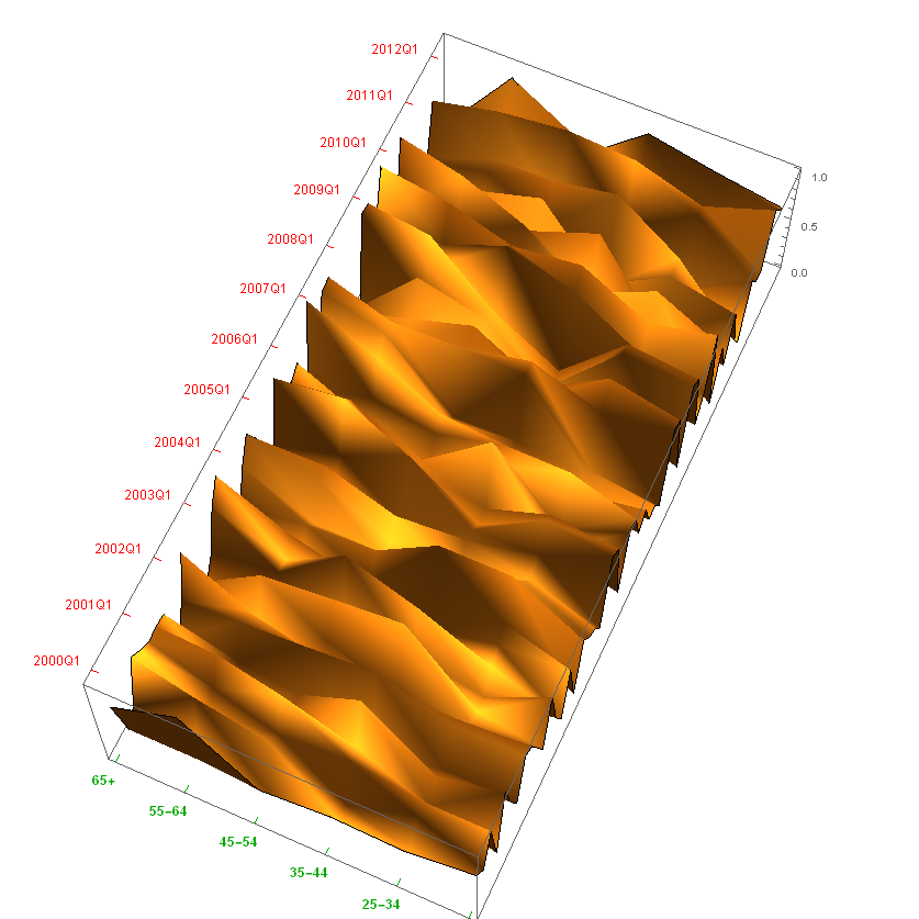
In order to de-clutter the long axis, OP asked to skip 3 out of 4 ticks for that axis, so we will generate a tick mark only for the first quarter of each year:

Flatten@Table[ToString@year <> "Q1", {year, 2000, 2014, 1}]; firstquarters = Transpose@{Range[1, 4 Length@%, 4], %};

Using firstquarters instead of quarters in the Ticks option of the ListPlot3D expression already given above yields: ticks every 1st quarter

$\endgroup$
6
  • $\begingroup$ Thank you very much. The labels are: age groups for the shorter axis, and yearlyquarters (2015Q1-like) for the longer one. $\endgroup$ Commented May 4, 2015 at 18:52
  • $\begingroup$ Any hints on: - fitting? - plotting two surfaces on the same chart? - Skipping 3 out of every 4 labels for the longer axis? $\endgroup$ Commented May 4, 2015 at 19:02
  • $\begingroup$ @AlfonsoFR I've introduced the new tick marks, and the skipping. Plotting two surfaces uses the exact same syntax: just include a list of two datasets as the first argument of ListPlot3D[ {firstdataset, seconddataset}, options ...]. I can't help you with fitting unless you tell us quite a bit more about your data. $\endgroup$
    – MarcoB
    Commented May 4, 2015 at 20:09
  • $\begingroup$ The data comes from three series for Activity, Occupation and Unemployment in Spain. The point is to reveal distortions, in particular the gap for the so-called "lost generation", approximately between age groups 24 (now finishing studies) and 40 (born before democracy, who lived the compulsory military service). But it has some other application as well. Your help was really thorough and is much appreciated @MarcoB. $\endgroup$ Commented May 5, 2015 at 8:53
  • $\begingroup$ @AlfonsoFR I'm afraid that your code didn't come through in the comment. Maybe you could add it in an "Update" section to your original question. $\endgroup$
    – MarcoB
    Commented May 6, 2015 at 16:49

Your Answer

By clicking “Post Your Answer”, you agree to our terms of service and acknowledge you have read our privacy policy.

Not the answer you're looking for? Browse other questions tagged or ask your own question.