6
$\begingroup$

I often have the situation where I'll use Manipulate[] to compare and examine 2 or more lists. A simplified example follows:

list1 = NestList[3 # (1.25 - #) &, .1, 20];
list2 = NestList[3 # (1.3 - #) &, .1, 20];

Manipulate[
 Column[{
   ListLinePlot[list1[[windowStart ;; windowEnd]], ImageSize -> 350],
   ListLinePlot[list2[[windowStart ;; windowEnd]], ImageSize -> 350]}
  ], {windowStart, 1, Length[list1] - 1, 1}, {windowEnd, 2, 
  Length[list1], 1}]

Manipulate

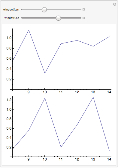
The 2 controls provide me a simple window on the data that lets me zoom in and out. This works great, but a couple of enhancements would make it much more useful.

If you play with the "window" sizing you'll note that the x axis of each plot resets whenever you move either control, so that it only ranges over the number of data points immediately displayed instead of the positions of the data values in the original list.

Does a simple way (or anyway) exist to display the original positions on the x axis? This would prove very useful when I look for anomalies in list calculations on very long lists.

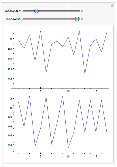
Secondly, as sometimes I have half a dozen lists to compare at a time, can anyone suggest a way to place a crosshair over the entire column of list plots that would do two things:

  • Allow me to readily compare corresponding values in different lists
  • Display the position of values from the original list.

Something like this (ok, this doesn't have positions, but you get the idea):
Manipulate2

Maybe a nested Manipulate[] might get me there? Just looking for some strategies to do this.

$\endgroup$

4 Answers 4

7
$\begingroup$

You may find a suggestion or two of interest in what follows (although it's not exactly what you asked for):

list1 = NestList[3 # (1.25 - #) &, .1, 20];
list2 = NestList[3 # (1.3 - #) &, .1, 20];
list3 = NestList[3 # (1.275 - #) &, .1, 20];

Manipulate[Grid[{{
   If[lists != {}, ListLinePlot[
  Tooltip@#[[windowStart ;; windowEnd]] & /@ (lists /. {1 -> 
       list1, 2 -> list2, 3 -> list3}), ImageSize -> 350, 
  AxesLabel -> {"element", None}, PlotMarkers -> Automatic,
  GridLines -> {{n}, None},
  GridLinesStyle -> Directive[Blue, Thickness[.007], Dashed]]],
  Grid[Prepend[(lists /. {1 -> {1, list1[[n]]}, 
     2 -> {2, list2[[n]]}, 3 -> {3, list3[[n]]}}), {"list", 
   "element " <> ToString[n + windowStart - 1]}], Frame -> All]
  } }],
 {{windowStart, 1, "start element"}, 1, windowEnd - 1, 1},
 {{windowEnd, Length[list1], "end element"}, 2, Length[list1], 1},
 {{n, 5, "current element"}, 1, Length[list1], 1},
 {{lists, {1}}, {1, 2, 3}, CheckboxBar}]

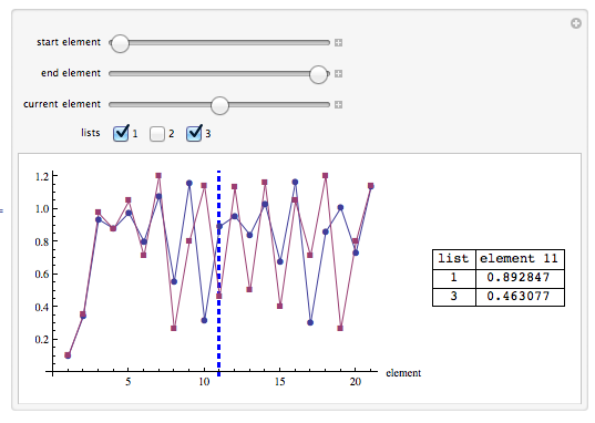
plots 2

  1. I superimposed the graphs to save space. There are 3 lists in the present example. Two are selected and displayed.
  2. You can select those lists you want to compare at any given moment.
  3. A current element slider highlights the element that you are comparing at the moment.
  4. A table of values shows the current value for each selected list
  5. Tooltips can be read off by mousing over the line graph markers.
  6. windowStart has a maximum value of the current value of windowEnd

Edit: Multiple plots

Alternatively, you may include multiple plots in a pane:

list1 = NestList[3 # (1.25 - #) &, .1, 20];
list2 = NestList[3 # (1.3 - #) &, .1, 20];
list3 = NestList[3 # (1.275 - #) &, .1, 20];

Manipulate[
 Pane[
  Grid[{{
   Column[If[lists != {}, ListLinePlot[
      Tooltip@#[[2]][[windowStart ;; windowEnd]], 
      ImageSize -> {350, 200}, AxesLabel -> {"element", None}, 
      PlotMarkers -> Automatic,
      PlotLabel -> "List " <> ToString[#[[1]]],
      GridLines -> {{n}, None},

      GridLinesStyle -> 
       Directive[Blue, Thickness[.007], 
        Dashed]] & /@ (lists /. {1 -> {1, list1}, 2 -> {2, list2},
        3 -> {3, list3}})
   ]],
 Grid[
  Prepend[(lists /. {1 -> {1, list1[[n]]}, 2 -> {2, list2[[n]]}, 
      3 -> {3, list3[[n + windowStart - 1]]}}), {"list", 
    "element " <> ToString[n]}], Frame -> All]
 } }], {500, 450}, Scrollbars -> {False, True}],
{{windowStart, 1, "start element"}, 1, windowEnd - 1, 1},
{{windowEnd, Length[list1], "end element"}, 2, Length[list1], 1},
{{n, 5, "current element"}, 1, Length[list1], 1},
{{lists, {1}}, {1, 2, 3}, CheckboxBar}]
$\endgroup$
6
  • $\begingroup$ By the way, I assumed that the lists would always be the same size. Otherwise it made no sense (to me) to be comparing elements at the same place in the lists. $\endgroup$
    – DavidC
    Commented Apr 24, 2012 at 18:54
  • $\begingroup$ @David_Carraher -- You assume correctly. Great solution! I think I can adapt it to a column of charts (which works better for my purposes) by giving each a grid line and having all of them driven by the same "current element" control. I still want to figure out a way to display the absolute position from the original lists of the "current element". That will help me zero in on things that may go wrong in the series of calculations that produce the different lists. A suggestion or two! I could spend a week deconstructing and reapplying the interesting constructs in your code. Thx! $\endgroup$
    – Jagra
    Commented Apr 24, 2012 at 19:13
  • $\begingroup$ @Jagra You should be able to use multiple plots as you intend, possibly by placing a column in a Pane with a vertical scrollbar. Could you explain what you mean by "display the absolute position"? $\endgroup$
    – DavidC
    Commented Apr 24, 2012 at 19:50
  • $\begingroup$ Take a list: {7,6,8,9,3,4,2}. I think of the absolute position of 9 in the list as 4, it being the 4th element in the list. Regardless of how I display the lists I always want to know the absolute position of an element relative to the original list. That way if I need to check a series of calculations at position 3127 I can easily retrieve the specific data and set up a unit test. $\endgroup$
    – Jagra
    Commented Apr 24, 2012 at 19:56
  • $\begingroup$ @Jagra I fixed the element number. Also, I included a paned version with multiple plots. $\endgroup$
    – DavidC
    Commented Apr 24, 2012 at 20:18
3
$\begingroup$

You can use DataRange to get the numbers on the $x$-axis to correspond to the indices in the list, e.g.

list1 = NestList[3 # (1.25 - #) &, .1, 20];
list2 = NestList[3 # (1.3 - #) &, .1, 20];

Manipulate[
 Column[{ListLinePlot[list1[[windowStart ;; windowEnd]], ImageSize -> 350,
    DataRange -> {windowStart, windowEnd}],
   ListLinePlot[list2[[windowStart ;; windowEnd]], ImageSize -> 350,
    DataRange -> {windowStart, windowEnd}]}], 
  {windowStart, 1, Length[list1] - 1, 1}, {windowEnd, 2, Length[list1], 1}]

Mathematica graphics

$\endgroup$
1
$\begingroup$

I don't know about the cross-hairs, but for keeping the original x-axis plots handy, you will need to define a PlotRange for both ListPlots:

Manipulate[
 Column[{ListLinePlot[list1[[windowStart ;; windowEnd]], 
    ImageSize -> 350, PlotRange -> {{0, Length@list1}, Automatic}], 
   ListLinePlot[list2[[windowStart ;; windowEnd]], ImageSize -> 350, 
    PlotRange -> {{0, Length@list1}, Automatic}]}], {windowStart, 1, 
  Length[list1] - 1, 1}, {windowEnd, 2, Length[list1], 1}]

You can also define a specific y range by replacing the Automatic with a defined number pair, perhaps something like {Min[{Min@list1,Min@list2}],Max[{Max@list1,Max@list2}]} or similar.

$\endgroup$
2
  • $\begingroup$ Thanks for the input. Your solution gets me thinking, but doesn't get me all that I need. Moving just your 2nd control shows fewer data points on the same background (PlotRange). The x axis does correspond to the original positions in the list, but the solution doesn't enable one to zoom in on the data (display fewer data points across the full width of the plot). Moving just the 1st control to the left changes where the displayed series begin, no zoom and it loses the correspondence of the x axis to the original list positions. Still a mystery to solve, thanks again. $\endgroup$
    – Jagra
    Commented Apr 24, 2012 at 18:47
  • $\begingroup$ @Jagra Hmmm, I didn't think of moving the beginning point (I only played around with the ending point). But for the ending point, I guess I misunderstood what you were asking for with the zoom vs. keeping original x-axis :) $\endgroup$
    – tkott
    Commented Apr 24, 2012 at 19:12
0
$\begingroup$

I've already accepted an answer to this question (and I got good ones, from which to choose), but I came across a useful little application that addresses one of the issues, I originally raised.

A description from its website:

xScope is eight tools in one that will help any designer or developer do their job faster and produce more accurate results.

Created for designers and developers by The Iconfactory & ARTIS Software, xScope is a powerful set of tools that are ideal for measuring, aligning and inspecting on-screen graphics and layouts. Quickly available via the Mac OS X menu bar, xScope's flexible tools float above desktop windows and UI elements making measuring a breeze.

[XScope][1]

Note: I have no interest or affiliation with the company that makes this.

I like its crosshairs tool. Clicking it displays a horizontal and vertical crosshair which stretches across your entire display with your cursor at the center of the cross hairs. This makes it very easy to align anything on your display and for my specific purposes makes a simple way to readily check x and y coordinates of columns or rows of plots to compare data points without programming variable grid lines.

$29 - better if one could get it for free - but I've found it so useful over the past week, I thought others here might want to know about it.

$\endgroup$

Your Answer

By clicking “Post Your Answer”, you agree to our terms of service and acknowledge you have read our privacy policy.

Not the answer you're looking for? Browse other questions tagged or ask your own question.