32
$\begingroup$

Consider the following typical interactive sequence. First I produce a ListPlot:

enter image description here

OK, not bad, but I want those dots to be bigger, and also joined. First, I make the dots bigger, like this:

enter image description here

Good. Next, to join the dots, I do this:
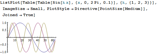
enter image description here

Aaaarrrrrgh! The dots disappeared! Why??? Don't they know anything about usability at WRI?

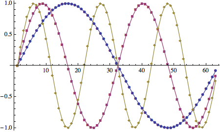
I have tried to achieve the desired effect in a bazillion ways, and they all fail for one reason or another: either the dots no longer look like dots (but rather like diamonds, squares, triangles), or they are no longer the same color as the lines joining them, or something else...

So my question is: how can I achieve the simple effect of several plots of (distinctly visible) dots joined by lines, and each plot of a different, but uniform, color?

I also have a meta-question: The frustration illustrated by the interaction above is entirely typical of my experience with Mathematica, since day 1. I used to think that the reason why I had such difficulty getting the simplest things done with Mathematica was that I just didn't know it well enough... But this problem has persisted over the years, with hardly any improvement, even though I've devoted considerable effort to learning more and more about Mathematica. I have been using Mathematica now for about 20 years (!), and I still struggle for hours at a time with trivialities like this one. This makes me wonder whether these difficulties are really more a reflection with a fundamental flaw in some aspect of Mathematica's design (one that somehow makes conceptually simple things turn out to be disproportionately difficult). Sure, when one is starting out with some new software simple things may take a long time to accomplish, but Mathematica is the only software that I've been using for more than, say 4-5 years, and that I still have to struggle with for hours to get simple things to work (and very often I just have to give up with)...

$\endgroup$
4
  • 1
    $\begingroup$ About your meta-question, there was identical discussion here about something similar but I cand find it. There was no conclusion :) Some find those issues "features" the others "bugs". I believe the oryginal discussion was about not plotting automatically alle the values for given domain. $\endgroup$
    – Kuba
    Commented Sep 7, 2013 at 22:59
  • 5
    $\begingroup$ I would be surprised if anyone found the fact that Joined -> True, Mesh -> All draws every point in blue instead of the corresponding line's colour to be a "feature" and not a "bug". $\endgroup$
    – user484
    Commented Sep 8, 2013 at 0:02
  • 1
    $\begingroup$ @RahulNarain In this case I would call it bug, but it is not always so obvious, there are many different "features" out there :). $\endgroup$
    – Kuba
    Commented Sep 8, 2013 at 0:10
  • 2
    $\begingroup$ fyi, can also use the new command ListLinePlot for this. No difference for this case. ListLinePlot[data, ImageSize -> 700, PlotMarkers -> {Automatic, 12}] !Mathematica graphics $\endgroup$
    – Nasser
    Commented Sep 8, 2013 at 2:16

5 Answers 5

43
$\begingroup$

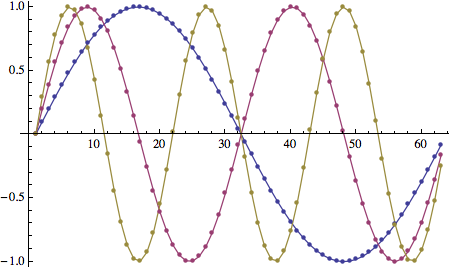
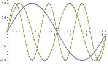
The PlotMarkers option is designed to handle this problem. Here are two very simple ways to do it using that option.

data = Table[Table[Sin[k x], {x, 0, 2 Pi, 0.1}], {k, {1, 2, 3}}];

ListPlot[data,
  Joined -> True,
  PlotMarkers -> {Automatic, 7}]

plot.1

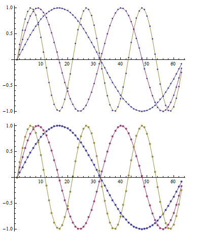
The above solution has a drawback: there can be a slight misalignment of the markers, because they're rendered as text. See this question for a detailed discussion.

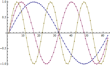
ListPlot[data,
  Joined -> True,
  PlotMarkers -> Graphics@{Disk[{0, 0}, [email protected]]}]

plot.2

Note: it might seem that wrapping Disk with List is unnecessary, but that is not the case. Without the wrapper, the points will alll be black. See this question for more detail.

$\endgroup$
0
13
$\begingroup$

This is a duplicate but I can't find it, meanwhile:

ListPlot[Table[Table[Sin[k x], {x, 0, 2 Pi, 0.1}], {k, {1, 2, 3}}], 
         PlotStyle -> [email protected], Joined -> True
        ] /.  Line[x_, y___] :> {Point[x], Line[x, y]}

enter image description here

$\endgroup$
2
  • $\begingroup$ Thanks! Once again, I feel some remorse after choosing one of two excellent answers... $\endgroup$
    – kjo
    Commented Sep 8, 2013 at 2:00
  • 1
    $\begingroup$ @kjo I think you have chosen well, I would accept m_goldberg's solution too. Modifying PlotMarkes is neatter then postprocessing :) $\endgroup$
    – Kuba
    Commented Sep 8, 2013 at 7:43
10
$\begingroup$

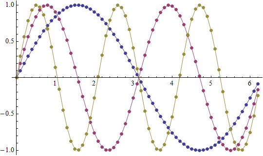
Here is a low-level solution for this problem which guarantees exact positioning of graphics primitives:

data = Table[Table[{x, Sin[k x]}, {x, 0, 2 Pi, 0.1}], {k, 3}];

Graphics[MapIndexed[{ColorData[1]@@ #2, Line@#1, PointSize[Medium], Point@#1} &, data], 
 Axes -> True, AspectRatio -> 1/GoldenRatio]

plot

$\endgroup$
1
  • $\begingroup$ Very simple, and very cool! $\endgroup$
    – kjo
    Commented Sep 8, 2013 at 12:46
8
$\begingroup$

Quick-and-dirty:

data = Table[Table[{x, Sin[k x]}, {x, 0, 2 Pi, 0.1}], {k, 3}];
Show[
 ListPlot[data, Joined -> True (* add other options here *)],
 ListPlot[data, PlotStyle -> PointSize[Medium]]]

Mathematica graphics

Setting the colors of the dots independently is easy:

Show[
 ListPlot[data, Joined -> True (* add other options here *)],
 ListPlot[data, PlotStyle -> Directive[{PointSize[Medium], Gray}]]]

Mathematica graphics

$\endgroup$
1
  • $\begingroup$ Definitely the best solution. It has no issue of misalignment as in the top answer. $\endgroup$
    – Doris
    Commented Jul 6 at 22:21
6
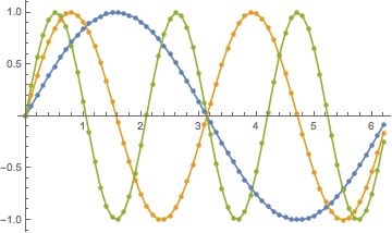
$\begingroup$
data = Table[Sin[k x], {k, 3}, {x, 0, 2 Pi, 0.1}];
ListLinePlot[data,  Mesh -> All]

MapThread[
  ListLinePlot[#, Mesh -> All, PlotStyle -> {[email protected], #2}] &,
   {data, ColorData[1, "ColorList"]~Take~3}] // Show

enter image description here

$\endgroup$
4
  • $\begingroup$ +1 for finally correcting that nested Table thing! $\endgroup$
    – Mr.Wizard
    Commented Sep 8, 2013 at 7:07
  • $\begingroup$ @Mr.Wizard: I had not noticed that until reading your comment. FWIW, the original was cut-and-pasted directly from the Options>PlotStyle section of the documentation page for ListPlot... $\endgroup$
    – kjo
    Commented Sep 8, 2013 at 12:41
  • $\begingroup$ @kjo Sorry if I offended you; I did not mean to. Rather, I couldn't believe that nobody before chyanog bothered to give the cleaner code for that. Unfortunately the documentation examples are not always written in the best style IMO. $\endgroup$
    – Mr.Wizard
    Commented Sep 8, 2013 at 14:02
  • $\begingroup$ @Mr.Wizard: oh, I took no offense at all, so no worries. My comment was posted more as a curiosity than as anything else, and for those who, like me, may need to be reminded not to take the docs as holy scripture... :) $\endgroup$
    – kjo
    Commented Sep 8, 2013 at 14:10

Your Answer

By clicking “Post Your Answer”, you agree to our terms of service and acknowledge you have read our privacy policy.

Not the answer you're looking for? Browse other questions tagged or ask your own question.