2
$\begingroup$

I am using version 8 and I have the following code:

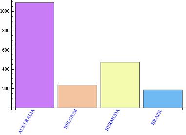
totals4 = {{1093, "AUSTRALIA"}, {235, "BELGIUM"}, {474, "BERMUDA"}, {187, "BRAZIL"}};
BarChart[#, ChartStyle -> "Pastel", 
         ChartLabels -> (Placed[Rotate[Style[#, Blue], Pi/3] & /@ #2, {{.5, 0}, {1, 1}}])
         ] & @@ Transpose[totals4]

Is there a way to get the labels to be the same color as their respective bar?

Thank you in advance.

bar chart

$\endgroup$
6
  • $\begingroup$ Where is totals4? $\endgroup$ Commented Jun 4, 2013 at 1:02
  • $\begingroup$ totals4 has this data: {{1093, "AUSTRALIA"}, {235, "BELGIUM"}, {474, "BERMUDA"}, {187, "BRAZIL"}} $\endgroup$
    – sente
    Commented Jun 4, 2013 at 1:39
  • $\begingroup$ At this point I'd like to register a small protest on behalf of people with less than perfect eyesight who will find rotated pastel-colored text difficult to read. Why not make the labels simple, straight, and readable, rather than 'interesting'?! OK, protest over... :) $\endgroup$
    – cormullion
    Commented Jun 4, 2013 at 6:58
  • $\begingroup$ If it helps, the chart will be going on a website with a gray background. $\endgroup$
    – sente
    Commented Jun 4, 2013 at 9:39
  • 1
    $\begingroup$ @sente Nooooooo!!!!!! :) well, ok, but run it through the accessibility checker first. Or read web pages that suck... :) $\endgroup$
    – cormullion
    Commented Jun 4, 2013 at 16:14

3 Answers 3

7
$\begingroup$

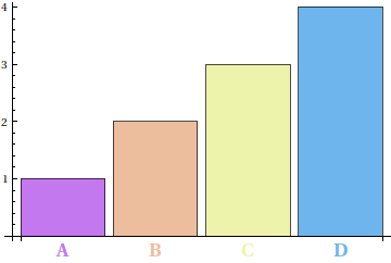
I guess something like this:

BarChart[Range[4], ChartStyle -> "Pastel", ChartLabels ->
         MapIndexed[Style[#1, ColorData["Pastel", Rescale[#2[[1]], {1, 4}]], Bold, 16] &,
                    CharacterRange["A", "D"]]]

bar chart with colored labels

Since ColorData["Pastel"] only supports arguments in the interval $[0,1]$, a rescaling is necessary; ponder for instance on the result of Rescale[Range[4], {1, 4}].

$\endgroup$
7
  • $\begingroup$ The name of the countries will change depending upon the query. Is it possible to not hard code it? In other words Australia is Purple and Belgium would be Orange and so on. If it is not possible with labels is it possible with legends? $\endgroup$
    – sente
    Commented Jun 4, 2013 at 1:44
  • $\begingroup$ Well, some legwork from you, first: did you already manage to produce a bar chart with the bars colored the way you want them? (That is, data for Australia is purple, etc.) $\endgroup$ Commented Jun 4, 2013 at 1:46
  • $\begingroup$ Well the query that generated the data was this one: totals4 = SQLExecute[conn, " SELECT t2.cnt, t2.description FROM name_loc t1 INNER JOIN ( SELECT COUNT() 'cnt', f.fk_cnty_id 'fk_cnty_id', c.description \ 'description' FROM name_loc f INNER JOIN countries c ON f.fk_cnty_id = c.id and c.letter_code <> 'US' INNER JOIN identifiers i ON f.fk_ident_id = i.id GROUP BY f.fk_cnty_id HAVING COUNT()>100 ) as t2 ON t1.fk_cnty_id = t2.fk_cnty_id GROUP BY t1.fk_cnty_id limit 4 "] $\endgroup$
    – sente
    Commented Jun 4, 2013 at 2:13
  • $\begingroup$ The exact color for the country does not matter. Usually there are thirty countries in the chart, that is why hard coding it is not an option. Basically I want to take whatever color Mathematica assigns to a particular bar and then use the same color in the label. If this is possible it would be great. $\endgroup$
    – sente
    Commented Jun 4, 2013 at 2:17
  • $\begingroup$ Well, all you really need is the length of your list of countries, or whatever. At the bare minimum, you can do With[{n = Length[countries]}, BarChart[data, ChartStyle -> "Pastel", ChartLabels -> MapIndexed[Style[#1, ColorData["Pastel", Rescale[#2[[1]], {1, n}]]] &, countries]]]. I gather it was not immediately apparent to you that the Range[4] and CharacterRange["A", "D"] were replaceable with your data; you did after all not initially mention the data you're working with. $\endgroup$ Commented Jun 4, 2013 at 2:25
1
$\begingroup$

For Version 7

In version 7 the underlying Graphics expression that is produced by BarChart is highly conducive to a post-processing approach.

  • Each bar and label is contained in an expression that also includes style information.

  • The label however has an additional Style wrapper to effectively reset the color.

  • To style the bars and labels similarly we need only to remove this undesired re-styling.

This can be accomplished with the following replacement rule:

 Style[obj_, {GrayLevel[0]}] :> obj

Complete:

totals4 = {{1093, "AUSTRALIA"}, {235, "BELGIUM"}, {474, "BERMUDA"}, {187, "BRAZIL"}};

BarChart[#, ChartStyle -> "Pastel", 
    ChartLabels -> (Placed[Rotate[#, Pi/3] & /@ #2, {{.5, 0}, {1, 1}}])] & @@ 
  Transpose[totals4] /. Style[obj_, {GrayLevel[0]}] :> obj
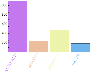
enter image description here

The rule may need to be made more specific if you have other objects with an explicit style of {GrayLevel[0]} in the chart. An example of a more restrictive pattern that might be needed is:

Text[Style[obj_, {GrayLevel[0]}], pos__] :> Text[obj, pos]
$\endgroup$
4
  • $\begingroup$ Maybe one could also suggest using a background that has better contrast with the pastels... Perhaps just use Framed on the labels and insert a background color there. Anyway, nice observation of the inner structure. $\endgroup$
    – Jens
    Commented Jun 4, 2013 at 4:20
  • $\begingroup$ @Jens can you confirm that this works on versions other than 7? $\endgroup$
    – Mr.Wizard
    Commented Jun 4, 2013 at 4:22
  • $\begingroup$ Oh wait, it doesn't work on version 8. I forgot your version 7 comment... Maybe wrap the labels in Tooltip and use a pattern based on that. I may give it a shot. $\endgroup$
    – Jens
    Commented Jun 4, 2013 at 4:24
  • 1
    $\begingroup$ Unfortunately, in version 8, the text labels are no longer grouped in the same list as the bar they belong to. So the solution by that new guy @0x4A4D may be the best bet. $\endgroup$
    – Jens
    Commented Jun 4, 2013 at 4:29
0
$\begingroup$

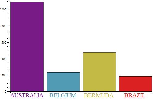
You can also inject the labels with the same color as the associated bar using a custom ChartElementFunction:

ClearAll[ceFX]
ceFX[cedf_: "Rectangle", style_: (FontSize -> Scaled[.04])] := 
 ({ChartElementData[cedf][##], 
  Text[Style[#3[[1]], style], Offset[{0, -2}, {Mean[#[[1]]], 0}], {0, 1}, {1, 0}]} &)

Examples:

BarChart[# -> #2 & @@@ totals4, ChartStyle -> "Rainbow", ChartElementFunction -> ceFX[]]

enter image description here

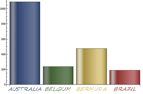
BarChart[# -> #2 & @@@ totals4, ChartStyle -> "DarkRainbow", 
 ChartElementFunction -> ceFX["GlassRectangle", Directive[Bold, Italic, FontSize -> 20, 
    FontFamily -> "Segoe Script"]]]

enter image description here

$\endgroup$

Your Answer

By clicking “Post Your Answer”, you agree to our terms of service and acknowledge you have read our privacy policy.

Not the answer you're looking for? Browse other questions tagged or ask your own question.