17
$\begingroup$

The following problem is one that may have showed up to you while plotting a large data collection. Suppose you have a data set of say 1 million points. ListLinePlot will use all of those points to create your plot. Unfortunately, if the points are so close together they will overlap in the plot and they become irrelevant.

I was wondering if there is some quick way in Mathematica to get rid of the redundancies in the plots. The term redundancies depends of course of the image resolution (size).

Let us work with the following example

rx[n_] := Accumulate[Prepend[RandomVariate[ExponentialDistribution[1000], n], 0]]
ry[n_] := Accumulate[Prepend[RandomVariate[NormalDistribution[0, .001], n], 0]]
x = rx[100000];
y = ry[100000];
ListLinePlot[Table[{x[[i]], y[[i]]}, {i, Length[x]} ]]

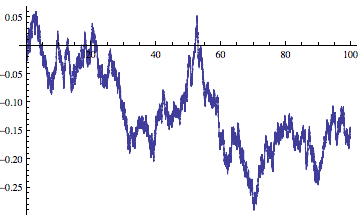
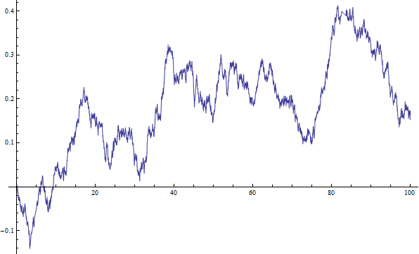
Here is one of the many possible plots generated by the above
random sample

This plot was generated with 100,000 points and some of them may not even be visible since other points overlap part of the point. The question is, is there some built in function that gives us a way to remove the redundancies and thus reducing the size of the figure?

I should be more precise. If this plot is to be exported as a raster plot (jpeg, png) then there is no problem. The problem arises if we export it as a pdf or eps. The resulting vector format will have to plot all of those points and it will take a while to display it when in reality we only have a few points to display.

The very naive way I did before was to remove some points from my initial data, as follows:

ListLinePlot[Table[{x[[i]], y[[i]]}, {i, 1, Length[x], 100}]]
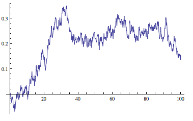
figure 2

And you can imagine what will happen if I skip 1000 points at a time

ListLinePlot[Table[{x[[i]], y[[i]]}, {i, 1, Length[x], 1000}]]
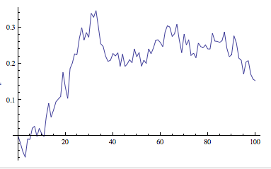
figure 3

Possible Solution 1

The first idea that came to my mind was to loop over my data and see if the points are close to each other, if they are sufficiently close (we can use a parameter to decide this) then we remove one of them.

This solution will remove points from our initial data set but we want to make it so that we do not remove important features of the plot as I did with the 3rd plot.

Possible Solution 2

The other solution was to export/rasterize the final figure I wanted (only the lines in the plot, this excludes the axes or any other objects). Once this is done then we outline the plot and make a vector figure of it again.

Keep in mind that we are trying to reduce the size of points that are being plotted while making the plot resemble what Mathematica plotted very naively.

Any ideas of how to implement any of the ideas above or an even better one to achieve the desired result?

$\endgroup$
5
  • 1
    $\begingroup$ I think about this kind of data compression problem a lot. It forces one to ask some interesting questions. What features of the data do you want to preserve? What features of the data don't matter? What features only describe noise? What features of the data to you regard as actual information? If you just want the data's general trend a moving average will do as @kale suggests, but a moving average will clip your extrema. If you want to capture extrema, than an iterative compression algorithm might make the most sense. Give it some thought, let us know. I may have something for you. $\endgroup$
    – Jagra
    Commented Apr 2, 2013 at 20:23
  • $\begingroup$ @Jagra, This is indeed a compression problem. I am trying Kale's solution on the actual data that I have but it is not having the results I was expecting. Could you perhaps show how an iterative compression algorithm work with the example provided? In this case all we want to have is a good looking picture (vector graphics) but without all that overlapping produced by plotting points that are close to each other. Oh, imagine a outlining a font. We have the figure, I just want to rasterize it and outline it. $\endgroup$
    – jmlopez
    Commented Apr 2, 2013 at 20:45
  • 3
    $\begingroup$ A standard approach for simplifying a polygonal curve while losing as little detail as possible is called the Douglas-Peucker algorithm. This demonstration by Mark McClure contains a Mathematica implementation. $\endgroup$
    – user484
    Commented Apr 3, 2013 at 2:34
  • $\begingroup$ @RahulNarain, this is very interesting. Thank you for introducing me to the algorithm. I will definitely be using it later on. Would you mind taking a shot to this question to see with how many points you can represent the plots? $\endgroup$
    – jmlopez
    Commented Apr 3, 2013 at 3:01
  • $\begingroup$ The PIP algorithm described in this review might be helpful for compressing the time series as well as some of the other techniques that are mentioned. $\endgroup$ Commented Apr 3, 2013 at 19:23

4 Answers 4

13
$\begingroup$

This filters out your points by their EuclideanDistance. I think it makes a pretty good job preserving the curve's features with very few points:

rx[n_] :=  Accumulate[Prepend[RandomVariate[ExponentialDistribution[1000], n], 0]]
ry[n_] :=  Accumulate[Prepend[RandomVariate[NormalDistribution[0, .001], n], 0]]
c = Transpose[{rx@#, ry@#}] &@100000;
t = Table[(lp = {c[[1]]}; 
          If [EuclideanDistance[lp[[-1]], #] > parm, AppendTo[lp, #]] & /@ c;
          Column[{StringJoin["Points ", ToString@Length@lp], 
          ListLinePlot@lp}]), 
    {parm, 10^-2, 5 10^-2, 10^-2}];

Mathematica graphics

Edit

Here you may see how it works at a "microscopic" scale. Coarser iterations chose points not selected in previous ones. That's how it preserves "the form".

Mathematica graphics

$\endgroup$
4
  • $\begingroup$ I knew there had to be some very short command to do this. Those plots look almost exactly as the original. $\endgroup$
    – jmlopez
    Commented Apr 2, 2013 at 21:05
  • $\begingroup$ @jmlopez That's the idea :) $\endgroup$ Commented Apr 2, 2013 at 21:14
  • 1
    $\begingroup$ Thank you for the ideas belisairus/verde, I have added the code I ended up using based on your answer for future reference. $\endgroup$
    – jmlopez
    Commented Apr 3, 2013 at 1:18
  • $\begingroup$ @jmlopez After all, it was your idea, sketched on the "possible solution 1" on your question :) $\endgroup$ Commented Apr 3, 2013 at 1:24
12
$\begingroup$

Here is a modified version of belisarius' answer I ended up using. Instead of using the euclidean distance to find out if two points are close to each other I set a fixed rectangle in an area and collapse it into a line. For instance, consider the same example.

rx[n_] := Accumulate[Prepend[RandomVariate[ExponentialDistribution[1000], n], 0]]
ry[n_] := Accumulate[Prepend[RandomVariate[NormalDistribution[0, .001], n], 0]]
c = Transpose[{rx@#, ry@#}] &@100000;
ListLinePlot[c]

random sample

Here we can see that from 0 to 100 there are about 325 pixes which means that any point that is located in an interval of length 100/325 essentially lies in the same vertical line. There may be many points in a rectangle of this length so we need to find the minimum and maximum so that we can draw a line. Here is a function I made to filter the data given the length of PlotRange/pixels.

filter[c_, uup_] := Module[{lp, min, max, x},
  lp = {};
  min = c[[1]];
  max = c[[1]];
  x = c[[1, 1]];
  If[#[[1]] - x > uup,
     If[min[[1]] < max[[1]],
      AppendTo[lp, min];
      AppendTo[lp, max],
      AppendTo[lp, max];
      AppendTo[lp, min]
      ];
     min = #;
     max = #;
     x = #[[1]],
     If[#[[2]] > max[[2]], max = #];
     If[#[[2]] < min[[2]], min = #];
     ] & /@ c;
  Return[lp];
  ]

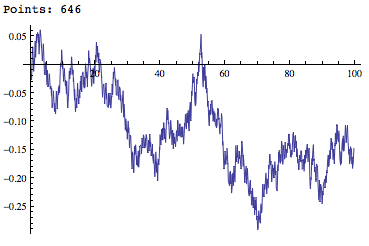
Using said value we obtain:

lp = filter[c, 100/325];
Print["Points: " <> ToString@Length@lp];
ListLinePlot[lp]

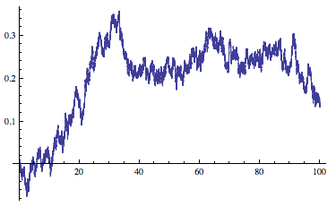
result

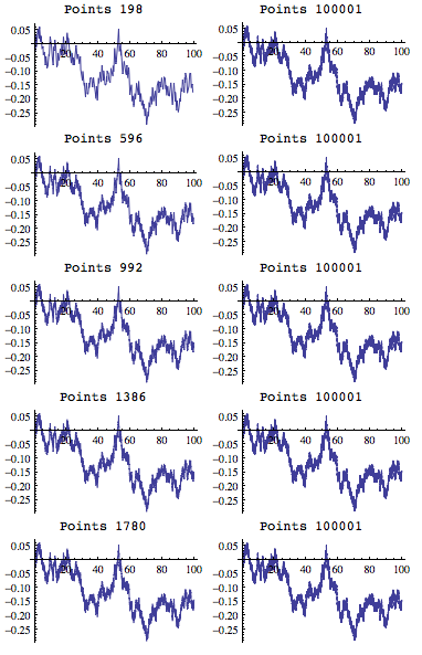
The amount of overlapping has been reduced and thus we do not see the bold look it had. Here is a side by side comparison with different parameters for the filter.

Column@Table[(
   lp = filter[c, 100/i];
   Grid[{
     {
      StringJoin["Points ", ToString@Length@lp], 
      StringJoin["Points ", ToString@Length@c]
      }, {
      ListLinePlot[lp, ImageSize -> 2.5 72],
      ListLinePlot[c, ImageSize -> 2.5 72]
      }
     }]),
  {i, 100, 1000, 200}]

comparison

Edit

I'm adding a modified version of the filter written by Thomas:

filter1[c_, uup_] := Module[{
   d = Split[c, Floor[First@#1, uup] === Floor[First@#2, uup] &],
   x, ord, y
   },
  y = (#[[2]] & /@ (Transpose /@ d));
  ord = Ordering /@ y;
  ord = {First@#, Last@#} & /@ ord;
  ord = Sort /@ ord;
  Join @@ MapThread[Part, {d, ord}]
  ]

Edit 2

This version is again much faster. It is basically a different way of calculating the vector d, the rest is identical to filter1 above:

filter2[c_, uup_] := Module[{tmp, len, d, ord, y},
  tmp = Split[Floor[c[[All, 1]], uup]];
  len = Accumulate@Flatten[{1, Length /@ tmp}];
  d = MapThread[Take[c, {#1, #2}] &, {Most@len, Rest@len - 1}];
  y = #[[All, 2]] & /@ d;
  ord = Ordering /@ y;
  ord = {First@#, Last@#} & /@ ord;
  ord = Sort /@ ord;
  Join @@ MapThread[Part, {d, ord}]
  ]
$\endgroup$
4
  • $\begingroup$ +1 It is really surprising how similar are all those curves $\endgroup$ Commented Apr 3, 2013 at 1:30
  • $\begingroup$ Your filter function can be sped up about 3-fold with this code: filter1[c_, uup_] := Module[{d = Split[c, Floor[First@#1, uup] === Floor[First@#2, uup] &], x, ord, y}, x = (#[[1]] & /@ (Transpose /@ d)); y = (#[[2]] & /@ (Transpose /@ d)); ord = Ordering /@ y; ord = {First@#, Last@#} & /@ ord; ord = Sort /@ ord; Join @@ MapThread[Part, {d, ord}]] $\endgroup$
    – Thomas
    Commented Apr 3, 2013 at 10:35
  • $\begingroup$ @Thomas, I added your function to the answer. I should note however, that the modified version gives some extra points as compared to the one I wrote. Feel free to make adjustments to your function here or write a separate answer if you should desire and I'll delete my last edit. $\endgroup$
    – jmlopez
    Commented Apr 3, 2013 at 14:00
  • $\begingroup$ I have added another version of the filter, much faster than before. The difference is much more pronounced for larger data sets. Eg for 10^6 points: filter: 11 sec; filter1: 3.3 sec; filter2: 0.7 sec $\endgroup$
    – Thomas
    Commented Apr 3, 2013 at 17:09
12
$\begingroup$

To reduce the number of points, I'd use Interpolation:

f = Interpolation[Transpose@{x,y}, InterpolationOrder->1];
Plot[f@x,{x,0,100}]

enter image description here

$\endgroup$
8
  • 1
    $\begingroup$ That seems to smooth the curve. However, say with bin = 800 you already lost a lot of the information in the plot (the stochastic noise) but with my data it still shows that it is plotting about 90000 points. Since a lot of these points now lie in a straight line this means that we can remove a lot of them. $\endgroup$
    – jmlopez
    Commented Apr 2, 2013 at 19:44
  • 1
    $\begingroup$ Aha, I like the idea of using Interpolation and using the option PlotPoints in Plot. This reduces the amount of points plotted drastically. $\endgroup$
    – jmlopez
    Commented Apr 2, 2013 at 20:07
  • 1
    $\begingroup$ +1 for the update. I'd suggest you make it the main (or only part) of your answer. The MovingAverage part really doesn't answer the question, as it introduces new values. $\endgroup$ Commented Apr 2, 2013 at 20:08
  • 2
    $\begingroup$ +1 for the Interpolation solution: that exploits MMA's ability to sample adaptively. The moving average approach is not advisable, because it can (drastically) change even the major qualitative features of the graph. It is guaranteed to pull the extremes in toward the middle, for instance, and to reduce the slopes. $\endgroup$
    – whuber
    Commented Apr 3, 2013 at 17:13
  • 1
    $\begingroup$ @whuber, I probably should remove that MovingAverage approach since it isn't that usable in this case. $\endgroup$
    – kale
    Commented Apr 3, 2013 at 17:31
10
$\begingroup$

As I said in my comment, the Douglas-Peucker algorithm is a standard method for simplifying polygonal curves. This demonstration by Mark McClure contains a Mathematica implementation. Since he is a user on this site, I feel like he deserves the points for this answer. Nevertheless, in the interests of having an answer here, and hoping this falls under fair use, I quote his implementation:

dist[q : {x_, y_}, {p1 : {x1_, y1_}, p2 : {x2_, y2_}}] := With[
   {u = (q - p1).(p2 - p1)/(p2 - p1).(p2 - p1)},
   Which[
    u <= 0, Norm[q - p1],
    u >= 1, Norm[q - p2],
    True, Norm[q - (p1 + u (p2 - p1))]
    ]
   ];
testSeg[seg[points_List], tol_] := Module[
    {},
    dists = dist[#, {points[[1]], points[[-1]]}] & /@ 
      points[[Range[2, Length[points] - 1]]];
    max = Max[dists];
    If[max > tol,
     pos = Position[dists, max][[1, 1]] + 1;
     {seg[points[[Range[1, pos]]]], 
      seg[points[[Range[pos, Length[points]]]]]},
     seg[points, done]]] /; Length[points] > 2;
testSeg[seg[points_List], tol_] := seg[points, done];
testSeg[seg[points_List, done], tol_] := seg[points, done];
dpSimp[points_, tol_] := 
  Append[First /@ First /@ Flatten[{seg[points]} //. 
       s_seg :> testSeg[s, tol]], Last[points]];

(P.S. @Mark, if you want to add your own answer, I'll be happy to delete this one.)

As suggested by @whuber, for plots it's more meaningful to compare vertical differences than geometric distances. This just requires changing the dist function to

dist[q : {x_, y_}, {p1 : {x1_, y1_}, p2 : {x2_, y2_}}] := 
  With[{u = (x - x1)/(x2 - x1)}, Abs[y - (y1 + u (y2 - y1))]];

Then you can do, for example,

ListLinePlot[dpSimp[Transpose@{x,y}, 0.01]]

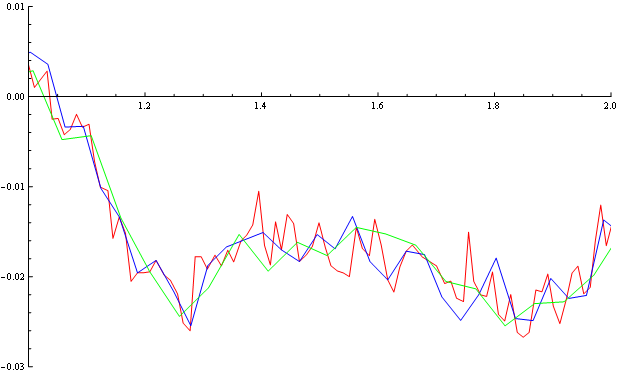
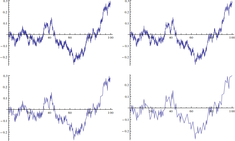
to get a plot that differs by at most 0.01 from the original data. Here are four plots with tolerances I picked to give just under 1000, 500, 200, and 100 points respectively.

enter image description here

$\endgroup$
2
  • 2
    $\begingroup$ On a plot, we usually are concerned primarily about vertical differences rather than geometric distances in the plane. Thus the Douglas-Peucker algorithm does not seem appropriate for this problem. $\endgroup$
    – whuber
    Commented Apr 3, 2013 at 17:11
  • 4
    $\begingroup$ Well, the horizontal scale is so much larger than the vertical scale in this case that geometric distances are effectively the same as vertical differences here! But you make a great point. One only needs to modify the dist function to return the vertical difference, and then it does the job. $\endgroup$
    – user484
    Commented Apr 3, 2013 at 17:56

Your Answer

By clicking “Post Your Answer”, you agree to our terms of service and acknowledge you have read our privacy policy.

Not the answer you're looking for? Browse other questions tagged or ask your own question.