First lets plot your function to see what it looks like.
Plot[myfun[t], {t, 0, 100}]
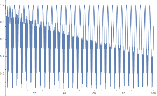
This is only between 0 to 100 seconds. What we see is some very high frequencies but also a constant frequency which we can estimate at about 0.3 Hz. If we plot at later times
Plot[myfun[t], {t, 500, 600}]
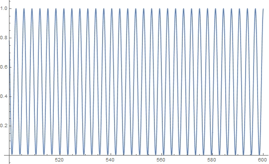
We can see that the starting high frequencies have died away and the frequency at about 0.3 Hz remains.
Now we can do a Fourier analysis. As you have some high frequencies we need to sample at a very fast sample rate. I have guessed at the sample rate but hope it is good enough.
sr = 100;  (* Sample rate *)
data = Table[myfun[t], {t, 0, 1000, 1/sr}];
nn = Length@data
Plotting again shows that I seem to have captured the high frequency data
ListLinePlot[data[[1 ;; Round[100 sr]]]]
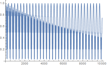
You should probably check by looking at a shorter time interval.
Now for the Fourier analysis.
ft = Fourier[data, FourierParameters -> {-1, -1}];
freqs = Table[f, {f, 0, sr (nn - 1)/nn, sr/nn}];
The second line of code is to make the frequencies that correspond to the data in the Fourier transform. See here for details.
ListLogPlot[Transpose[{freqs, Abs[ft]}][[1 ;; 10000]],
 PlotRange -> All, Joined -> True]
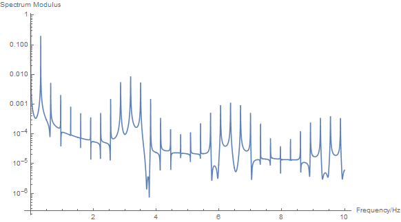
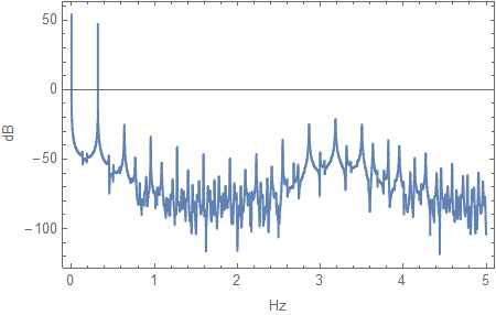
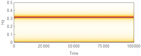
We can see a dominant peak at about 0.3 Hz and lots of other peaks that make up your high frequencies.
Hope that helps.


E^(-0.018t)` and the square roots. $\endgroup$myfunon an evenly spaced grid from-Pito Pi` and applyFourier. $\endgroup$Sin[10 t]is squared, the relevant angular frequency is actually 20. Second of all, those are particular angular frequencies that show up. Instead, you should see dominant peaks at $2/2\pi$, $4/2\pi$, and $20/2\pi$, which you will see if you use one of the linked answers. The one usingPeriodogram' is easy to use, and the other one shows the best way to useFourier` (the FFT) to get a power spectrum. $\endgroup$