2
$\begingroup$

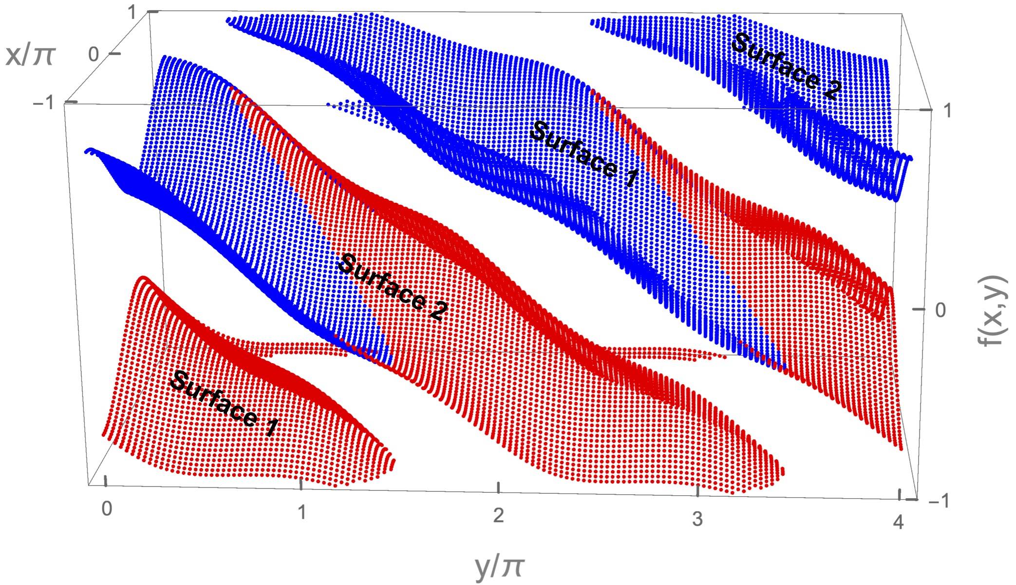
I have a data to plot in the form of {x,y,f(x,y)}. Essentially, I have two curves (to be precise, surfaces). I want different colors for each surface. But I'm failing to do so.

Here is my datatoplot:

Graphics3D[Riffle[{Red, Blue},Point /@ Transpose[SortBy[Last] /@ Partition[datatoplot, 2]]]]

In the above plot: you see four surfaces. Actually there is a periodic boundary condition (all the faces of cuboid). So, from left corner (first red) and third (blue red combination) are the same, likewise second (blue red) and forth (blue).

PS: To be more clear. The top face and the bottom face are same. Likewise, any opposite face of the cuboid. So, the first red (on the left corner) goes and reappear on the top ( third surface) but blue and red (instead of red). Hope it's clear! But I can do it better, if it isn't

I was looking for the clever way to color them. But I don't know.

enter image description here

$\endgroup$
4
  • $\begingroup$ Very cool dataset. But I see 4 surfaces. $\endgroup$ Commented Jun 2, 2019 at 19:21
  • $\begingroup$ @AntonAntonov Oops! Thanks for pointing it out. Actually there is a periodic boundary condition. So, from left corner (first red) and third (blue red combination) are the same, likewise second (blue red) and forth (blue). $\endgroup$
    – Shamina
    Commented Jun 2, 2019 at 19:30
  • $\begingroup$ I am not sure I understand. Is the plot in my answer something you expect/want? $\endgroup$ Commented Jun 2, 2019 at 19:33
  • $\begingroup$ @AntonAntonov. I'm sorry, maybe I'm talking in telepathy. You almost got it. I mean the top face and the bottom face are same. Likewise, any opposite face of the cuboid. So, the first red (on the left corner) goes and reappear on the top ( third surface) but blue and red (instead of red). Hope it's clear! But I can do it better, if it isn't $\endgroup$
    – Shamina
    Commented Jun 2, 2019 at 19:38

2 Answers 2

4
$\begingroup$

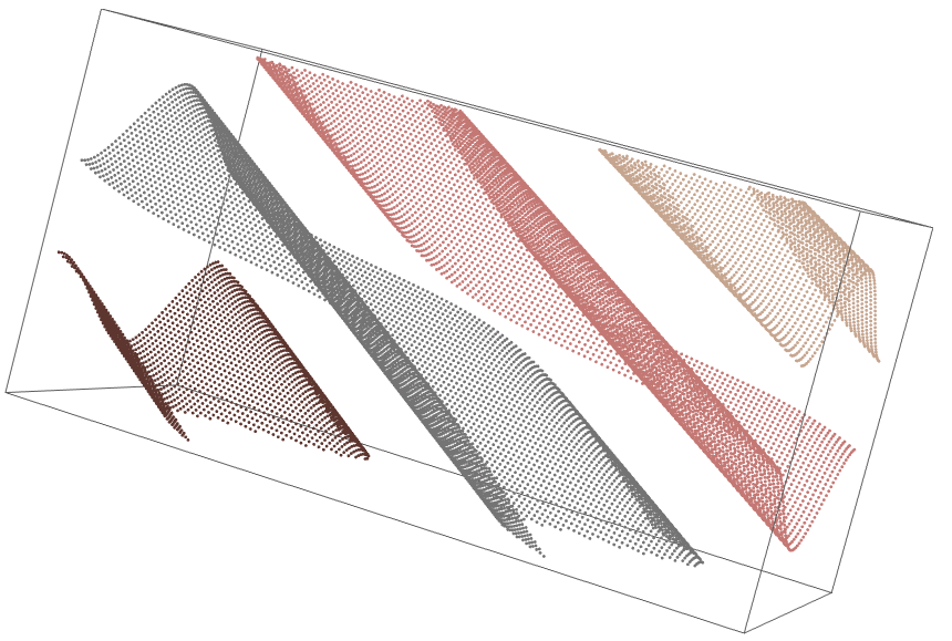
1. We find the Nearest Neighbors (NN's) graph based on the 4 closest NN's for each point.

2. We find the connected components of that graph.

3. We plot the components with some color scheme/function.

data = Import["~/Downloads/FePqRtb9.m"];

AbsoluteTiming[
 gr = NearestNeighborGraph[data, 4];
 ccs = ConnectedComponents[gr];
]
Length[ccs]

(* {0.110175, Null} *)
(* 4 *)  

Graphics3D[
 MapIndexed[{ColorData[7, "ColorList"][[#2[[1]]]], Point[#1]} &, ccs]]

enter image description here

I used the 4 closest Nearest Neighbors (NN's) for each point because the points patterns of the surfaces can be projected on 2D regular grids. I could have used 8 NN's, but 4 NN's seemed enough (i.e. it worked.) Because we have 4 surfaces I used 4 as the number of connected components to be identified.

Additional code / responses

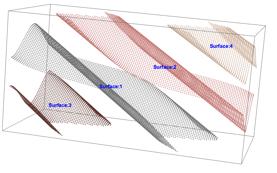
Using this code we can see which surface on the plot corresponds to which element of components lists, ccs.

Graphics3D[
 MapIndexed[{Text[
     Style["Surface:" <> ToString[#2[[1]]], Blue, Bold, 
      FontSize -> 16], Mean[#1]], 
    ColorData[7, "ColorList"][[#2[[1]]]], Point[#1]} &, ccs]]

enter image description here

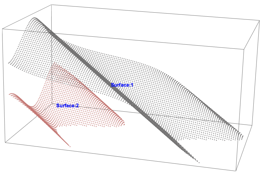
And we have this plot for those components:

Graphics3D[
 MapIndexed[{Text[
     Style["Surface:" <> ToString[#2[[1]]], Blue, Bold, 
      FontSize -> 16], Mean[#1]], 
    ColorData[7, "ColorList"][[#2[[1]]]], Point[#1]} &, 
  ccs[[{1, 3}]]]]

enter image description here

$\endgroup$
9
  • $\begingroup$ I edited my question. Unfortunately, I was explaining to myself (I.e too vague in my explanation). But you almost got it! I need two days sets (containing two surfaces data), that will solve all the hurdles. I need to calculate quantities but this separation of data wasn't clear before so everything was wrong like the plot, as shown in the question $\endgroup$
    – Shamina
    Commented Jun 2, 2019 at 19:45
  • $\begingroup$ I hope you can modify / extend the code of my answer to produce the plot you want... $\endgroup$ Commented Jun 2, 2019 at 20:03
  • 1
    $\begingroup$ I updated my answer with more explanations. $\endgroup$ Commented Jun 3, 2019 at 12:55
  • 1
    $\begingroup$ See my updated answer. $\endgroup$ Commented Jun 3, 2019 at 17:12
  • 1
    $\begingroup$ Sounds good, good luck! $\endgroup$ Commented Jun 4, 2019 at 12:54
0
$\begingroup$

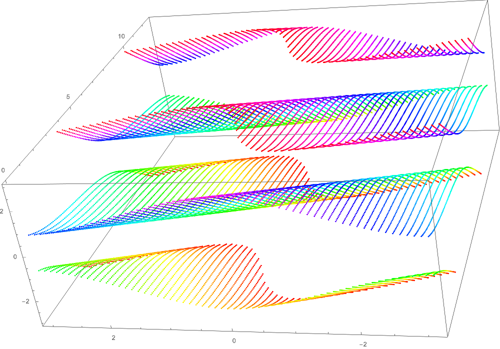
You can experiment with ListLinePlot3D.

ListPointPlot3D[datatoplot, ColorFunction -> Function[{x, y, z}, Hue[z]], 
 PlotStyle -> PointSize[0.002], ImageSize -> 800]

enter image description here

$\endgroup$

Your Answer

By clicking “Post Your Answer”, you agree to our terms of service and acknowledge you have read our privacy policy.

Not the answer you're looking for? Browse other questions tagged or ask your own question.