15
$\begingroup$

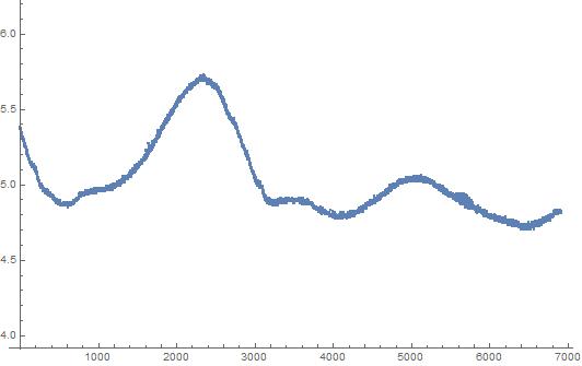
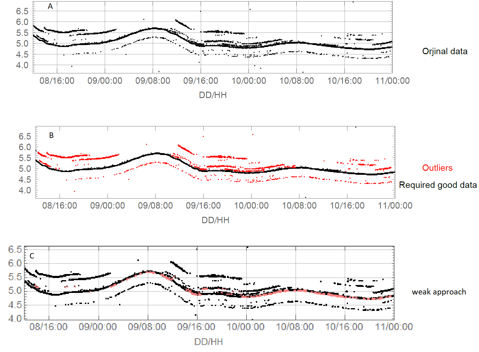
I have the following temperature time-series. As you can see it contains very very noisy points in some periods (Fig.A). I tried to approach the best data(the black one in the center) based on the idea mentioned here: How to remove outliers from data but I got weak time-series as demonstrated in the pink dots (Fig.c).

Therefore, what come finally to my mind is to manually delete the unwanted signals and then export the desired signal data and interpolate the missing data by tracking the deleted time steps. But I need help to do this, or if there is very powerful approach to eliminate the unwanted signals might be a solution (mathematical or image processing by Mathematcia). Thanks in advanced.enter image description here

data:https://drive.google.com/file/d/12I7HYE2cjEFUJF3zQIgeCx8O_Xqtviaa/view

P.S. I do not have any duplicate in my data i.e. each time step has only one value.

$\endgroup$

3 Answers 3

9
$\begingroup$

Introduction

It seems to me that this question should be answered using more "traditional" time series methods than the already provided interesting solutions (with graphs and image processing.)

The workflow shown below is something considered during the design of the QRMon package and it is very similar to the data cleaning done in "Cleaning away data points which are enveloped within a function".

The "traditional" time series procedure

  1. Summarize the data

  2. Do a (Quantile Regression) fit.

  3. Pick points close to the fitted curve.

    • Using an appropriate threshold.
  4. Plot the picked points.

  5. If satisfactory results stop, else use the picked points as new data and goto to 1.

Get the data

Actually the other answers did not discuss how the data is obtained. I downloaded the data from the provided link and had to pre-process it a bit.

data = Import["~/Downloads/MSE-q188361.txt", "Data"];

Tally[Length /@ data]
(* {{5, 1704}, {4, 34}} *)

data = Select[data, Length[#] == 5 &];
data = data[[All, 1 ;; 4]];
data = Select[data, VectorQ[#, NumberQ] &];
Dimensions[data]
(* {1703, 4} *)

Workflow code

The implementation below uses the package QRMon:

Import["https://raw.githubusercontent.com/antononcube/MathematicaForPrediction/master/MonadicProgramming/MonadicQuantileRegression.m"]

and Fold. Only two interations are needed, but I did experiment with different regression fits (algorithms, function bases parameters, and algorithm options) and different point picking thresholds.

The data is quite skewed, so the built-in function Fit does not work that well. The Quantile Regression algorithm is somewhat slow, but the whole computation should finish within 15 seconds.

AbsoluteTiming[
 cleanData =
   Fold[
    First[Values[
       QRMonUnit[#1]⟹
        QRMonEcho[Style[Row[{"Iteration parameters:\n{number of knots, quantile, pick threshold}=", #2}], Bold, Purple, FontSize -> 16]]⟹
        QRMonEchoDataSummary⟹
        QRMonQuantileRegression[#2[[1]], #2[[2]], Method -> {LinearProgramming, Method -> "InteriorPoint", Tolerance -> 10^(-3)}]⟹
        QRMonSetRegressionFunctionsPlotOptions[{PlotStyle -> Red}]⟹
        QRMonPlot[ImageSize -> Large, PlotLabel -> Style["Data and fit", Bold, 16]]⟹
        QRMonPickPathPoints[#2[[3]]]⟹
        QRMonEchoFunctionValue[ListPlot[#, ImageSize -> Large, PlotLabel -> Style["Picked points", Bold, 16], PlotTheme -> "Detailed"] & /@ # &]⟹
        QRMonTakeValue
       ]] &, 
    Join @@ data, {{16, 0.3, 0.1}, {30, 0.5, 0.025} (*,{24, 0.5, 0.01}*)}];
]

enter image description here

enter image description here

The final result is given to the variable cleanData:

Short[cleanData]
(* {{2, 5.3698}, {4, 5.3698} <<4563>> {6809, 4.813}, {6811, 4.813}) *)
$\endgroup$
24
$\begingroup$

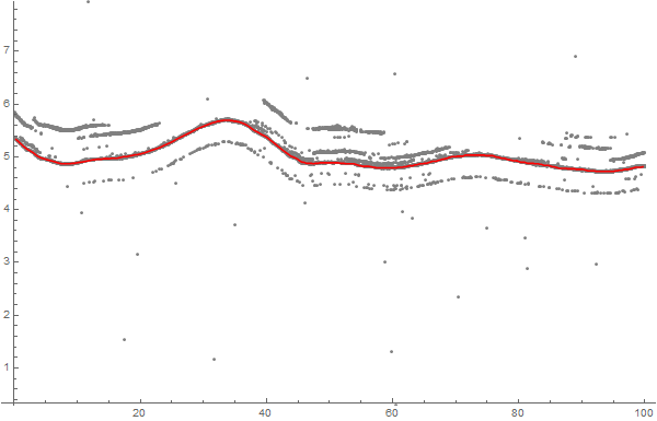
One simple way of "filtering" your data is to treat the points as a graph, and search for the shortest path from left to right:

xScale = 10.; 
xy = Transpose[{N[Range[Length[data]]]*(xScale/Length[data]), data}]; 

start = {-xScale, Mean[data]}; 
finish = {2*xScale, Mean[data]}; 
graph = NearestNeighborGraph[Join[{start}, xy, {finish}], 25]; 
graph = SetProperty[graph, 
   EdgeWeight -> 
    Apply[SquaredEuclideanDistance, EdgeList[graph], {1}]]; 

Now we have graph with all your points, plus two extra points "start" and "finish" far left and far right of the point set.

enter image description here

Every point is connected to it's 25 closest neighbors, and I'm using SquaredEuclideanDistance as edge weights - that way, long edges are penalized, and the shortest path should contain all "inlier" points.

Here's the shortest path from start to finish:

path = FindShortestPath[graph, start, finish][[2 ;; -2]];
ListLinePlot[path, PlotRange -> MinMax[data], 
 Prolog -> {Gray, Point[xy]}, PlotStyle -> Red, ImageSize -> 600]

enter image description here


ADD:

I was asked what the xScale parameter means. Basically, it defines the cost of "skipping" a point of data, in relation to going "up and down" in y direction. So for smaller values of xScale, to cost of skipping a point is low, and a lot of points are skipped. If we increase xScale, more points get selected:

enter image description here

$\endgroup$
7
  • $\begingroup$ Very cool approach, nice... $\endgroup$
    – MikeY
    Commented Dec 24, 2018 at 13:05
  • $\begingroup$ @Niki Estner, Wonderful sir, I realized that the orjinal data length has been dramatically decreased decrease from 6919 to 2592! $\endgroup$
    – Mehmet
    Commented Dec 25, 2018 at 0:14
  • $\begingroup$ Excuse me sir, I found that changing the value of the xScale = 10.; has a significant effect on the accuracy of the red line :) $\endgroup$
    – Mehmet
    Commented Dec 25, 2018 at 10:36
  • 1
    $\begingroup$ @M.Basel: Yes, of course. By changing the x scale, you can basically adjust the cost of "detours" up and down. What would be the point of a filter with no adjustable parameters? $\endgroup$ Commented Dec 25, 2018 at 11:18
  • $\begingroup$ I am afraid if I could not understand your question very well so do you refer to y-axis? $\endgroup$
    – Mehmet
    Commented Dec 25, 2018 at 11:27
9
$\begingroup$

Here's an alternate approach that takes the data into an image that you can edit in a Paint program, and then back into data. Presumes you have "insider knowledge" about the data set that allows you to identify and exclude bad data.

Assuming the data is in dat, plot it

 ListPlot[dat]

enter image description here

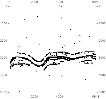
Convert to an image, using a sparse array as an intermediary:

mindat = dat // Min
normdat = (dat - mindat)/((dat - mindat) // Max);
discretizer = 5000; (* discretizes the vertical axis, you pick the value to choose resolution *)
datsparse = Floor[normdat * discretizer] + 1;
sparsedata = Transpose[{datsparse, Range[Length[datsparse]]}];
rules = Map[# -> 1 &, sparsedata];
spa = SparseArray[rules]
MatrixPlot[spa, ColorFunction -> "Monochrome"]

enter image description here

From sparse array to image

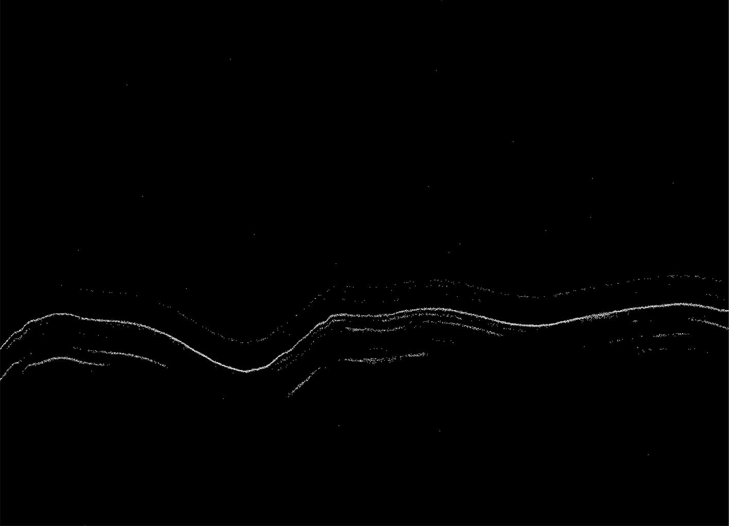
immf = MaxFilter[Image[spa, "Bit"], 2]
Export["C:\\immf.tiff", immf]

Note: the MaxFilter[ ] command will result in multiple values for the same time step. Can delete if you want. Also note the image is inverted. Taken care of on the Import[ ].

enter image description here

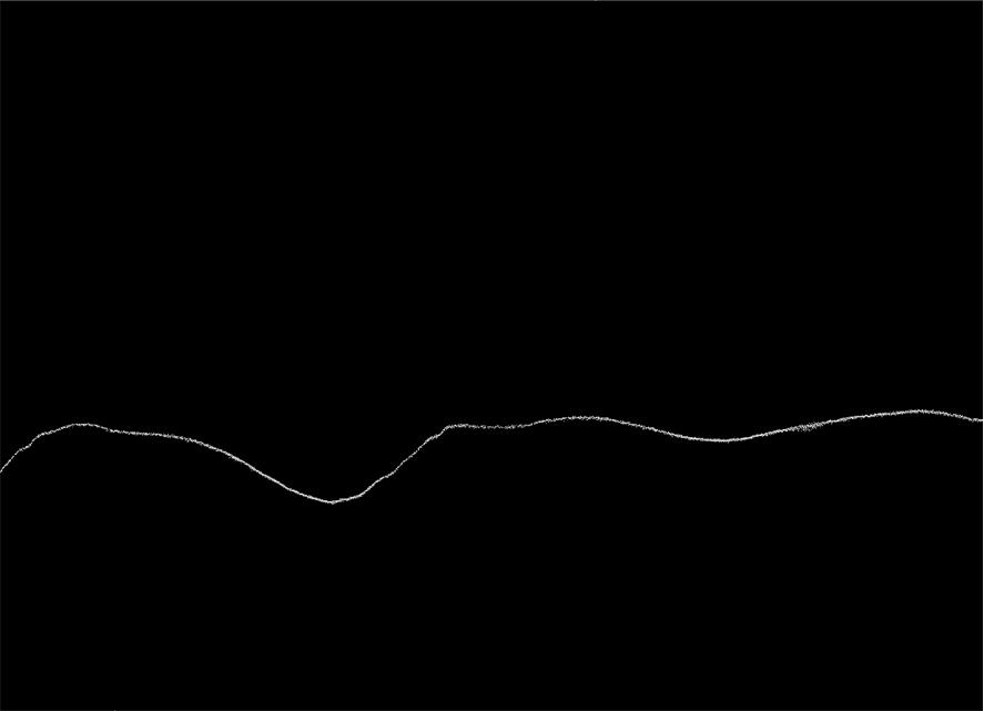
Edit it in your favorite paint program and import, reversing the math

immfmod = Import["C:\\immfmod.tiff"] // Binarize

enter image description here

Grab the data and renormalize. First the data...

imd = immfmod // ImageData

Get the location of positions where they have a value of '1', doing a little manipulating to get the X and Y axes correct, and transpose so we can scale the Y axis in the next step.

postrans = Transpose[Sort[Map[Reverse, Position[imd, 1]]]];

Reset the Y axis back to the original space

postrans[[2]] = (postrans[[2]] - 1)/discretizer ((dat - mindat) // Max) + mindat;
pos = postrans // Transpose;

Take a look

enter image description here

The data has repeated points for the same X-axis values. If you don't like that, get rid of the MaxFilter[ ] command, as I just used it to make the image easier to see.

$\endgroup$
2
  • $\begingroup$ Y, Wonderful sir, your approach resulted in larger number of elements, thus accepted range was data was 70%. The main challenge in this approach is to do perform continuous manual correction between export and import but efficient. I do appreciate your contrbution! $\endgroup$
    – Mehmet
    Commented Dec 25, 2018 at 11:21
  • $\begingroup$ Y, Dear sir, The removed outliers were 30% approximately. Alternatively, Mr. Niki's approach, gave greater percentage of outliers 57% approximately. The main difficulty is to treat outliers by paint (export, treat, import) for huge amount of data. Therefore, when treating the image by paint it is not essential to delete all outliers because I introduced (MedianFilter) to (pos[[All,2]]). Thanks all for supporting $\endgroup$
    – Mehmet
    Commented Dec 27, 2018 at 8:11

Your Answer

By clicking “Post Your Answer”, you agree to our terms of service and acknowledge you have read our privacy policy.

Not the answer you're looking for? Browse other questions tagged or ask your own question.