1
$\begingroup$

I need some help in creating a plot that shows the Income Distribution of an economy.

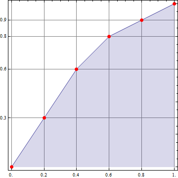
The simple idea is to show the population percentage at the x-coordinate and the income percentage at the y-coordinate.

For example: I have a list={0.2,0.3,0.1,0.3,0.1} of the income percentage of 5 households (each household = 20% of population).

Now I would like to show in a plot that 20% (or 1 household) holds 30% of the whole income. 40% (or 2 households) hold 60% of the income. 60% (or 3 households) hold 80% of the whole income and so on.

Please could someone assist and help?

$\endgroup$
1
  • $\begingroup$ Have you seen ListPlot? $\endgroup$
    – Edmund
    Commented Jan 17, 2018 at 18:36

1 Answer 1

1
$\begingroup$
list = {0.2, 0.3, 0.1, 0.3, 0.1};

ListLinePlot[Accumulate[Prepend[Reverse@Sort@list, 0]], 
 AspectRatio -> 1, Frame -> True, DataRange -> {0, 1}, Filling -> Axis,
 FrameTicks -> {{{.3, .6, .8, .9}, Automatic}, {Range[0, 1, .2], 
    Automatic}},
 Mesh -> {Range[0, 1, .2]}, 
 MeshStyle -> Directive[PointSize[Large], Red], 
 GridLines -> {Range[0, 1, .2], {.3, .6, .8, .9}}] (*thanks: Bob Hanlon*)

enter image description here

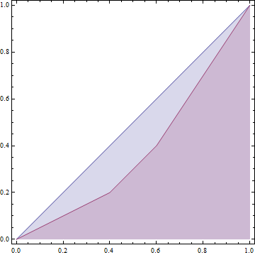
To get the standard Lorenz curve:

ListLinePlot[{{0, 1}, Accumulate[Sort@Prepend[list, 0]]}, 
  AspectRatio -> 1, Frame -> True, DataRange -> {0, 1}, Filling -> Axis]

enter image description here

$\endgroup$
3
  • $\begingroup$ I believe that you want Accumulate[Prepend[Reverse@Sort@list, 0]] $\endgroup$
    – Bob Hanlon
    Commented Jan 17, 2018 at 18:47
  • $\begingroup$ yes, thank you @BobHanlon. $\endgroup$
    – kglr
    Commented Jan 17, 2018 at 18:51
  • $\begingroup$ Thanks @BobHanlon and @kglr! That is a big help! $\endgroup$
    – Ni Ko
    Commented Jan 18, 2018 at 10:26

Your Answer

By clicking “Post Your Answer”, you agree to our terms of service and acknowledge you have read our privacy policy.

Not the answer you're looking for? Browse other questions tagged or ask your own question.