6
$\begingroup$

There are actually several questions here but I thought they are closely related so I should not split into several posts. Here we go...

I have the following list

data2={{-0.209091, 2.89296}, {0.281818, 2.92958}, {0.8, 2.97535}, {1.28182, 
  3.03028}, {1.8, 3.07606}, {2.28182, 3.11268}, {2.5, 3.1493}, {2.8, 
  3.18592}, {-0.2, 2.74648}, {0.272727, 2.79225}, {0.8, 
  2.83803}, {1.27273, 2.8838}, {1.80909, 2.92958}, {2.28182, 
  2.95704}, {2.50909, 2.99366}, {2.8, 3.03028}, {-0.209091, 
  2.58169}, {0.272727, 2.63662}, {0.790909, 2.69155}, {1.27273, 
  2.74648}, {1.8, 2.77394}, {2.28182, 2.81972}, {2.50909, 
  2.82887}, {2.8, 2.87465}, {-0.2, 2.43521}, {0.281818, 
  2.49014}, {0.8, 2.55423}, {1.27273, 2.59085}, {1.8, 
  2.63662}, {2.28182, 2.66408}, {2.50909, 2.69155}, {2.8, 
  2.71901}, {-0.2, 2.27958}, {0.281818, 2.33451}, {0.790909, 
  2.38944}, {1.27273, 2.43521}, {1.80909, 2.48099}, {2.28182, 
  2.50845}, {2.5, 2.52676}, {2.81818, 2.56338}, {-0.2, 
  2.07817}, {0.272727, 2.14225}, {0.790909, 2.21549}, {1.28182, 
  2.27042}, {1.80909, 2.30704}, {2.27273, 2.36197}, {2.5, 
  2.37113}, {2.8, 2.40775}, {-0.2, 1.83099}, {0.272727, 
  1.93169}, {0.790909, 2.01408}, {1.28182, 2.07817}, {1.80909, 
  2.14225}, {2.29091, 2.16972}, {2.50909, 2.20634}, {2.80909, 
  2.2338}, {-0.2, 1.54718}, {0.281818, 1.65704}, {0.8, 
  1.77606}, {1.29091, 1.84014}, {1.8, 1.92254}, {2.29091, 
  1.97746}, {2.50909, 1.99577}, {2.80909, 2.03239}, {-0.2, 
  1.21761}, {0.281818, 1.32746}, {0.8, 1.47394}, {1.27273, 
  1.57465}, {1.80909, 1.6662}, {2.28182, 1.72113}, {2.50909, 
  1.7669}, {2.80909, 1.80352}, {-0.2, 0.869718}, {0.263636, 
  1.0162}, {0.781818, 1.15352}, {1.29091, 1.26338}, {1.80909, 
  1.39155}, {2.29091, 1.46479}, {2.5, 1.51972}, {2.80909, 
  1.55634}, {-0.2, 0.622535}, {0.272727, 0.714085}, {0.809091, 
  0.851408}, {1.28182, 0.988732}, {1.79091, 1.09859}, {2.28182, 
  1.21761}, {2.5, 1.25423}, {2.81818, 1.3}, {-0.209091, 
  0.411972}, {0.272727, 0.494366}, {0.8, 0.63169}, {1.28182, 
  0.723239}, {1.80909, 0.851408}, {2.3, 0.961268}, {2.5, 
  1.02535}, {2.80909, 1.07113}, {-0.209091, 0.265493}, {0.281818, 
  0.338732}, {0.8, 0.430282}, {1.28182, 0.521831}, {1.8, 
  0.640845}, {2.28182, 0.759859}, {2.50909, 0.796479}, {2.80909, 
  0.860563}, {-0.209091, 0.183099}, {0.281818, 0.219718}, {0.790909, 
  0.292958}, {1.28182, 0.375352}, {1.80909, 0.466901}, {2.28182, 
  0.576761}, {2.49091, 0.61338}, {2.80909, 0.677465}, {-0.209091, 
  0.109859}, {0.272727, 0.146479}, {0.8, 0.201408}, {1.28182, 
  0.256338}, {1.80909, 0.338732}, {2.28182, 0.430282}, {2.50909, 
  0.466901}, {2.8, 0.521831}};

Based on the answers I got here I can plot it as follows

ListLinePlot[Partition[data2, 8], Frame -> True, 
 PlotRangePadding -> Scaled[0.1], Axes -> False, 
 PlotMarkers -> {{\[EmptyCircle], Medium}}, 
 PlotLegends -> {"-\!\(\*SuperscriptBox[\(91\), \(\(\\\ \
\)\(o\)\)]\)C", "-88\!\(\*SuperscriptBox[\(\\\ \), \(o\)]\)C", 
   "-\!\(\*SuperscriptBox[\(85\), \(\(\\\ \\\ \)\(o\)\)]\)C", 
   "-82\!\(\*SuperscriptBox[\(\\\ \), \(o\)]\)C", 
   "-79\!\(\*SuperscriptBox[\(\\\ \), \(\(\\\ \)\(o\)\)]\)C", 
   "-76\!\(\*SuperscriptBox[\(\\\ \), \(o\)]\)C", 
   "-\!\(\*SuperscriptBox[\(73\), \(\(\\\ \)\(o\)\)]\)C", 
   "-70\!\(\*SuperscriptBox[\(\\\ \), \(o\)]\)C", 
   "-\!\(\*SuperscriptBox[\(67\), \(\(\\\ \)\(o\)\)]\)C", 
   "-64\!\(\*SuperscriptBox[\(\\\ \), \(o\)]\)C", 
   "-\!\(\*SuperscriptBox[\(61\), \(\(\\\ \)\(o\)\)]\)C", 
   "-58\!\(\*SuperscriptBox[\(\\\ \), \(o\)]\)C", 
   "-\!\(\*SuperscriptBox[\(55\), \(\(\\\ \)\(o\)\)]\)C", 
   "-52\!\(\*SuperscriptBox[\(\\\ \), \(o\)]\)C", 
   "-\!\(\*SuperscriptBox[\(49\), \(\(\\\ \)\(o\)\)]\)C"}, 
 ImageSize -> 600]

and obtain

enter image description here

First Question Is it possible the circles to be on the top of the lines and not behind them as it this graph?

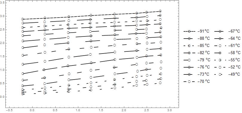
Second Question I want the several lines to be distinguishable even in a blank and white printing. I am thinking about applying Dashing but I do not know which structure to use in order to do this automatically (as the Default PlotStyle does with the colors). The only thing I thought is something like

lst = Table[{Black, 
    Dashing[{RandomReal[]/10, Abs[RandomReal[]/10 - 0.1]}]}, {r, 15}];

ListLinePlot[Partition[data2, 8], Frame -> True, 
 PlotRangePadding -> Scaled[0.1], Axes -> False, 
 PlotMarkers -> {{\[EmptyCircle], Medium}}, PlotStyle -> lst, 
 PlotLegends -> {"-\!\(\*SuperscriptBox[\(91\), \(\(\\\ \
\)\(o\)\)]\)C", "-88\!\(\*SuperscriptBox[\(\\\ \), \(o\)]\)C", 
   "-\!\(\*SuperscriptBox[\(85\), \(\(\\\ \\\ \)\(o\)\)]\)C", 
   "-82\!\(\*SuperscriptBox[\(\\\ \), \(o\)]\)C", 
   "-79\!\(\*SuperscriptBox[\(\\\ \), \(\(\\\ \)\(o\)\)]\)C", 
   "-76\!\(\*SuperscriptBox[\(\\\ \), \(o\)]\)C", 
   "-\!\(\*SuperscriptBox[\(73\), \(\(\\\ \)\(o\)\)]\)C", 
   "-70\!\(\*SuperscriptBox[\(\\\ \), \(o\)]\)C", 
   "-\!\(\*SuperscriptBox[\(67\), \(\(\\\ \)\(o\)\)]\)C", 
   "-64\!\(\*SuperscriptBox[\(\\\ \), \(o\)]\)C", 
   "-\!\(\*SuperscriptBox[\(61\), \(\(\\\ \)\(o\)\)]\)C", 
   "-58\!\(\*SuperscriptBox[\(\\\ \), \(o\)]\)C", 
   "-\!\(\*SuperscriptBox[\(55\), \(\(\\\ \)\(o\)\)]\)C", 
   "-52\!\(\*SuperscriptBox[\(\\\ \), \(o\)]\)C", 
   "-\!\(\*SuperscriptBox[\(49\), \(\(\\\ \)\(o\)\)]\)C"}, 
 ImageSize -> 600]

but the output is a mesh.enter image description here

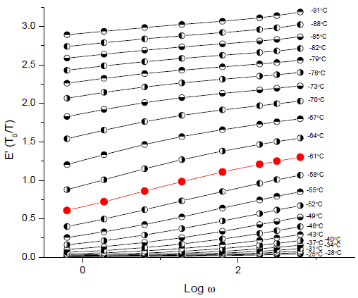
Third Question Is it possible to arrange the PlotMarkers so that I obtain the appearance of plot markers of the following graph

enter image description here

found here

Fourth Question (and final one:-)!) How can I insert a Legend that is mainly text and bypass the associated line as in the above plot?

(EDIT) I corrected the name (data2 instead of data) and also the title (Labeled instead of Legend) in accordance with rcollyer's reply

  1. In the language developed for plotting/charting, these are labels, not legends. The semantic distinction is immaterial for most concerns, but the implementation for this is not in, yet. But, when it is, you would wrap each data set in Labeled[dataset, label, position].
$\endgroup$
1
  • $\begingroup$ You are right. I fixed it. $\endgroup$
    – Dimitris
    Commented Sep 23, 2015 at 14:08

2 Answers 2

13
$\begingroup$

There is a lot to your question, but first some preliminaries.

Instead of crafting your own markup for degrees Celsius, I would use the Quantity framework as it will handle the markup for you, and in my opinion looks better:

Quantity[-{91, 88, 85, 82, 79, 76, 73, 70, 67, 64, 61, 58, 55, 52, 49}, 
 "DegreesCelsius"]

which you can use directly as the argument to PlotLegends. Also, since your data sets are at different temperatures, I would be very tempted to use a rainbow color scheme, e.g.

temps = -{91, 88, 85, 82, 79, 76, 73, 70, 67, 64, 61, 58, 55, 52, 49};
ListLinePlot[Partition[data2, 8], Frame -> True, 
 PlotRangePadding -> Scaled[0.1], Axes -> False, 
 PlotMarkers -> {{\[EmptyCircle], Medium}}, 
 PlotStyle -> Map[ColorData[{"Rainbow", {-91, -49}}], temps], 
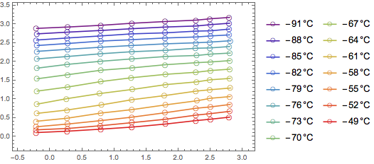
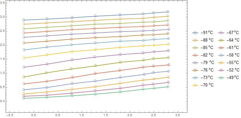
 PlotLegends -> Quantity[temps, "DegreesCelsius"]]

enter image description here

as I find it helps guide the eyes. If the data is somewhat jumbled, though, this might not be enough variation to distinguish between the lines, so adding Dashing and/or different PlotMarkers will help.

1. The markers are on top of the line, at least in v10, as they are in the Graphics object after the lines. If you are brave, you can look at the output using

InputForm@plot

But, that tends to be very noisy, and can be overwhelming. Instead, you can extract those primitives from the plot directly,

Cases[plot, prim : _Inset | _Line :> Head@prim, -1]
(* Line, Line, Line, Line, Line, Line, Line, Line, Line, Line, Line, 
Line, Line, Line, Line, Inset, Inset, Inset, Inset, Inset, Inset, 
Inset, Inset, Inset, Inset, Inset, Inset, Inset, Inset, Inset}
*)

which as you can see shows that Line always occurs before Inset which is used for the plot markers.

2. I would not use RandomReal to determine the spacing here as you found out it gives visually unpleasant results. I would stick to the constructs used within Dotted and Dashed with maybe one addition.

{Dotted, Dashed} 
(* {Dashing[{0, Small}], Dashing[{Small, Small}], 
 Dashing[{0, Small, Small, Small}]} *)

From this, you can construct your own dashing spec, e.g.

Clear[mDashing, dot, dash, longdash];
SetAttributes[mDashing, HoldFirst];
mDashing[spec : {(dot | dash | longdash) ..}] :=
  Block[{dot = Sequence[0, Small], 
   dash = Sequence[Small, Small], 
   longdash = Sequence[Large, Small]},
   Dashing[spec]
  ]

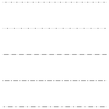
where I added longdash as the results were reasonable. With this you can easily reproduce the built-in forms using {dot}, {dash}, or {dot, dash}, but it becomes more useful in specifying other patterns, e.g.

Graphics[MapIndexed[{#, Line[{{0, -#2[[1]]}, {1, -#2[[1]]}}]} &, 
  {mDashing[{dot, dot, dash}], mDashing[{dot, dot, dot, dash}],
   mDashing[{dot, longdash}], mDashing[{dash, longdash}],
   mDashing[{dot, dash, dot, longdash}]}],
 AspectRatio -> 1]

enter image description here

But, to make the data sets distinguishable, I would not rely just on the style of the lines, but, instead, use a combination of Dashing specs and PlotMarkers as together they give you a reasonable range without having to generate a large number of unique dashing specs.

3. Yes, there are a couple of answers on this site that give you a wide range of options with regards to markers. Alexey in particular has some very well written answers on it. But, you might want to check out ChartElementData["PlotMarkers"].

4. In the language developed for plotting/charting, these are labels, not legends. The semantic distinction is immaterial for most concerns, but the implementation for this is not in, yet. But, when it is, you would wrap each data set in Labeled[dataset, label, position].

$\endgroup$
4
  • $\begingroup$ Amazing! I learn a lot of things! $\endgroup$
    – Dimitris
    Commented Sep 23, 2015 at 14:11
  • $\begingroup$ @dimitris I added an additional bit of code to add a rainbow color scheme to the plot. I think this helps guide the eye when dealing with data at different temperatures (or, any other auxiliary data). $\endgroup$
    – rcollyer
    Commented Sep 23, 2015 at 14:32
  • $\begingroup$ @rcollyer The triangle plot markers in the ChartElementData["PlotMarkers"] are implemented incorrectly like it was in themes: for example RegionCentroid@ChartElementData["EmptyMarkers"][[4, 1, 1, 2, 2]] returns {0.5, 0.355667} what even does not coincide with the center of the graph: RegionCentroid@ChartElementData["EmptyMarkers"][[4, 1, 1, 1, 3]] returns {1/2, 0.45} (but it would be much better if centroids placed at {0, 0} as it is currently implemented in themes). Probably it's worth to fill a bug report? $\endgroup$ Commented Sep 26, 2015 at 9:43
  • $\begingroup$ @AlexeyPopkov sure, send it in. $\endgroup$
    – rcollyer
    Commented Sep 28, 2015 at 12:33
0
$\begingroup$
data2 = {{-0.209091, 2.89296}, {0.281818, 2.92958}, {0.8, 
    2.97535}, {1.28182, 3.03028}, {1.8, 3.07606}, {2.28182, 
    3.11268}, {2.5, 3.1493}, {2.8, 3.18592}, {-0.2, 
    2.74648}, {0.272727, 2.79225}, {0.8, 2.83803}, {1.27273, 
    2.8838}, {1.80909, 2.92958}, {2.28182, 2.95704}, {2.50909, 
    2.99366}, {2.8, 3.03028}, {-0.209091, 2.58169}, {0.272727, 
    2.63662}, {0.790909, 2.69155}, {1.27273, 2.74648}, {1.8, 
    2.77394}, {2.28182, 2.81972}, {2.50909, 2.82887}, {2.8, 
    2.87465}, {-0.2, 2.43521}, {0.281818, 2.49014}, {0.8, 
    2.55423}, {1.27273, 2.59085}, {1.8, 2.63662}, {2.28182, 
    2.66408}, {2.50909, 2.69155}, {2.8, 2.71901}, {-0.2, 
    2.27958}, {0.281818, 2.33451}, {0.790909, 2.38944}, {1.27273, 
    2.43521}, {1.80909, 2.48099}, {2.28182, 2.50845}, {2.5, 
    2.52676}, {2.81818, 2.56338}, {-0.2, 2.07817}, {0.272727, 
    2.14225}, {0.790909, 2.21549}, {1.28182, 2.27042}, {1.80909, 
    2.30704}, {2.27273, 2.36197}, {2.5, 2.37113}, {2.8, 
    2.40775}, {-0.2, 1.83099}, {0.272727, 1.93169}, {0.790909, 
    2.01408}, {1.28182, 2.07817}, {1.80909, 2.14225}, {2.29091, 
    2.16972}, {2.50909, 2.20634}, {2.80909, 2.2338}, {-0.2, 
    1.54718}, {0.281818, 1.65704}, {0.8, 1.77606}, {1.29091, 
    1.84014}, {1.8, 1.92254}, {2.29091, 1.97746}, {2.50909, 
    1.99577}, {2.80909, 2.03239}, {-0.2, 1.21761}, {0.281818, 
    1.32746}, {0.8, 1.47394}, {1.27273, 1.57465}, {1.80909, 
    1.6662}, {2.28182, 1.72113}, {2.50909, 1.7669}, {2.80909, 
    1.80352}, {-0.2, 0.869718}, {0.263636, 1.0162}, {0.781818, 
    1.15352}, {1.29091, 1.26338}, {1.80909, 1.39155}, {2.29091, 
    1.46479}, {2.5, 1.51972}, {2.80909, 1.55634}, {-0.2, 
    0.622535}, {0.272727, 0.714085}, {0.809091, 0.851408}, {1.28182, 
    0.988732}, {1.79091, 1.09859}, {2.28182, 1.21761}, {2.5, 
    1.25423}, {2.81818, 1.3}, {-0.209091, 0.411972}, {0.272727, 
    0.494366}, {0.8, 0.63169}, {1.28182, 0.723239}, {1.80909, 
    0.851408}, {2.3, 0.961268}, {2.5, 1.02535}, {2.80909, 
    1.07113}, {-0.209091, 0.265493}, {0.281818, 0.338732}, {0.8, 
    0.430282}, {1.28182, 0.521831}, {1.8, 0.640845}, {2.28182, 
    0.759859}, {2.50909, 0.796479}, {2.80909, 0.860563}, {-0.209091, 
    0.183099}, {0.281818, 0.219718}, {0.790909, 0.292958}, {1.28182, 
    0.375352}, {1.80909, 0.466901}, {2.28182, 0.576761}, {2.49091, 
    0.61338}, {2.80909, 0.677465}, {-0.209091, 0.109859}, {0.272727, 
    0.146479}, {0.8, 0.201408}, {1.28182, 0.256338}, {1.80909, 
    0.338732}, {2.28182, 0.430282}, {2.50909, 0.466901}, {2.8, 
    0.521831}};

temps = -{91, 88, 85, 82, 79, 76, 73, 70, 67, 64, 61, 58, 55, 52, 49};
cols = Map[ColorData[{"Rainbow", {-91, -49}}], temps];
dsplit = Split[data2, First@#2 > First@#1 &];
callouts = 
  Callout[#1, #2] & @@@ 
   Transpose[{dsplit, Quantity[temps, "DegreesCelsius"]}];

ListLinePlot[callouts
 , Frame -> True
 , PlotRange -> MinMax[dsplit]
 , PlotRangePadding -> Scaled[.05]
 , Axes -> False
 , ImageSize -> 500
 , PlotStyle -> cols
 , PlotMarkers -> "OpenMarkers"
 , PlotLegends -> Placed[
   LineLegend[cols, Quantity[temps, "DegreesCelsius"]
    , LegendLayout -> {"Row", 3}
    , LegendMarkers -> "OpenMarkers" (*set to None*)
    , LegendMarkerSize -> 20
    , LegendLabel -> Style["Temperatures, °C\n", Bold, 12]
    ], {0.41, -0.01}]
 ]

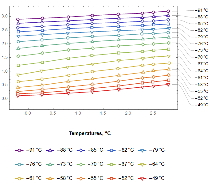
enter image description here


Some thoughts and after thoughts:

  1. The individual traces are easy to identify and read on black and white printed output.

  2. Markers are above the traces. If PlotMarkers are all circular, then these would be hard to identify on black and white printed output. A broken dashed legend would be not as helpful.

  3. To aid in identifying traces, the relatively recently introduced Callout command can be used as required.

  4. Identifying plots from colors assumes that users have adequate color vision.

  5. Identifying plots from Dashing requires extra cognitive acuity. Putting this dashed line in the legends leads to difficulty in identification.

$\endgroup$

Your Answer

By clicking “Post Your Answer”, you agree to our terms of service and acknowledge you have read our privacy policy.

Not the answer you're looking for? Browse other questions tagged or ask your own question.