3
$\begingroup$

I would like to plot bivariate data along with the marginal distributions. I've arranged the plots in a GraphicsGrid as below but the marginals are centered away from the bivariate plot and I wonder if there isn't a better way.

There are several related questions but none that I can find that quite work for what I'd like to do. For example, Visualization of Bivariate Distributions and Align plots with a shift.

Here is the GraphicsGrid version using PDF plots, (I'll have Histograms and a Listplot in the actual version.)

Module[{jointPDF, marg1PDF, marg2PDF, mu1, mu2, s1, s2, rho, size,
        jointPlot, marg1Plot, marg2Plot, x1, x2},

  mu1 = mu2 = 0;
  s1 = s2 = 1;
  rho = 0.4;
  jointPDF = PDF[MultinormalDistribution[{mu1,mu2}, {{s1, rho}, {rho, s2}}],{x1, x2}];
  marg1PDF = PDF[NormalDistribution[mu1, s1], x1];
  marg2PDF = PDF[NormalDistribution[mu2, s2], x2];
  size = 300;

  jointPlot = ContourPlot[jointPDF, {x1, -4, 4}, {x2, -4, 4}, AspectRatio -> 1, ImageSize -> size, Contours -> 15, ContourShading -> None];
  marg1Plot = Rotate[Plot[marg1PDF, {x1, -4, 4}, Axes -> False, ImageSize -> size, AspectRatio -> 1/3], -Pi/2];
  marg2Plot = Rotate[Plot[marg2PDF, {x2, -4, 4}, Axes -> False, ImageSize -> size, AspectRatio -> 1/3], Pi];

  GraphicsGrid[{
     {jointPlot, marg1Plot},
     {marg2Plot,}
   }]
]

Which produces this output: enter image description here
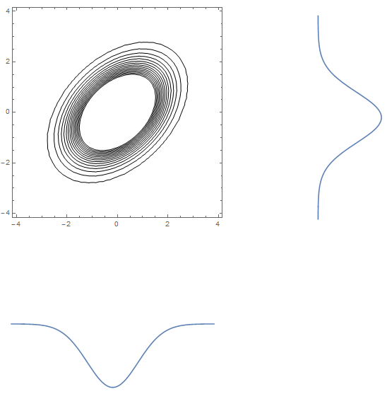
I'd like the marginals to sit more tightly on the joint distribution's plot axes but can't figure out how.

Thanks.

$\endgroup$
3

2 Answers 2

6
$\begingroup$

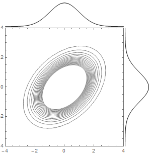
Epilog may be useful to you:

Module[{jointPDF, marg1PDF, marg2PDF, mu1, mu2, s1, s2, rho, size, 
  jointPlot, marg1Plot, marg2Plot, x1, x2}, mu1 = mu2 = 0;
 s1 = s2 = 1;
 rho = 0.4;
 jointPDF = 
  PDF[MultinormalDistribution[{mu1, 
     mu2}, {{s1, rho}, {rho, s2}}], {x1, x2}];
 marg1PDF = PDF[NormalDistribution[mu1, s1], x1];
 marg2PDF = PDF[NormalDistribution[mu2, s2], x2];
 size = 300;
 jointPlot = 
  ContourPlot[jointPDF, {x1, -4, 4}, {x2, -4, 4}, 
       AspectRatio -> 1, 
       ImageSize -> size, Contours -> 15, ContourShading -> None,
       Epilog -> {
         Line[Table[{x1, 4.1 + 4 marg1PDF}, {x1, -4, 4, .1}]],
         Line[Table[{4.1 + 4 marg2PDF, x2}, {x2, -4, 4, .1}]]
       },
       PlotRangePadding -> 0, 
       PlotRangeClipping -> False, 
       ImagePadding -> {{10, 55}, {20, 55}}
   ]
 ]

enter image description here

$\endgroup$
1
  • $\begingroup$ Sjoerd, brilliant, thank you. I had not thought of using Epilog because I was focused on using Histogram for the marginals and spent a lot of time trying to get Rotate and Translate to work. However, I think I can make your answer work on the Histograms by using an Interpolation on BinList and then using this interpolation function as the margPDF's in your answer. I think this will do. Many thanks. $\endgroup$
    – pjc42
    Commented Mar 23, 2015 at 18:32
2
$\begingroup$

There was also a very complete answer to my question given in a near duplicate as pointed out by Lou in the comment above, see: How can I make an X-Y scatter plot with histograms next to the X-Y axes?.

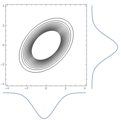
In my example, a simple change from GraphicsGrid to Grid fixed the issue with the marginal plots standing off so far.

Module[
 {jointPDF, marg1PDF, marg2PDF, mu1, mu2, s1, s2, rho, size, jointPlot, marg1Plot, marg2Plot, x1, x2},

  mu1 = mu2 = 0;
  s1 = s2 = 1;
  rho = 0.4;
  jointPDF = PDF[MultinormalDistribution[{mu1,mu2}, {{s1, rho}, {rho, s2}}],{x1, x2}];
  marg1PDF = PDF[NormalDistribution[mu1, s1], x1];
  marg2PDF = PDF[NormalDistribution[mu2, s2], x2];
  size = 300;

  jointPlot = ContourPlot[jointPDF, {x1, -4, 4}, {x2, -4, 4}, AspectRatio -> 1, ImageSize -> size, Contours -> 15, ContourShading -> None];
  marg1Plot = Rotate[Plot[marg1PDF, {x1, -4, 4}, Axes -> False, ImageSize -> size, AspectRatio -> 1/3], -Pi/2];
  marg2Plot = Rotate[Plot[marg2PDF, {x2, -4, 4}, Axes -> False, ImageSize -> size, AspectRatio -> 1/3], Pi];

  Grid[{
     {jointPlot, marg1Plot},
     {marg2Plot,},
     Spacings -> {0.75, 0}
   }]
]

The Spacings-> {0.75,0} deals with the additional space of axes labels in the y direction.

The amended code produces this: enter image description here

Many thanks to Lou and Sjoerd for their help.

$\endgroup$
2
  • 3
    $\begingroup$ If you look closely at the alignment of the marginal distributions in this answer, the peaks do not align with the means (peaks are not at zero). This is caused by the different padding/spacing of the plots. The use of Epilog in @Sjoerd's answer avoids this issue by using the same frame of reference. $\endgroup$
    – Bob Hanlon
    Commented Mar 24, 2015 at 2:42
  • $\begingroup$ You're right, good point. Thanks. $\endgroup$
    – pjc42
    Commented Mar 24, 2015 at 18:13

Your Answer

By clicking “Post Your Answer”, you agree to our terms of service and acknowledge you have read our privacy policy.

Not the answer you're looking for? Browse other questions tagged or ask your own question.