19
$\begingroup$

I want to chart data using a BarChart, the labels on the x-axis are numbers. Unfortunately they are so close to each other it really looks strange and more like one huge number. How can I add a spacing between the labels?

The relevant piece of code:

datalist = {{12, 1, 1}, {13, 0, 1}, {19, 3, 1}, {20, 5, 2}, {21, 5, 2}, 
{22, 1, 9}, {23, 18, 20}, {24, 3, 3}, {26, 1, 15}, {27, 12, 4}, {28, 8, 9}, 
{29, 4, 6}, {30, 3, 5}, {31, 2, 3}, {32, 0, 5}, {33, 7, 2}, {34, 14, 2},
{35, 1, 6}, {36, 1, 0}, {37, 3, 8}, {39, 1, 1}, {40, 1, 15}, {42, 3, 1},
{44, 1, 3}, {47, 12, 0}, {50, 9, 1}, {51, 0, 1}, {52, 0, 3}, {53, 1, 1},
{56, 1, 1}, {58, 12, 1}, {62, 3, 1}, {67, 1, 0}, {71, 5, 3}, {80, 1, 2}};

BarChart[datalist[[All, {2, 3}]], ChartLayout -> "Stacked", 
    ChartLabels -> { Transpose[datalist][[1]], None}]
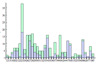
enter image description here

$\endgroup$
0

4 Answers 4

18
$\begingroup$

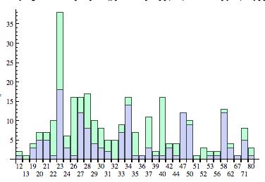
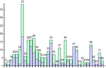
Here's one approach, which modifies the labels slightly to shift some of the labels down a bit.

BarChart[datalist[[All, {2, 3}]], ChartLayout -> "Stacked", 
   ChartLabels -> {
      MapIndexed[If[OddQ[First[#2]], #, Column[{"", #}]] &, Transpose[datalist][[1]]], 
      None
      }]

enter image description here

$\endgroup$
4
  • 2
    $\begingroup$ That's clever. I never would have though of replacing every other label with Column["", label], +1. $\endgroup$
    – rcollyer
    Commented Apr 18, 2012 at 14:42
  • $\begingroup$ @rcollyer It assumes that the labels are sufficiently short. Hopefully we'll get some more solutions. (I can think of at least two, in addition to an alternative way of doing what mine does.) $\endgroup$ Commented Apr 18, 2012 at 15:16
  • $\begingroup$ You're right about that assumption. An immediate alternative is rotating them 90 Degree. $\endgroup$
    – rcollyer
    Commented Apr 18, 2012 at 15:20
  • $\begingroup$ Posted it, low hanging fruit and all. $\endgroup$
    – rcollyer
    Commented Apr 18, 2012 at 15:27
13
$\begingroup$

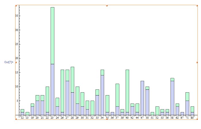
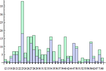
Or Use ImageSize and BarSpacing

datalist = {{12, 1, 1}, {13, 0, 1}, {19, 3, 1}, {20, 5, 2}, {21, 5, 
   2}, {22, 1, 9}, {23, 18, 20}, {24, 3, 3}, {26, 1, 15}, {27, 12, 
   4}, {28, 8, 9}, {29, 4, 6}, {30, 3, 5}, {31, 2, 3}, {32, 0, 
   5}, {33, 7, 2}, {34, 14, 2}, {35, 1, 6}, {36, 1, 0}, {37, 3, 
   8}, {39, 1, 1}, {40, 1, 15}, {42, 3, 1}, {44, 1, 3}, {47, 12, 
   0}, {50, 9, 1}, {51, 0, 1}, {52, 0, 3}, {53, 1, 1}, {56, 1, 
   1}, {58, 12, 1}, {62, 3, 1}, {67, 1, 0}, {71, 5, 3}, {80, 1, 
   2}}; BarChart[datalist[[All, {2, 3}]], ChartLayout -> "Stacked", 
 ChartLabels -> {Transpose[datalist][[1]], None}, 
 ImageSize -> Scaled[1], BarSpacing -> .5]

enter image description here

$\endgroup$
9
$\begingroup$

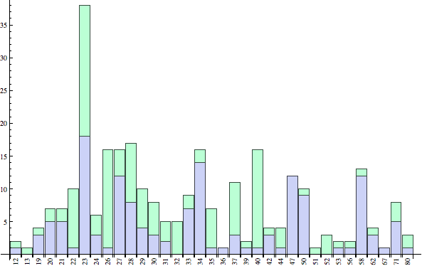
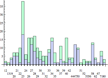
An alternative is to rotate the labels by 90 degrees:

BarChart[datalist[[All, {2, 3}]], ChartLayout -> "Stacked", 
   ChartLabels -> {
      Map[Rotate[Text[#], π/2] &, Transpose[datalist][[1]]],  
      None
   }
]

enter image description here

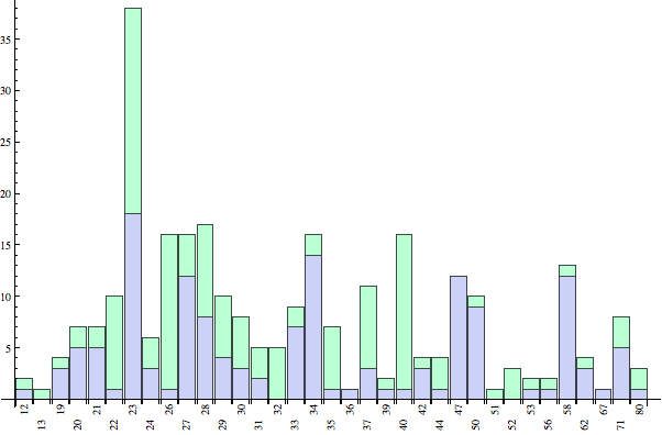
Or, if you prefer some extra spacing, here's another one which adapts Brett's method:

BarChart[datalist[[All, {2, 3}]],
   ChartLayout -> "Stacked", 
   ChartLabels -> {
    MapIndexed[
     With[{rottext =  Rotate[Text[#], π/2], odd = OddQ[First@#2]},
        If[odd, rottext, Column[{"", rottext}]]
     ] &, 
     Transpose[datalist][[1]]
    ], 
    None
 }]

enter image description here

$\endgroup$
0
5
$\begingroup$

Personally I prefer Brett's solution, but I wanted to show a few alternative ways to move the chart labels vertically so they are away from each other.

BarChart[datalist[[All, {2, 3}]], ChartLayout -> "Stacked", 
  ChartLabels -> {Placed[datalist[[All, 1]], Above], None}]

enter image description here

This version works much better if the labels are regularly spaced numbers. I prefer AdjustmentBox to Column because it allows more control.

BarChart[datalist[[All, {2, 3}]], ChartLayout -> "Stacked", 
 ChartLabels -> {Placed[datalist[[All, 1]], Axis, 
    DisplayForm@AdjustmentBox[#, BoxBaselineShift -> 2 Mod[#, 3]] &], 
   None}]

enter image description here

Depending on your operating system and font, you can get some help from the FontTracking option:

BarChart[datalist[[All, {2, 3}]], ChartLayout -> "Stacked", 
 ChartLabels -> {Placed[datalist[[All, 1]], Axis, 
    Style[#, FontTracking -> "Narrow"] &], None}]

enter image description here

$\endgroup$

Your Answer

By clicking “Post Your Answer”, you agree to our terms of service and acknowledge you have read our privacy policy.

Not the answer you're looking for? Browse other questions tagged or ask your own question.