1
$\begingroup$

I have a list of points, that may have clusters in some of the $x$ axis values, and my goal is to get a function that shows that graphically.

Something like this, but the red function is "hand drawn", it's just for reference.
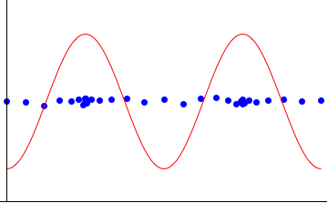
frequency plot

The high points of the red plot shows where the clusters are and the low points where are the points that are most isolated.

$\endgroup$
2

1 Answer 1

4
$\begingroup$
values = Transpose[{Join[
     RandomVariate[NormalDistribution[1.5, 0.3], 100], 
     RandomVariate[NormalDistribution[3.5, 0.3], 100]], 
    RandomVariate[NormalDistribution[1.5, 0.1], 200]}];
Overlay[{ListPlot[values, PlotRange -> {{0, 5}, {0, 2}}, 
   ImagePadding -> 25], 
  SmoothHistogram[values[[All, 1]], Axes -> False, 
   PlotRange -> {{0, 5}, {0, All}}, ImagePadding -> 25]}]

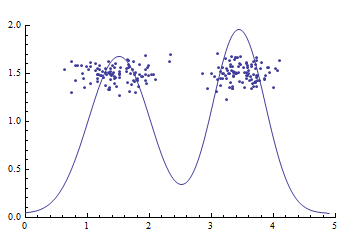
enter image description here

$\endgroup$

Your Answer

By clicking “Post Your Answer”, you agree to our terms of service and acknowledge you have read our privacy policy.

Not the answer you're looking for? Browse other questions tagged or ask your own question.