4
$\begingroup$

How to construct a contour plot so that positive contour lines are colored red and negative contour lines are colored blue. I tried using functions to set the color, but I always got lines colored the same color. Thank you in advance

colorData = data[[All, 6]];
colorFunction[colorData_] := If[colorData > 0, Green, Blue];
f = ColorData["AvocadoColors"];
 
lapPlot = 
 ListContourPlot[lapPlane[[All, {4, 5, 6}]], PlotLegends -> Automatic,
   Contours -> 100, ContourShading -> None, 
  ContourLabels -> Automatic, 
  ContourStyle -> f /@ Rescale[colorData]]

Unfortunately, due to the large size, I am unable to load all the input data. input data enter link description here

https://dropmefiles.com/q8B3n

$\endgroup$
3
  • 2
    $\begingroup$ Try Show[ContourPlot[for negatives in blue], Contourplot[for positives in red]] $\endgroup$
    – Bill
    Commented Apr 18 at 1:53
  • $\begingroup$ The result of ContourPlot[Sin[x + y], {x, -Pi, Pi}, {y, -Pi, Pi}, ColorFunction -> Function[{x, y}, If[TrueQ[Sin[x*y] >= 0], Blue, Red]], PlotPoints -> 50 ] is not true. $\endgroup$
    – user64494
    Commented Apr 18 at 8:40
  • $\begingroup$ Thanks for the tip. I tested this option [Show], but unfortunately, it doesn't work. $\endgroup$
    – user98502
    Commented Apr 18 at 13:04

2 Answers 2

3
$\begingroup$

Update:

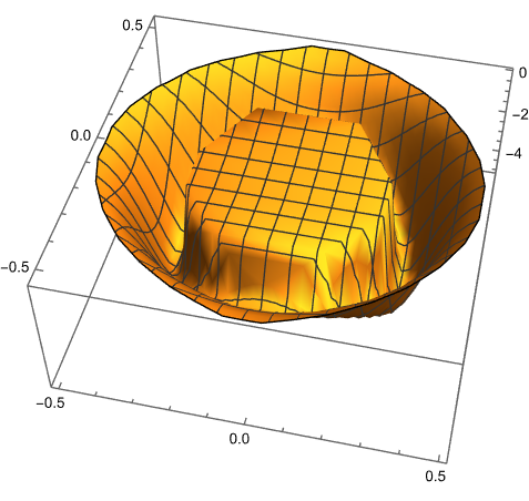
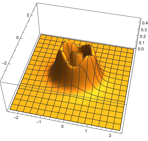
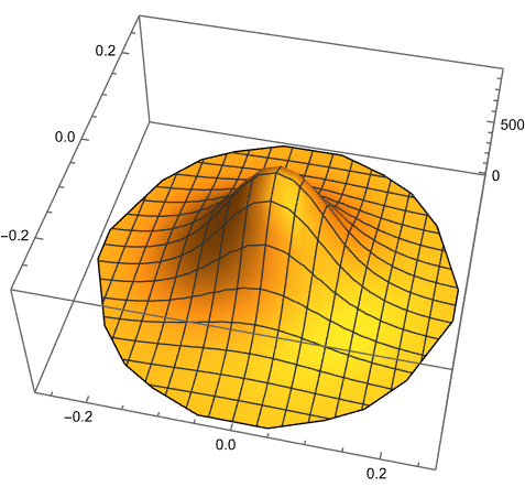
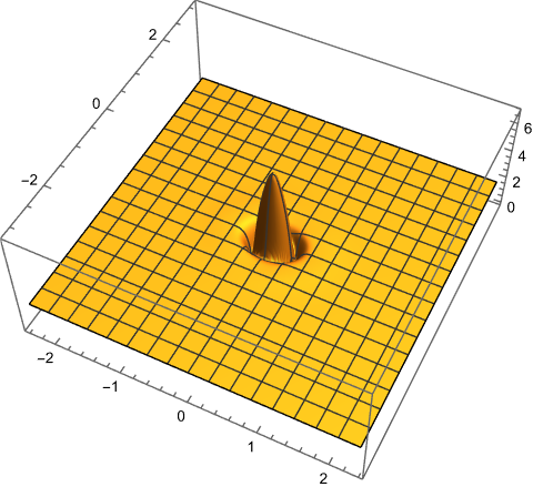
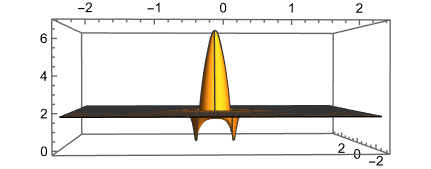
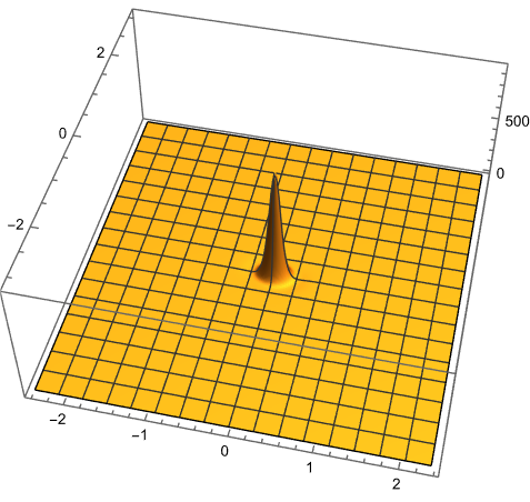
Here is a depiction of the data by ListPlot3D. The data can be separated into three groups by the third value.

On the first image the whole data is used but all that can be seen is just the positive data with #[[3]] > 0.46 because the other values are to small compared to it.

On the next three images you can see data from the three groups separately.

data = ImageData[Import["https://i.sstatic.net/TMXaHoiJ.png"], "Byte"] // 
   Flatten // FromCharacterCode // Uncompress;
ListPlot3D[data, PlotRange -> All]
ListPlot3D[Select[data, #[[3]] < 0 &], PlotRange -> All]
ListPlot3D[Select[data, 0 < #[[3]] < 0.46 &], PlotRange -> All]
ListPlot3D[Select[data, #[[3]] > 0.46 &], PlotRange -> All]

enter image description here

enter image description here

enter image description here

enter image description here

Another way to depict the data is to use logarithm on third value so that details of each group of data are visible.

ListPlot3D[{#[[1]], #[[2]], Log[#[[3]] + 6]} & /@ data, 
 PlotRange -> All]

enter image description here

enter image description here

Original answer:

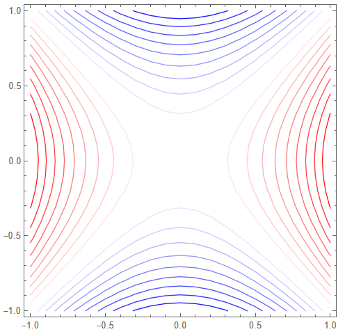
data = Flatten[
   Table[{x, y, x^2 - (y)^2}, {x, -1, 1, 0.1}, {y, -1, 1, 0.1}], 1];
mm = MinMax@data[[All, 3]];
d = 0.1;
cont = Table[{Rescale[k, {0, 1}, mm], 
    Blend[{Blue, White, Red}, k]}, {k, 0, 1, d/(mm[[2]] - mm[[1]])}];
ListContourPlot[data, ContourShading -> None, Contours -> cont]

enter image description here

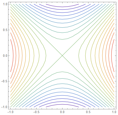
With ColorData["Rainbow"][k] instead of Blend[{Blue, White, Red}, k].

enter image description here

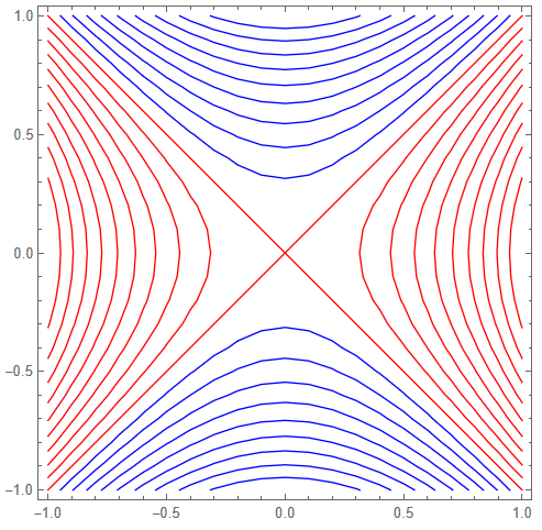
With If[k < 0.5, Blue, Red] instead of Blend[{Blue, White, Red}, k].

enter image description here

data stored in image:

$\endgroup$
5
  • $\begingroup$ I know this option. However, it is necessary that there was no fill between the contours, but the lines themselves were painted. $\endgroup$
    – user98502
    Commented Apr 18 at 19:15
  • $\begingroup$ @user98502 I edited my answer. $\endgroup$ Commented Apr 19 at 8:30
  • $\begingroup$ Thank you for answering my question. This is truly a great solution. However, I don't have enough experience to understand why this didn't work with my data. $\endgroup$
    – user98502
    Commented Apr 20 at 14:54
  • $\begingroup$ I would like to express my gratitude to everyone who took the time to provide answers and suggestions. I believe this issue can be considered resolved, as I have been advised by a moderator to open a new question that specifically addresses the processing of my data. I appreciate your assistance and look forward to resolving my data processing concerns in the new thread. <mathematica.stackexchange.com/questions/302159/…> $\endgroup$
    – user98502
    Commented Apr 20 at 15:20
  • $\begingroup$ @user98502 Did you have at look at your data? Negative values are in the range roughly (-5,0). Then there are lots of positive extremely small values and then there are positive values in the range (0.5,970). So it is like you were surprised that why you do not see any people on the image of whole Earth or why you do not see the whole Earth on image of one person. I will update my answer. $\endgroup$ Commented Apr 20 at 15:51
1
$\begingroup$

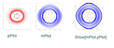
To get positive and negative values I used the Select function

pData = Select[data, #[[4]] > 0 &];
mData = Select[data, #[[4]] < 0 &];
pPlot = 
 ListContourPlot[pData[[All, {1, 2, 4}]], PlotLegends -> Automatic,
   Contours -> 50, ContourShading -> None, ContourLabels -> Automatic,
   ContourStyle -> Red ]
 mPlot = ListContourPlot[mData[[All, {1, 2, 4}]], PlotLegends -> Automatic,
   Contours -> 50, ContourShading -> None, ContourLabels -> Automatic,
   ContourStyle -> Blue ]

enter image description here

True, I can’t figure out why the result of the negative graph is very strange

$\endgroup$
1
  • $\begingroup$ I uploaded data to an external server $\endgroup$
    – user98502
    Commented Apr 18 at 19:13

Your Answer

By clicking “Post Your Answer”, you agree to our terms of service and acknowledge you have read our privacy policy.

Not the answer you're looking for? Browse other questions tagged or ask your own question.