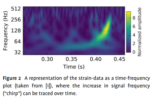
In a paper that analyzes the data from GW150914, a time-frequency plot was shown.
The paper proposes that, quote:
An approximate version of the time-frequency evolution can also be obtained directly by measuring the time differences $t$ between successive zero-crossings and estimating $f_{GW} = 1/(2\Delta t)$, without assuming a waveform model
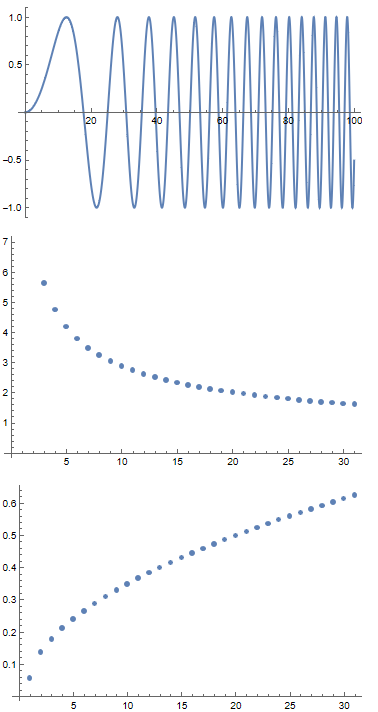
I would like to create this alternative version. So far I have already obtained data from successive zero crossings and used $f_{GW} = 1/(2\Delta t)$ to generate a list of frequencies. However I am a bit confused on how to plot it vs. time as the two arrays have different dimensions. Also because frequency at a single time doesn't make sense to me.
I looked up some time-frequency analysis technique, but they all use some form of Fourier Transform. Can anyone shed some light on how might I proceed?


