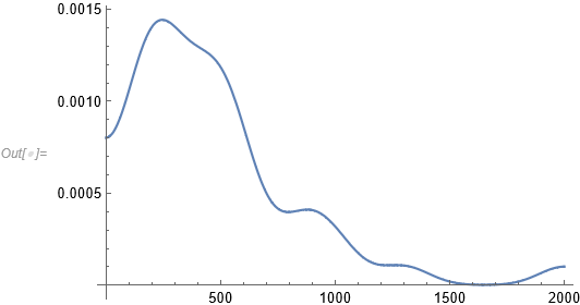
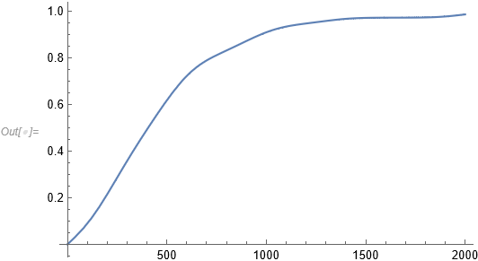
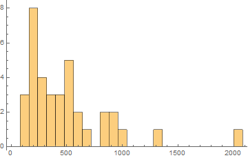
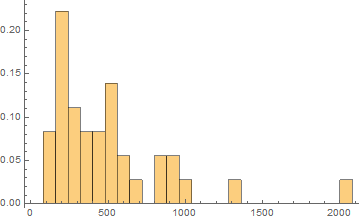
I don't know if I will be clear about what I am asking for, but here is my problem: how could I create a histogram (with the probability curve, later) when I have many different values (each one with frequency equals to one), in such a way that in the $x$ axis I put ranges (like: $0$ to $80$, $80$ to $160$, $160$ to $240$ and so on) and on the $y$ axis I have the frequency, that is the number of values that lie within the $x$ range?
To say, the list of my values is:
$200,540,563,1031,458,957,200,800,226,314,517,210,900,160,432,380,89,1300,850,120,350,222,243,600,300,173,549,80,500,162,500,450,2000,300,647,371$
I know I have to use BarChart. I just cannot get how to create a range on the $x$ axis and the frequency over $y$ axis.
Thank you!


Histogram[data, {80}]wheredatais the list of values? $\endgroup$