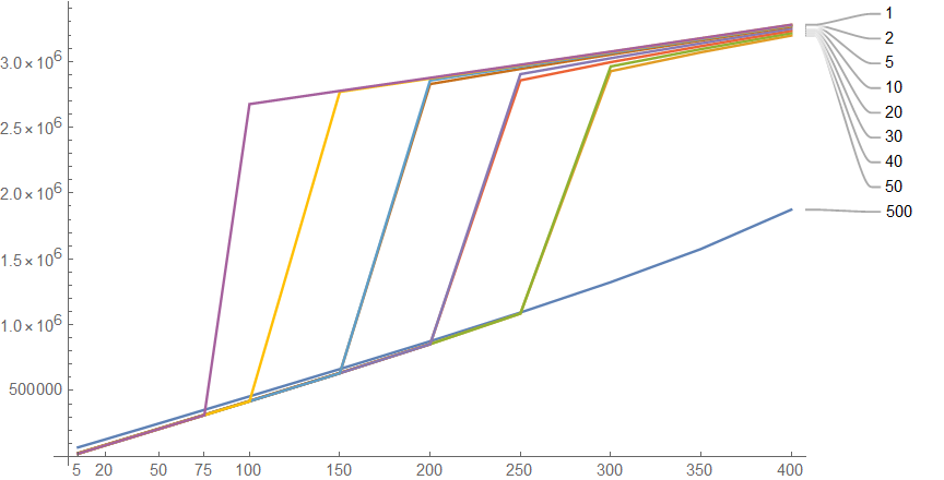
I'm capitalizing on someone else's work with regard to steam tables. I wanted to make some unusual kind of charts. I can get most of the way to the chart design. But I have trouble with the x-axis, which I'd like it to be the temperature in the calculations (tvalue)
tvalue = {5, 10, 20, 30, 40, 50, 75, 100, 150, 200, 250, 300, 350,400}

pcurve1 =Table[ThermodynamicData["Water","Enthalpy", {"Temperature" -> Quantity[tvalue,"DegreesCelsius"],"Pressure" -> Quantity[i, "Bar"]}], {i, {500, 50, 40, 30, 20,10,5, 2, 1}}];

ListLinePlot[pcurve1,PlotLabels -> {500, 50, 40, 30, 20, 10, 5, 2, 1}, PlotRange -> All]
This produces a chart close to what I want. Except that the x-axis is the sequence from 1 to 14, from the tvalue list. But what I want the x-axis to be is the actual temperatures used to determine the enthalpy (5, 10, 20, etc.). DataRange will insert a range of values, but not consistent with tvalue.
I tried the folks at Wolfram and they told me just to transpose tvalue, and pcurve1. Doesn't work though.
Your thoughts are welcome.


