4
$\begingroup$

I'm trying to teach myself about sampling and filtering — and I'm not sure if I'm misunderstanding the concepts or misapplying Wolfram Language. I started by creating a simple test signal with contributions at 2 and 3 Hz,

f[t_] := Sin[6 Pi t] + Cos[4 Pi t]  

I then created a data set of sampled points

τ = 1/6.5;  
freq = Table[n, {n, -15, 15, τ}]; 
data = Table[f[n], {n, -15, 15, τ}]; 

Plotting the Fourier transform

combine = Partition[Riffle[freq, Abs[Fourier[data]]],2];
ListLinePlot[combine, PlotRange -> {{-7, 7}, All}]

gives

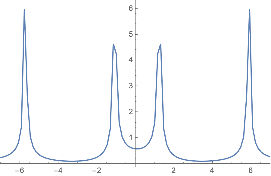
enter image description here

which is not peaking at either 3 or 2 Hz. Furthermore, when I plot

filtered = LowpassFilter[Abs[Fourier[data]], 2.5*Pi]

no discernible filtering occurs. Please, what am I doing wrong?

$\endgroup$

2 Answers 2

5
$\begingroup$

Three important points:

  1. Fourier is symmetrical with half of the data repeated (you see this in your plot)
  2. There is a DC term.
  3. You want to filter the original signal, not the Fourier. And make sure the timestamps are right before doing the filtering.

With this understanding and setting

f[t_] := Sin[6 Pi t] + Cos[4 Pi t];
\[Tau] = 1/6.5;
data = Table[{n, f[n]}, {n, 0, 30, \[Tau]}];
fd = Abs[Fourier[data[[;; , -1]]]];

and

frequencyTerms = Take[Range[0, 6.5, 6.5/196], 98];

Now plotting (only need half):

ListPlot[Transpose[{frequencyTerms, Take[fd, Length[fd]/2]}], 
 PlotRange -> All, Joined -> True, Mesh -> All, Frame -> True, 
 GridLines -> Automatic, 
 FrameLabel -> {"Frequency (Hz)", "Amplitude"}]
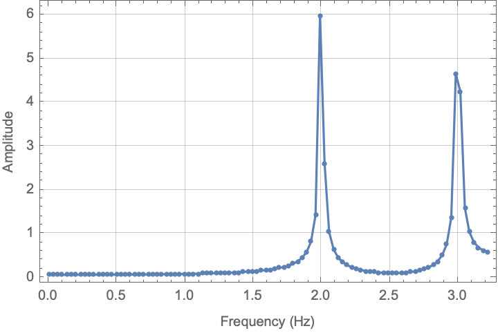
Frequency Response

This is probably close to what you expect.

For the filtering, there is probably a more elegant method, but if you define the data as a time series,

dataTS = TimeSeries[data];

and then apply the filter and convert back to the data only:

filtered = LowpassFilter[dataTS, 2.5 Pi];
filteredData = First@Normal[filtered]; 
fd2 = Abs[Fourier[filteredData[[;; , -1]]]];

and plot

ListPlot[Transpose[{frequencyTerms, Take[fd2, Length[fd2]/2]}], 
 PlotRange -> All, Joined -> True, Mesh -> All, Frame -> True, 
 GridLines -> Automatic, 
 FrameLabel -> {"Frequency (Hz)", "Amplitude"}]
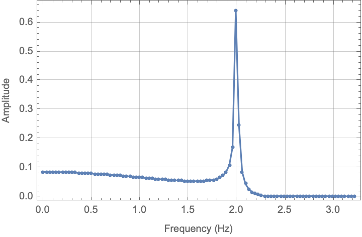
Filtered Frequency Response You get something that is again, closer to expected.

I hope this helps.

=============== Update: I was asked why the amplitude is different for the two frequency components. Here is some modified code to show why that occurs:

samplingFrequency = 100;
f[t_] := Sin[6 Pi t] + Cos[4 Pi t];
\[Tau] = 1/samplingFrequency;
data = Table[{n, f[n]}, {n, 0, 30, \[Tau]}];
fd = Abs[Fourier[data[[;; , -1]]]];
frequencyTerms = 
  Take[Range[0, samplingFrequency, samplingFrequency/Length[data]], 
   Floor[Length[data]/2]];
ListPlot[Transpose[{frequencyTerms, Take[fd, Floor[Length[fd]/2]]}], 
  PlotRange -> All, Joined -> True, Mesh -> All, Frame -> True, 
  GridLines -> Automatic, 
  FrameLabel -> {"Frequency (Hz)", "Amplitude"}]

And here is the corresponding plot: Frequency response with high sample rate
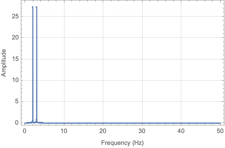
Note that in this picture, the amplitudes are (relatively) the same.

$\endgroup$
4
  • $\begingroup$ The is great -- but why the different amplitudes in the first plot? $\endgroup$
    – GeekyCool
    Commented Feb 1, 2021 at 22:02
  • $\begingroup$ The second plot is for the filtered data and the filtered data has a lower amplitude, which is why the amplitude of the Fourier transform is lower. Note that the filter cutoff frequency is 2.5Hz and the signal of interest is at 2Hz. In contrast to the first plot, note that the amplitude falls from about 0.5Hz until the spike at 2Hz and then significantly thereafter. If you run the code I sent, do this: ListPlot[{dataTS, filtered}, Joined -> True, PlotRange -> {{0, 5}, All}] $\endgroup$
    – Mark R
    Commented Feb 3, 2021 at 1:17
  • $\begingroup$ Thanks -- but I guess I wasn't clear: I meant why do the amplitudes within the first plot differ? $\endgroup$
    – GeekyCool
    Commented Feb 4, 2021 at 18:48
  • $\begingroup$ I'm sorry - I didn't understand your question. The difference is due to the resolution of the sampling relative to the frequency component of the signal. To show this effect, I'll update the answer. $\endgroup$
    – Mark R
    Commented Feb 5, 2021 at 20:11
3
$\begingroup$
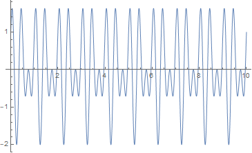
f[t_] := Sin[6 Pi t] + Cos[4 Pi t]
Plot[f[t], {t, 0, 10}]

enter image description here

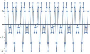
samplingrate = 20.; (* in Hz *)
samples = Table[f[t], {t, 0, 10, 1/samplingrate}];
samplingtimes = Range[0, 10, 1/samplingrate];

ListLinePlot[Transpose[{samplingtimes, samples}], PlotMarkers -> Automatic]

enter image description here

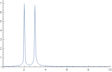
ft = Abs[Fourier[samples]];

ListLinePlot[
 Table[{(x - 1) (samplingrate/Length[samples]), ft[[x]]}, {x, 0, 
   Length[ft]/2}], PlotRange -> All]

enter image description here

peaks = FindPeaks[ft][[All, 1]];
peakfrequencies = 
 Table[(peak - 1) samplingrate/Length[samples], {peak, peaks}]

 (* {1.99005, 2.98507, 17.0149, 18.01} *)
$\endgroup$

Your Answer

By clicking “Post Your Answer”, you agree to our terms of service and acknowledge you have read our privacy policy.

Not the answer you're looking for? Browse other questions tagged or ask your own question.