Edit: I used too large a binwidth for the nonparametric density estimates in my original answer. Here I use the more appropriate "Automatic" choice.
Here is an approximate duplication of your 3 datasets:
SeedRandom[12345];
s1 = RandomVariate[BetaDistribution[40, 1.1], 300];
s2 = RandomVariate[BetaDistribution[10, 1.3], 500];
s3 = RandomVariate[BetaDistribution[15, 3], 300];
And here is the associated set of overlayed histograms:
Histogram[{s1, s2, s3}, {Range[0.4, 1, 0.02]},
 AxesLabel -> {"p", "Count"},
 PlotRange -> {{0.4, 1}, {0, 200}}, ChartLayout -> "Overlapped"]
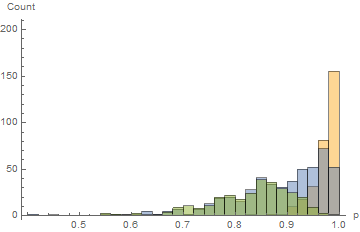
The interpretation is at best confusing because of the 5 different colors, the vertical axis depicts counts (which doesn't account for the different sample sizes), and it just looks like a mess. When one has large sample sizes and believe that the probability density is relatively smooth, one should completely avoid histograms and use nonparametric density estimates. (More sarcastically: one should strive to at least get into the latter half of the 20-th century. Nonparametric density estimation and smooth histograms are not new.)
Here is a comparison of the associated histograms and nonparametric density estimates for the 3 datasets:
(* Histogram of counts using PDF for vertical axis rather than counts *)
h1 = Histogram[s1, {Range[0.4, 1, 0.02]}, "PDF",
   AxesLabel -> {"p", "Count"}, PlotRange -> {{0.4, 1}, {0, 30}}];
h2 = Histogram[s2, {Range[0.4, 1, 0.02]}, "PDF",
   AxesLabel -> {"p", "Count"}, PlotRange -> {{0.4, 1}, {0, 30}}];
h3 = Histogram[s3, {Range[0.4, 1, 0.02]}, "PDF",
   AxesLabel -> {"p", "Count"}, PlotRange -> {{0.4, 1}, {0, 30}}];

(* Nonparametric density estimates *)
skd1 = SmoothKernelDistribution[s1, Automatic, {"Bounded", {0, 1}, "Gaussian"}];
skd2 = SmoothKernelDistribution[s2, Automatic, {"Bounded", {0, 1}, "Gaussian"}];
skd3 = SmoothKernelDistribution[s3, Automatic, {"Bounded", {0, 1}, "Gaussian"}];

(* Histograms and nonparametric density plots *)
Grid[{{
  Show[h1, Plot[PDF[skd1, x], {x, 0.4, 1}, PlotRange -> {{0.4, 1}, {0, 30}},
     PlotStyle -> Red], PlotLabel -> "s1", ImageSize -> Medium, Frame -> True,
     FrameLabel -> (Style[#, Bold, 14] &) /@ {"p", "Probability density"},
     AxesOrigin -> {0.4, 0}, PlotRangePadding -> None],

   Show[h2, Plot[PDF[skd2, x], {x, 0.4, 1}, PlotRange -> {{0.4, 1}, {0, 30}},
     PlotStyle -> Red], PlotLabel -> "s2", ImageSize -> Medium, Frame -> True,
     FrameLabel -> (Style[#, Bold, 14] &) /@ {"p", "Probability density"},
     AxesOrigin -> {0.4, 0}, PlotRangePadding -> None]},

  {Show[h3, Plot[PDF[skd3, x], {x, 0.4, 1}, PlotRange -> {{0.4, 1}, {0, 30}},
     PlotStyle -> Red], PlotLabel -> "s3", ImageSize -> Medium, Frame -> True,
     FrameLabel -> (Style[#, Bold, 14] &) /@ {"p", "Probability density"},
     AxesOrigin -> {0.4, 0}, PlotRangePadding -> None]}}]
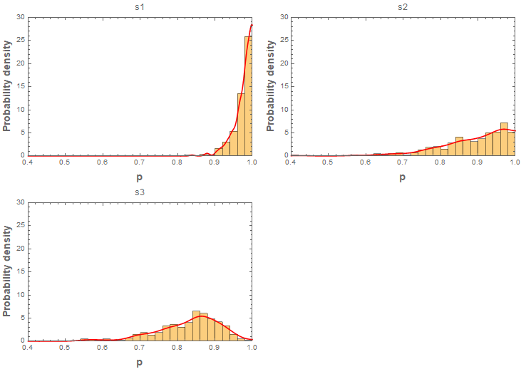
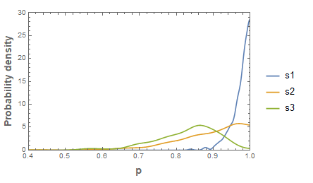
So overlaying the estimates of the probability density functions makes a much cleaner and appropriate comparison:
Plot[{PDF[skd1, x], PDF[skd2, x], PDF[skd3, x]}, {x, 0.4, 1},
 PlotRange -> {{0.4, 1}, {0, 30}}, Frame -> True,
 FrameLabel -> (Style[#, Bold, 14] &) /@ {"p", "Probability density"},
  PlotLegends -> {"s1", "s2", "s3"}, AxesOrigin -> {0.4, 0},
 PlotRangePadding -> None]

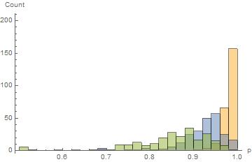


ChartBaseStyle -> Opacity[1]. $\endgroup$SmoothHistogram's orSmoothKernelDistribution's. (With your data you might need the"Bounded"option as it appears that there is a definite maximum at 1.) $\endgroup$