15
$\begingroup$

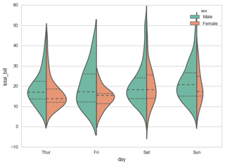
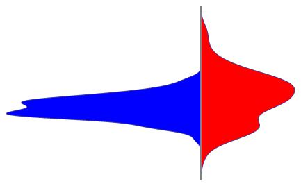
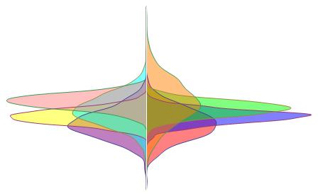
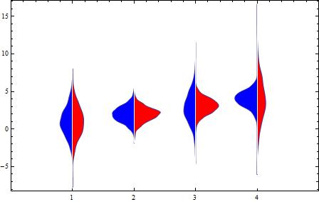
I've been trying to get paired distribution (aka "violin") plots like those shown below for a few hours, but all my attempts have failed.

enter image description here

The key features here are

  1. paired smooth histograms/distribution plots with a common vertical abscissa and divergent horizontal ordinates;
  2. different fill colors for the two subplots;

The closest Mathematica has are DistributionCharts, but these plots are not paired (i.e. they are always symmetrical).


I first tried SmoothHistogram, but it appears that there's no simple way to get a SmoothHistogram with a vertical abscissa.

Next I tried PairedSmoothHistogram, but I can't manage to assign different fill colors to the two sides.

BlockRandom[SeedRandom[0];
 Quiet[
  PairedSmoothHistogram[
   RandomVariate[NormalDistribution[], 100]
   , RandomVariate[NormalDistribution[], 100]
   , AspectRatio -> Automatic
   , Axes -> {False, True}
   , Ticks -> None
   , Spacings -> 0
   , ImageSize -> 30
   , Filling -> Axis
   ]
  , OptionValue::nodef
  ]
 ]

Mathematica graphics

Then I tried a combination of SmoothKernelDistribution and either ListPlot, ParametricPlot or ContourPlot, but this won't work because neither ParametricPlot nor ContourPlot accepts a Fill option, and I can't figure out how to get ListPlot to fill the spaces between the curves and the vertical axis.

For example,

violin[data1_, data2_, rest___] := Module[
  {  d1 = SmoothKernelDistribution[data1]
   , d2 = SmoothKernelDistribution[data2]
   , x
   , xrange
  }, xrange = {x, Sequence @@ (#[data1, data2] & /@ {Min, Max})}
   ; ParametricPlot[ {{-PDF[d1, x], x}, {PDF[d2, x], x}}
                   , Evaluate@xrange
                   , rest
                   , PlotRange -> All
                   , Axes -> {None, True}
                   , Ticks -> None
                   , PlotRangePadding -> {Automatic, None}
                   ]
];

BlockRandom[SeedRandom[0];
 violin[RandomVariate[NormalDistribution[], 100],
        RandomVariate[NormalDistribution[], 100],
        ImageSize -> 30
       ]
]

Mathematica graphics


I didn't expect this would be so hard. My brain is now fried.

Does anyone know how one does this?

$\endgroup$
0

5 Answers 5

15
$\begingroup$

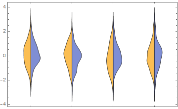
Here is something using a custom ChartElementFunction

Module[{c = 0},
 half[{{xmin_, xmax_}, {ymin_, ymax_}}, data_, metadata_] := (c++;   
   Map[Reverse[({0, Mean[{xmin, xmax}]} + # {1, (-1)^c})] &, 
    First@Cases[
      First@Cases[InputForm[SmoothHistogram[data, Filling -> Axis]], 
        gc_GraphicsComplex :> Normal[gc], ∞], 
      p_Polygon, ∞], {2}])]

(thanks to @halirutan for reminding me about how to do closures in WL).

data = RandomVariate[NormalDistribution[0, 1], {4, 2, 100}];

DistributionChart[data, BarSpacing -> -1, ChartElementFunction -> half]

Mathematica graphics

$\endgroup$
3
  • $\begingroup$ This looks like it has the right areas as I inserted data[[1, 1, All]] = 0.5 data[[1, 1, All]] + 2; and it looks like it is supposed to look. $\endgroup$
    – JimB
    Commented May 11, 2017 at 22:26
  • $\begingroup$ What's the rationale for p_Polygon :> p? (I get the same results if I replace it with just p_Polygon.) $\endgroup$
    – kjo
    Commented May 12, 2017 at 14:03
  • 1
    $\begingroup$ Oh its not needed, just something I forgot to clean up, during some test I was doing. I will change it now. $\endgroup$
    – chuy
    Commented May 12, 2017 at 15:10
8
$\begingroup$

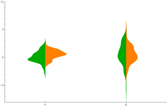
I just followed your approach but rather created tables of the density and associated x-values. I added a shift parameter to violin to allow the placement of each pair of probability density estimates.

violin[data1_, data2_, shift_] := 
 Module[{d1 = SmoothKernelDistribution[data1],
   d2 = SmoothKernelDistribution[data2], x, xrange},
  {xmin1, xmax1} = MinMax[data1];
  {xmin2, xmax2} = MinMax[data2];
  xrange1 = xmax1 - xmin1;
  xrange2 = xmax2 - xmin2;
  (* Create a table of the density values along with the associated x value *)
  pdf1 = Table[{-PDF[d1, x] + shift, x}, {x, xmin1 - 0.2 xrange1, 
     xmax1 + 0.2 xrange1, 1.4 xrange1/100}];
  pdf2 = Table[{PDF[d2, x] + shift, x}, {x, xmin2 - 0.2 xrange2, 
     xmax2 + 0.2 xrange2, 1.4 xrange2/100}];
  (* Construct violin graphic *)
  Show[Graphics[{Darker[Green], EdgeForm[Darker[Green]], 
     Polygon[pdf1]}],
   Graphics[{Orange, EdgeForm[Orange], Polygon[pdf2]}]]]

(* Generate some data *)
data11 = RandomVariate[NormalDistribution[], 100];
data12 = RandomVariate[NormalDistribution[0.5, 1], 100];
data21 = RandomVariate[NormalDistribution[1, 2], 100];
data22 = RandomVariate[NormalDistribution[0.5, 1.5], 100];

Show[ListPlot[{{-1, 3}}, AxesOrigin -> {-1, -8},
  Ticks -> {{{0, "A"}, {2, B}}, Automatic},
  PlotRange -> {{-1, 3}, {-8, 10}}, PlotStyle -> White],
 violin[data11, data12, 0],
 violin[data21, data22, 2],
 ImageSize -> Large]

Violin plot

$\endgroup$
8
$\begingroup$

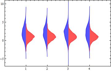
Update: Using GeometricTransformations to post-process SmoothHistogram outputs:

ClearAll[halfSH, pairedSH]
halfSH[side : (Left | Right) : Right][data_, o : OptionsPattern[]] := 
 Module[{i = 1, tr = If[side === Left, ReflectionTransform[{-1, 0}], Identity], 
   col = If[side === Left, Blue, Red]}, 
  Graphics[GeometricTransformation[SmoothHistogram[#, Automatic, "PDF", o, 
   Filling -> Axis, FillingStyle -> Lighter@col, PlotStyle -> col][[1]], 
      Composition[TranslationTransform[{i++, 0}], tr, ReflectionTransform[{1, -1}]]], 
     FilterRules[{o}, Options[Graphics]]] & /@ data]

halfSH[side : (Left | Right) : Right][data_, bwkernel__, 
  o : OptionsPattern[]] := 
 Module[{i = 1, tr = If[side === Left, ReflectionTransform[{-1, 0}], Identity], 
   col = If[side === Left, Blue, Red]}, 
  Graphics[GeometricTransformation[SmoothHistogram[#, bwkernel, o, Filling -> Axis, 
   FillingStyle -> Lighter@col, PlotStyle -> col][[1]], 
     Composition[TranslationTransform[{i++, 0}], tr, ReflectionTransform[{1, -1}]]], 
     FilterRules[{o}, Options[Graphics]]] & /@ data]

pairedSH[bw_: Automatic, df_: "PDF"][{d1_, o1 : OptionsPattern[]}, 
 {d2_, o2 : OptionsPattern[]},  o : OptionsPattern[]] := 
 Show[halfSH[Left][d1, bw, df, o1], halfSH[][d2, bw, df, o2], 
  PlotRange -> {{0, 1 + Length@d1}, Automatic}, o, Frame -> True, 
  FrameTicks -> {{Automatic, Automatic}, {Range[Length@d1], 
     Automatic}}, AspectRatio -> 1/GoldenRatio]

Examples:

{data1, data2} = RandomVariate[NormalDistribution[#, #], {4, 1000}] & /@ {2, 1};

pairedSH[][{data1}, {data2}]

enter image description here

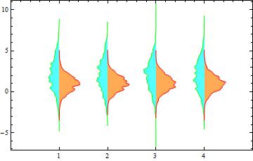
pairedSH[{"Adaptive", 0.3, .5}][{data1, FillingStyle->Lighter[Cyan], PlotStyle->Green}, 
 {data2, FillingStyle -> Lighter@Orange, PlotStyle -> Red}]

enter image description here

Original post:

{data1, data2} = RandomVariate[NormalDistribution[#, #], {4, 1000}] & /@ Range[2];

cedf1 = ChartElementDataFunction["SmoothDensity", "Shape" -> "SingleSided"];
cedf2 = ChartElementDataFunction["SmoothDensity", "Shape" -> "FlippedSingleSided"];

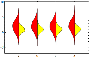
Show[DistributionChart[data1, ChartStyle -> Yellow, BarSpacing -> 2, 
      ChartElementFunction -> cedf1, ChartLabels -> {"a", "b", "c", "d"}], 
 DistributionChart[data2, ChartStyle -> Red, BarSpacing -> 2, 
  ChartElementFunction -> cedf2]]

Mathematica graphics

$\endgroup$
8
  • $\begingroup$ The OP stated "Next I tried PairedSmoothHistogram, but I can't manage to assign different fill colors to the two sides." $\endgroup$ Commented May 11, 2017 at 18:07
  • $\begingroup$ oops, thank you @David. $\endgroup$
    – kglr
    Commented May 11, 2017 at 18:09
  • $\begingroup$ Wow! That is both compact and understandable. $\endgroup$
    – JimB
    Commented May 11, 2017 at 21:28
  • $\begingroup$ Uh, maybe I spoke too soon. My comment still holds but...the areas under the curves should all be equal and they are not. Can that be adjusted? It looks like they are all scaled to the same height rather than the same area. $\endgroup$
    – JimB
    Commented May 11, 2017 at 21:44
  • $\begingroup$ Great function with "halfSH". I use it but I don't succeed to include the bandwith option in SmoothHistogram. $\endgroup$
    – Porty
    Commented Sep 13, 2017 at 9:08
6
$\begingroup$
data1 = RandomVariate[NormalDistribution[], 1000];
data2 = RandomVariate[NormalDistribution[], 1000];
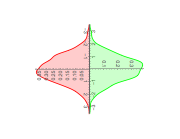
GraphicsRow[{
  Rotate[Graphics[SmoothHistogram[data1, 
     PlotStyle -> Red, 
     Filling -> Axis,
     PlotRange -> {{-3.5, 3.5}, Automatic}]], π/2],
  Rotate[Graphics[SmoothHistogram[data2, PlotStyle -> Green,
     Filling -> Axis, PlotRange -> {{-3.5, 3.5}, Automatic}]], -π/
    2]},
 Spacings -> {-234, 5}
 ]

enter image description here

(You may need to flip one distribution to keep the orientation of the vertical axes the same for the two plots.)

$\endgroup$
0
1
$\begingroup$

Step 1:

I tried PairedSmoothHistogram, but I can't manage to assign different fill colors to the two sides.

It turns out that FillingStyle option setting can be a Function so we can inject the two colors using an appropriate Function as the value of this option.

Example:

SeedRandom[1]
dd1 = RandomVariate[NormalDistribution[1, 2], 100];
dd2 = RandomVariate[NormalDistribution[], 100];
options = {Axes -> {False, True}, Ticks -> None, Filling -> Axis,
   AxesStyle -> Directive[Thickness[.005], Gray], Spacings -> 0};

PairedSmoothHistogram[dd1, dd2, 
 FillingStyle -> Module[{i = 1}, ({{Red, Blue}[[i++]], #} &)], options] 

enter image description here

An alternative, and less convenient, approach is to post-process the PairedSmoothHistogram output

Module[{i = 1}, PairedSmoothHistogram[dd1, dd2, options] /. 
 p_Polygon :> {{ Opacity[1, Blue], Opacity[1, Red]}[[i++]], p}]

which gives the same output.

This method also works for multiple data pairs using a longer list of colors:

SeedRandom[1]
data = Table[RandomVariate[NormalDistribution[c, RandomInteger[{1, 3}]], 
    500], {k, 2}, {c, 4}];
options = {Axes -> {False, True}, Ticks -> None, Filling -> Axis, Spacings -> 0,
    AxesStyle -> Directive[Thin, White]};

colors = Opacity[.5, #] & /@ {Red, Blue, Green, Orange, Purple, Yellow, Cyan, Pink};

PairedSmoothHistogram[##& @@ data, 
 FillingStyle -> Module[{i = 1}, ({colors[[i++]], #} &)], options]

enter image description here

Step 2:

paired smooth histograms/distribution plots with a common vertical abscissa and divergent horizontal ordinates

To get a chart that looks like a DistributionChart we can (1) use PairedSmoothHistogram on individual pairs and (2) combine them with appropriate translations.

The function pshListF creates a list of paired histograms from a data set with multiple data pairs. The function displaceF below (slightly modified version from this answer) performs the necessary translations.

ClearAll[pshListF, displaceF]
pshListF[data_, colors_: {Red, Blue}][o : OptionsPattern[]] := 
 Module[{d = Transpose[data]}, PairedSmoothHistogram[##, 
     FillingStyle -> Module[{i = 1}, ({{Red, Blue}[[i++]], #} &)], o] & @@@ d]

displaceF[p : {__Graphics}, labels_: Automatic, o : OptionsPattern[]] := 
 Module[{d = Accumulate[PlotRange[#][[1, 2]] & /@ p], 
   labeledticks = If[labels == Automatic, Range[Length@p], 
     Thread[{Range[Length@p], labels}]]}, 
  Show[Graphics[Translate[#[[1]], {#2, 0}] & @@@ Transpose[{p, d}]], 
   AspectRatio -> 1/GoldenRatio, PlotRange -> {{0, 1 + Length@p}, Automatic}, 
   Frame -> True, FrameTicks -> {{Automatic, Automatic}, {labeledticks, Automatic}}, o]]

Examples:

displaceF[pshListF[data][ options]]

enter image description here

displaceF[pshListF[data][ options], {"A", "B", "C", "D"}, 
 FrameTicksStyle -> {Automatic, Directive[14, "Panel"]}]

enter image description here

$\endgroup$

Your Answer

By clicking “Post Your Answer”, you agree to our terms of service and acknowledge you have read our privacy policy.

Not the answer you're looking for? Browse other questions tagged or ask your own question.