8
$\begingroup$

I have several data files containing three columns x, y, clas, where x and y are the coordinates on the configuration plane, while clas is an integer indicating the final state of the initial condition. If we plot each initial condition with a different color, corresponding to the particular final state, then we can obtain an interesting color-coded diagram. In my case there are only five possible final states:

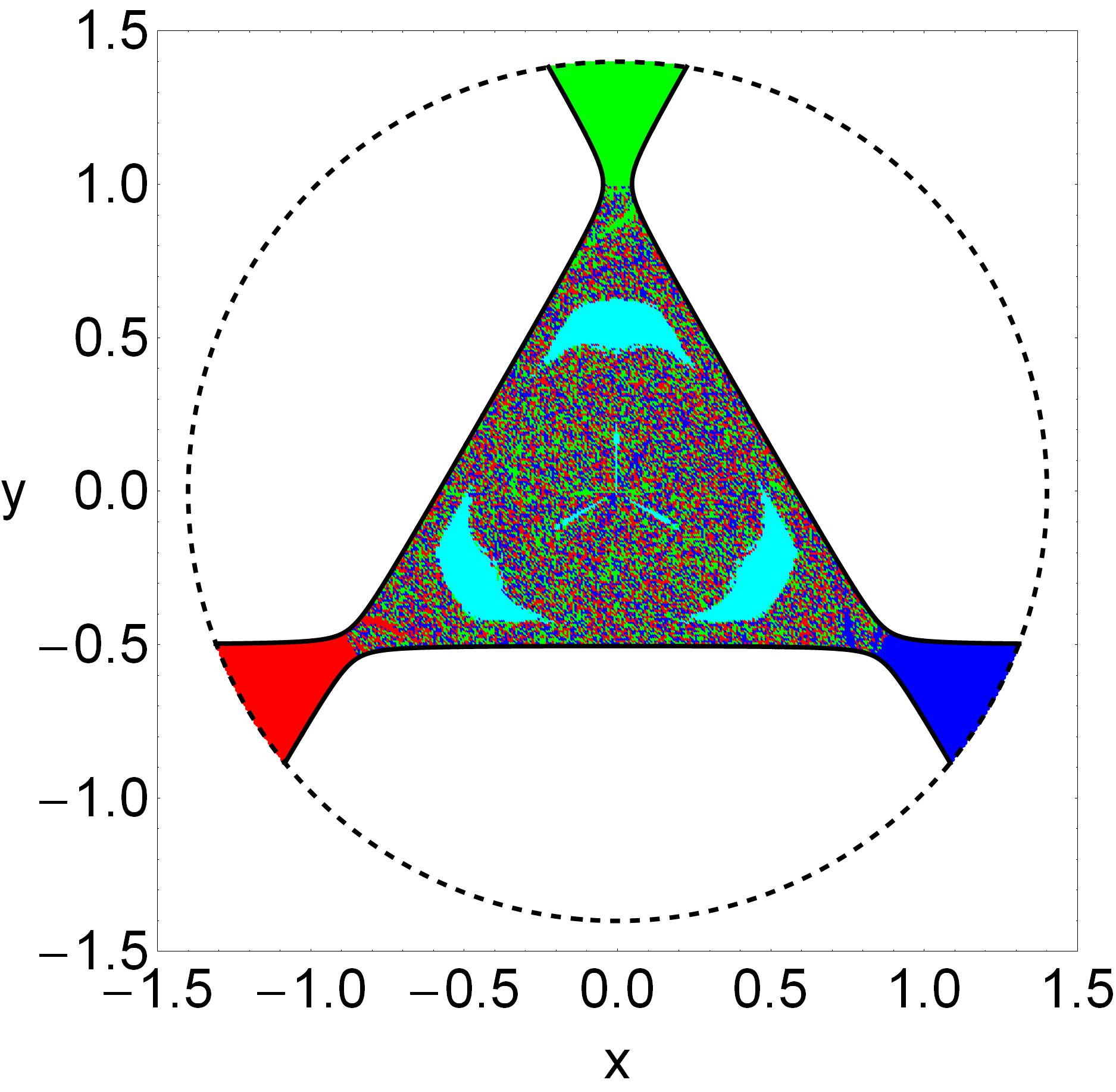
  • clas = -1 ---> The orbit is trapped chaotic (black).

  • clas = 0 ---> The orbit is non-escaping regular (cyan).

  • clas = 1 ---> The orbit escapes from channel #1 (green).

  • clas = 2 ---> The orbit escapes from channel #2 (red).

  • clas = 3 ---> The orbit escapes from channel #3 (blue).

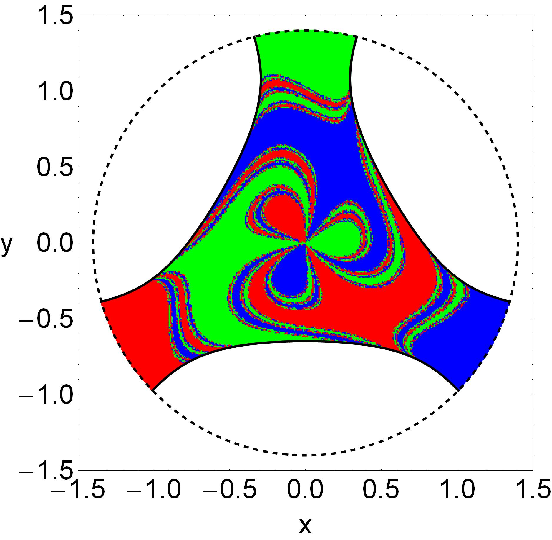
For this data file the corresponding color-coded diagram is the following

enter image description here

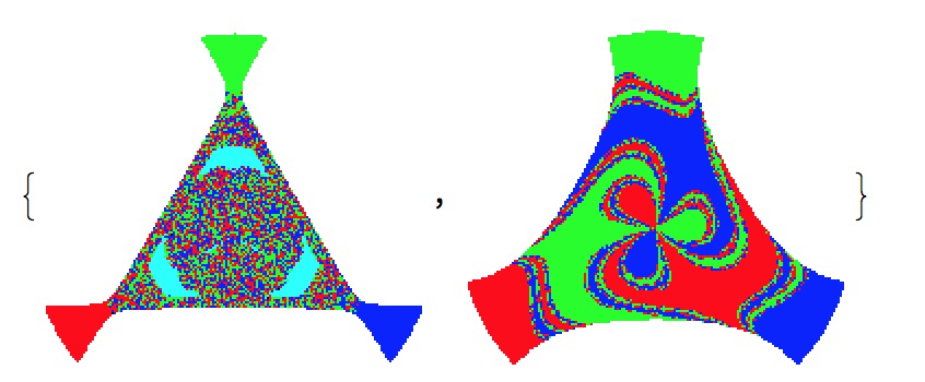
It is seen that in the central region there is a highly complicated (fractal/chaotic) mixture of escaping orbits.

For a much higher total energy the data corresponds to the following color-coded diagram

enter image description here

Now the central region is occupied by extended well-formed basins of escape. By the term "basin" we refer to local sets of initial conditions that lead to the same final state.

Obviously, in the first case it is very difficult, or even impossible, to predict the final state of the initial conditions located in the central region, while in the second case the same task is much easier.

My question: Is there a way to load the data files (with the three columns) into Mathematica and somehow compute the degree of unpredictability/fractality/chaoticity (name it as you want!)? In other words, I want to scan the data files and determine how randomly (or not) the several final states are distributed on the configuration (x,y) plane. The computations should produce a number.

Is this task doable? Any ideas?

Many thanks in advance!

How to create the color-coded diagrams:

m = Import["E017.out", "Table"];

getColor[m_List, i_Integer] := Module[{s = m[[i, 3]]}, 
Which[s == -1, Black, s == 0, Cyan, s == 1, Green, s == 2, Red, s == 3, Blue]];
data = Table[{PointSize[0.005], getColor[m, i], Point[{m[[i, 1]], m[[i, 2]]}]}, 
{i, 1, Length[m]}];

V = 1/2*(x^2 + y^2) - y*(1/3*y^2 - x^2);
h = 0.17;
xmin = 1.5;   
rad = 1.4;

S0 = Graphics[data];

S1 = ContourPlot[V == h, {x, -xmin, xmin}, {y, -xmin, xmin}, 
ContourStyle -> {{Black, Thickness[0.005]}}, AspectRatio -> 1, 
ContourShading -> False, PlotPoints -> 200, 
RegionFunction -> Function[{x, y}, Sqrt[x^2 + y^2] <= rad], 
PerformanceGoal -> "Quality"];

lim = ContourPlot[
Sqrt[x^2 + y^2] == rad, {x, -xmin, xmin}, {y, -xmin, xmin}, 
ContourStyle -> {{Black, Dashed, Thickness[0.005]}}, 
AspectRatio -> 1, ContourShading -> False, PlotPoints -> 200, 
PerformanceGoal -> "Quality"];    

P0 = Show[{S0, S1, lim}, Axes -> False, Frame -> True, 
FrameLabel -> {"x", "y"}, RotateLabel -> False, 
LabelStyle -> Directive[FontFamily -> "Helvetica", 22], 
AspectRatio -> 1, PlotRange -> xmin, PlotRangeClipping -> True, 
PlotRangePadding -> 0, ImageSize -> 450];

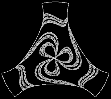
EDIT

According to the method proposed by bill s, we can determine the areas on the configuration (x,y) plane where the unpredictability, regarding the final state, is high.

S2 = Graphics[data[m2]];
f2 = GradientFilter[Image[S2], 1]

enter image description here

The white areas of the above diagram are the regions of high unpredictability.

Question: How can we create a new list, let's say data2, containing those initial conditions of the original data file, which correspond to the "white" areas?

$\endgroup$
13
  • $\begingroup$ How about counting number of cyan pixels, plus number of pixels where at least one of the neighbors is of a different color, and then compare with total number of pixels? $\endgroup$ Commented May 3, 2017 at 10:38
  • $\begingroup$ @PerAlexandersson That sounds great! Can you describe this approach in a detailed answer? $\endgroup$
    – Vaggelis_Z
    Commented May 3, 2017 at 10:50
  • $\begingroup$ Can you supply the data files and the way you have drawn the above figures? This would make it easier to build a measure or a filter that might give a number such as you ask for. $\endgroup$
    – bill s
    Commented May 3, 2017 at 12:16
  • $\begingroup$ @bills The data files are provided through external links (see my post). The plots themselves are irrelevant; only the data files are important since they contain all the information. $\endgroup$
    – Vaggelis_Z
    Commented May 3, 2017 at 12:21
  • $\begingroup$ What is the command to import the data? Import["yourfile"] gives the error Import::fmterr: Cannot import data as BYU format.. $\endgroup$
    – bill s
    Commented May 3, 2017 at 12:34

1 Answer 1

5
$\begingroup$

Since you presented the question in a visual manner, perhaps an image-based answer might be useful:

m1 = Import["E017.out", "Table"];
m2 = Import["E030.out", "Table"];
getColor[m_List, i_Integer] := 
  Module[{s = m[[i, 3]]}, 
   Which[s == -1, Black, s == 0, Cyan, s == 1, Green, s == 2, Red, 
    s == 3, Blue]];
data[m_] := 
  Table[{PointSize[0.005], getColor[m, i], 
    Point[{m[[i, 1]], m[[i, 2]]}]}, {i, 1, Length[m]}];
{S1 = Graphics[data[m1]], S2 = Graphics[data[m2]]}

enter image description here

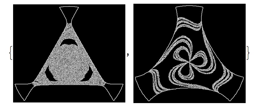
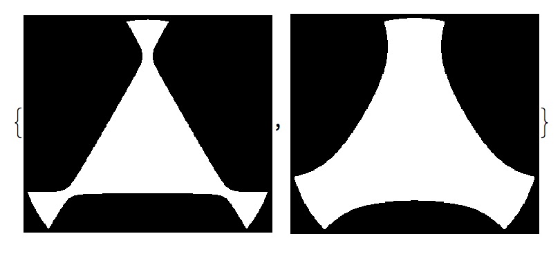
Taking the gradient of the images yields images with white where there are lots of changes and black in regions that are relatively constant.

{f1 = GradientFilter[Image[S1], 1], f2 = GradientFilter[Image[S2], 1]}

enter image description here

Now counting the white areas in the two filtered images gives a measure of how much change there is in each image.

{Total[ImageData[f1], 2], Total[ImageData[f2], 2]}
{14020.4, 10960.1}

Since the quantity of interest is the percentage, we can create binary masks:

{mask1, mask2} = {Sign[ImageData[ColorNegate[ColorConvert[Image[S1], "Grayscale"]]]], 
    Sign[ImageData[ColorNegate[ColorConvert[Image[S2], "Grayscale"]]]]};
Image /@ {mask1, mask2}

enter image description here

Now we can calculate

{Total[ImageData[f1],2], Total[ImageData[f2],2]}/{Total[mask1,2], Total[mask2,2]}
{0.478201, 0.225147}

which shows that about 48% of the first one and 22% of the second are in regions where the behavior of the system is unpredictable.

Of course, one could substitute other filters: StandardDeviationFilter might make more statistical sense.

$\endgroup$
9
  • $\begingroup$ Your approach looks very interesting! Some questions: (a) do you also count the black areas around the plots, where there are no initial conditions? (b) can the final results be normalized to a percentage, let's say for example that the white area is 54% of the total area? $\endgroup$
    – Vaggelis_Z
    Commented May 3, 2017 at 13:57
  • $\begingroup$ As implemented above, the Total counts everything. Of course, since the black areas around the edge are identically zero, adding them does not affect the calculation. To make it more precise, there are lots of things you could do: divide by the active area (to get a percentage, as you suggest) or use different weightings than the gradient filter uses. $\endgroup$
    – bill s
    Commented May 3, 2017 at 14:25
  • $\begingroup$ A major issue: is it possible to create a new list, let's say data2, which would contain all the initial conditions of the white regions? If so, please make an edit to your post. If we could obtain the initial conditions of the white areas then we could simply divide this number with the number of the total initial conditions and obtain the percentage. $\endgroup$
    – Vaggelis_Z
    Commented May 3, 2017 at 14:30
  • $\begingroup$ I just realized that your method is only an image manipulation method. You just take advantage of the produced image but you do not actually analyze the statistics of the actual data file. Am I right? $\endgroup$
    – Vaggelis_Z
    Commented May 3, 2017 at 14:36
  • $\begingroup$ Of course it's possible to create a set data2 and to normalize by it, and yes, this is an image-based approach (as I stated in the first sentence of the answer). But it is not true that the method is "not actually analyzing the data" since the picture is drawn exclusively from the data. The major difference is that the image is a uniformly sampled version of the data while the data is, by itself, unstructured. $\endgroup$
    – bill s
    Commented May 3, 2017 at 14:47

Your Answer

By clicking “Post Your Answer”, you agree to our terms of service and acknowledge you have read our privacy policy.

Not the answer you're looking for? Browse other questions tagged or ask your own question.