0
$\begingroup$

I often deal with graphs involving large dollar amounts over time. Mathematica will generally format Y-axis ticks as scientific numbers {1.0x10^6, 1.2x10^6 . . . etc.}.

So for example,

mydata = EventSeries@
  Table[{DatePlus[DateObject[{2010, 1, 1}], {x, "Month"}], 
    10^6 RandomReal[{1, 2}]}, {x, 0, 20}];

myplot = DateListPlot[mydata]

I'm happy to let Mathematica pick where the ticks go, but I want to change the formatting to {$1.0MM, $1.2MM . . . etc.}.

Is there an elegant way to do this?

$\endgroup$
1

1 Answer 1

2
$\begingroup$

Some fake data:

mydata = Table[{x, 10^6 RandomReal[{1, 2}]}, {x, 0, 1, .05}];

A plot with traditional (undesired) ordinate ticks:

myplot = ListPlot[mydata];

Old ordinate tick data extracted from myplot:

ordinateticks = (Ticks /. AbsoluteOptions[myplot, Ticks])[[2]];

Scaled and relabeled ordinate ticks:

myticks2 = MapAt[
  If[# != "",
    ("$" <> ToString[N[#/10^6, 2]] <> "MM")] &, ordinateticks, {All, 2}]

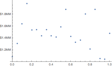
Replot of mydata with the new ordinate ticks:

ListPlot[mydata, Ticks-> {Automatic, myticks2}]

enter image description here

$\endgroup$
3
  • $\begingroup$ Thank you but this does not work for Date/Data pairs as in my new example above. How might this approach be adapted for DateListPlot[]s? $\endgroup$ Commented Feb 14, 2017 at 22:35
  • $\begingroup$ I urge you to ask your actual question (which did not originally include Date/Data pairs), otherwise we answerers are wasting our time. $\endgroup$ Commented Feb 14, 2017 at 22:37
  • $\begingroup$ My apologies; it honestly did not occur to me that the answer would be different for TimeSeries data. $\endgroup$ Commented Feb 14, 2017 at 22:39

Your Answer

By clicking “Post Your Answer”, you agree to our terms of service and acknowledge you have read our privacy policy.

Not the answer you're looking for? Browse other questions tagged or ask your own question.