I'm writing a module on population dynamics for my elementary differential equations class's MMA lab. I am pulling in the US population data with no trouble:
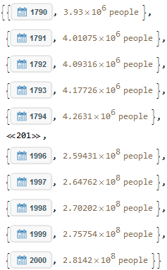
cd = CountryData["US", {"Population", {1790 , 2000}}]
Then the plot goes smoothly:
rp = DateListPlot[cd, PlotStyle -> RGBColor[1, 0, 0]]
yielding:
Then I solve the Malthusian model using the 1790 census as my initial condition:
malthus = DSolve[{p'[t] == k p[t], p[1790] == 3.93*10^6}, p[t], t]
and find the growth constant using the 2000 census:
Solve[(malthus[[1, 1, 2]] /. t -> 2000) == 281.42*10^6, k]
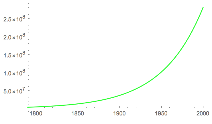
and plot it too:
malthusplot = Plot[malthus[[1, 1, 2]], {t, 1790, 2000}, PlotStyle -> RGBColor[0, 1, 0]]
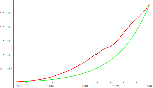
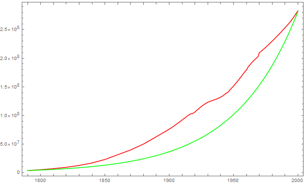
However, when I attempt to display these two graphs together the result is a correct display of whichever plot is listed first in the Show command, and the other plot is displayed as either a vertical or horizontal line. My best guess is that time series data does not play well with others. Any ideas?

](https://i.sstatic.net/F9vkL.png)


