11
$\begingroup$

I have two different models whose solutions in certain cases are virtually identical. For purposes of illustration, I'd like to plot both solutions in the same figure, but after playing around with Opactiy, Dashed, and Thick, the final result still appears simply as overlapping lines.

This post (Is it Possible to change dashes into circles with Plot command?) has interesting solutions with "dotting" instead of dashing, but these don't appear to show up in a plot legend.

Does Mathematica have a way of dealing with this, in a professional looking way?

As an example, take

F[x_] := 1/Sqrt[4 - x^2];
G[x_] := 1/Sqrt[3.99 - x^2];
Plot[{F[x], G[x]}, {x, 0, 2}, PlotLegends -> {"One", "Two"}]

Like the example, my curves are continuous, not discrete data points.

$\endgroup$
4
  • 4
    $\begingroup$ I would plot the difference or the (log) ratio. I don't think you can reasonably show the total variation of the functions and their difference on the same plot. $\endgroup$
    – mikado
    Commented Aug 14, 2016 at 20:01
  • 3
    $\begingroup$ @mikado, that is, their absolute or relative difference, or logs thereof. That's usually more informative than trying to overlay two near-identical curves anyway. $\endgroup$ Commented Aug 14, 2016 at 22:50
  • $\begingroup$ Well if you really want to create this plot, even though it won't probably be the most informative one, you could use different plot markers for each function. If you can't get the automatic legend, try to construct your own, there should be some possibilities for that. reference.wolfram.com/language/ref/PlotMarkers.html $\endgroup$
    – WalyKu
    Commented Aug 15, 2016 at 8:50
  • $\begingroup$ Well, how about simply Plot[{F[x], G[x]}, {x, 0, 2}, PlotLabels -> {"One", "Two"}]? $\endgroup$ Commented Aug 15, 2016 at 10:37

5 Answers 5

10
$\begingroup$

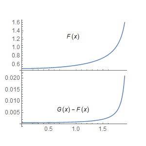
A rough example using plotGrid by Jens:

p1 = Plot[F[x], {x, 0, 1.9},
      PlotRange -> All, Epilog -> Inset["F(x)"]];

p2 = Plot[G[x] - F[x], {x, 0, 1.9},
      PlotRange -> All, Epilog -> Inset["G(x) - F(x)"]];

plotGrid[{{p1}, {p2}}, 300, 300]

enter image description here

$\endgroup$
13
$\begingroup$

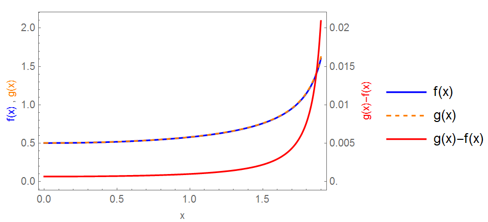
Just another way on same plot...

Plot[{f[x], g[x], 100 (g[x] - f[x])}, {x, 0, 1.9}, Frame -> True, 
 FrameTicks -> {{Automatic, 
    Table[{j, j/100}, {j, 0, 2, 0.5}]}, {Automatic, None}}, 
 PlotStyle -> {Blue, Directive[Orange, Dashed], Red}, 
 FrameLabel -> {{Row[{Style["f(x)", Blue], " , ", 
      Style["g(x)", Orange]}], Style["g(x)-f(x)", Red]}, {"x", None}},
  PlotLegends -> {"f(x)", "g(x)", "g(x)-f(x)"}]

enter image description here

$\endgroup$
11
$\begingroup$

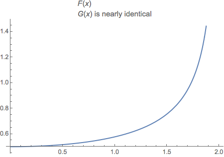
Be bold like Alexander the Great; cut the Gordian knot rather than untying it.

F[x_] := 1/Sqrt[4 - x^2]
Plot[F[x], {x, 0, 2},
  PlotLabel ->
    Column[
      {Style["F", Italic][x],
       Row[{G[x], " is nearly identical"}]},
      Alignment -> Left]]

plot

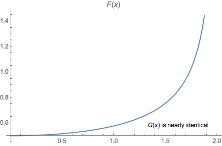
For a more note-like appearance you can use Inset.

Plot[F[x], {x, 0, 2},
  PlotLabel -> Style["F", Italic][x],
  Epilog ->
    Inset[Row[{G[x], " is nearly identical"}], Scaled[{.8, .125}]]]

plot

To further elucidate your work, you might add a difference plot to along with this one.

$\endgroup$
0
5
$\begingroup$

If you're plotting two very closely overlapping functions, it's usually acceptable to have them drawn over the top of each other. It could even be considered dishonest to manipulate the axes to exaggerate their differences.

To make a self-explaining plot, with two overlapping but clearly distinguishable lines, could you use PlotStyle, as shown here?: https://reference.wolfram.com/language/ref/PlotStyle.html

For example, you could make one line dashed and picked some appropriate colours.

$\endgroup$
1
  • 3
    $\begingroup$ For people who prefer this route: one method I've seen is to have the "background" curve be thicker and of a contrasting color than the "foreground" curve. $\endgroup$ Commented Aug 15, 2016 at 6:47
4
$\begingroup$

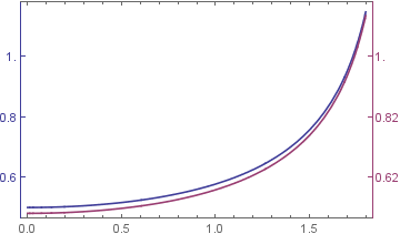
Here's a neat way by slight modification of TwoAxisPlot.

TwoAxisPlot[{f_, g_}, {x_, x1_, x2_}] := 
 Module[{fgraph, ggraph, frange, grange, fticks, 
   gticks}, {fgraph, ggraph} = 
   MapIndexed[
    Plot[#, {x, x1, x2}, Axes -> True, 
      PlotStyle -> ColorData[1][#2[[1]]]] &, {f, g}]; {frange, 
    grange} = {{0.5, 1.5}, {0.52, 1.52}}; 
  fticks = N@FindDivisions[frange, 5];
  gticks = 
   Quiet@Transpose@{fticks, 
      ToString[NumberForm[#, 2], StandardForm] & /@ 
       Rescale[fticks, frange, grange]};
  Show[fgraph, 
   ggraph /. 
    Graphics[graph_, s___] :> 
     Graphics[
      GeometricTransformation[graph, 
       RescalingTransform[{{0, 1}, grange}, {{0, 1}, frange}]], s], 
   Axes -> False, Frame -> True, 
   FrameStyle -> {ColorData[1] /@ {1, 2}, {Automatic, Automatic}}, 
   FrameTicks -> {{fticks, gticks}, {Automatic, Automatic}}]]

Now our plot.

TwoAxisPlot[{F[x], G[x]}, {x, 0, 1.8}]

enter image description here

$\endgroup$
1
  • 5
    $\begingroup$ I find this really strange, as at first glance it shows the area where the functions are nearly identical to be the most different. $\endgroup$
    – Mr.Wizard
    Commented Aug 14, 2016 at 22:25

Your Answer

By clicking “Post Your Answer”, you agree to our terms of service and acknowledge you have read our privacy policy.

Not the answer you're looking for? Browse other questions tagged or ask your own question.