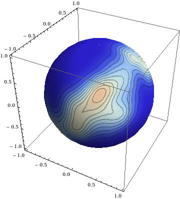
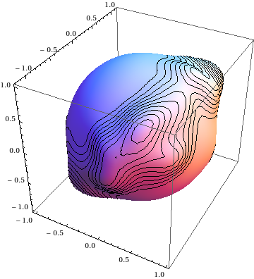
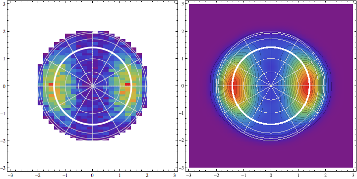
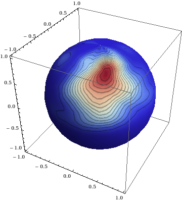
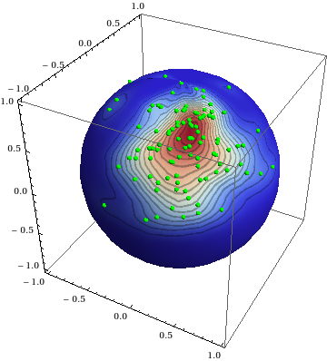
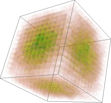
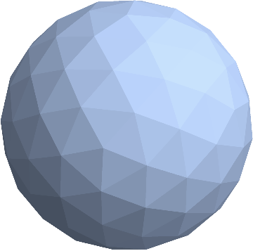
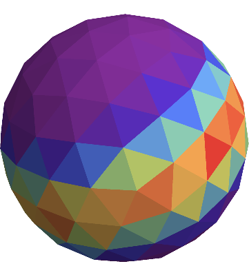
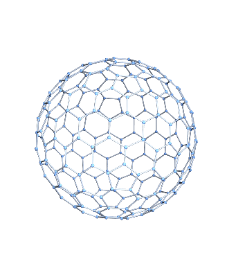
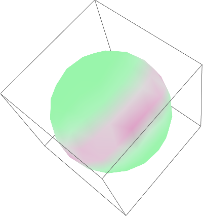
3D figures always look nice, but sometimes, they are limited in the way they can present data. Let's suppose that we have some data like those generated in the answer that J. M. gave, but they are dense around two points that are on opposite poles. In this case, a 3D figure would always hide half of the data. To show all the data we can transform the data using the Lambert azimuthal equal-area projection and then plot the data in 2D.
Let's generate our data using J. M.'s function. Here, I set one set of points to cluster around $(1,0,0)$ and the other one on the opposite side around $(-1,0,0)$:
BlockRandom[SeedRandom[42, Method -> "MersenneTwister"];
  vecs1 = Table[vonMisesFisherRandom[{1, 0, 0}, 3], {5000}]];

BlockRandom[SeedRandom[42, Method -> "MersenneTwister"];
  vecs2 = Table[vonMisesFisherRandom[{-1, 0, 0}, 3], {5000}]];

data = Join[vecs1, vecs2];
We create a function for data transformation, transform the data and plot the projected data in 2D:
xyzToLambert[xyzCoords_List] := Module[{xx, yy},
  xx = Sqrt[2/(1 + 10^-10 - xyzCoords[[3]])] xyzCoords[[1]];
  yy = Sqrt[2/(1 + 10^-10 - xyzCoords[[3]])] xyzCoords[[2]];
  {xx, yy}
  ]

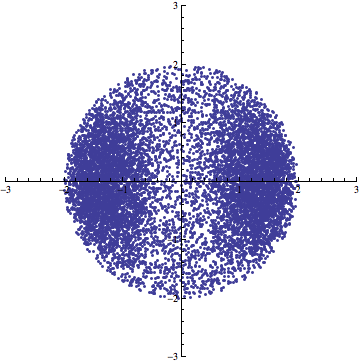
projdata = Table[xyzToLambert[data[[i]]], {i, Length[data]}];

ListPlot[projdata, AspectRatio -> 1, PlotRange -> {{-3, 3}, {-3, 3}}]

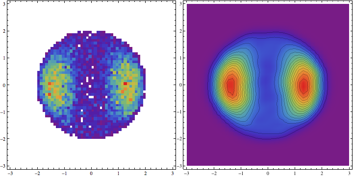
This already looks nice, but with many more data points, it is unlikely that we could see anything at all. We can thus proceed and make some other plots:
opts = {ColorFunction -> Function[{height}, ColorData["Rainbow"][height]],
        PlotRange -> {{-3, 3}, {-3, 3}}, ImageSize -> Medium};

Row@{
  DensityHistogram[projdata, 50, opts],
  SmoothDensityHistogram[projdata, opts]
  }

Update
It might be useful to add some spatial information by superimposing a grid on our plots. The lines in light gray correspond to the latitude/longitude grid in steps of 30 degrees, the thick white line corresponds to the equator line.

<< VectorAnalysis`
phiLines[theta_] := Module[{long, projlong},
  long = Table[
    CoordinatesToCartesian[{1, theta Degree, phi}, Spherical], {phi,
     0, 2 Pi, Pi/32}];
  projlong = Table[xyzToLambert[long[[i]]], {i, Length[long]}]]
thetaLines[phi_] := Module[{long, projlong},
  long = Table[
    CoordinatesToCartesian[{1, theta, phi Degree},
     Spherical], {theta, -Pi, Pi, Pi/32}];
  projlong = Table[xyzToLambert[long[[i]]], {i, Length[long]}]]

Row@{
  Show[
   DensityHistogram[projdata, opts],
   Graphics[{LightGray, Circle[{0, 0}, 2]}, AspectRatio -> 1,
    PlotRange -> {{-2.5, 2.5}, {-2.5, 2.5}}],
   ListPlot[Table[phiLines[phi], {phi, Range[0, 180, 30]}],
    PlotStyle -> LightGray, Joined -> True],
   ListPlot[Table[thetaLines[theta], {theta, Range[0, 150, 30]}],
    PlotStyle -> LightGray, Joined -> True],
   ListPlot[phiLines[90],
    PlotStyle -> {Thickness[.01], White}, Joined -> True]],
  Show[
   SmoothDensityHistogram[projdata, opts],
   Graphics[{LightGray, Circle[{0, 0}, 2]}, AspectRatio -> 1,
    PlotRange -> {{-2.5, 2.5}, {-2.5, 2.5}}],
   ListPlot[Table[phiLines[phi], {phi, Range[0, 180, 30]}],
    PlotStyle -> LightGray, Joined -> True],
   ListPlot[Table[thetaLines[theta], {theta, Range[0, 150, 30]}],
    PlotStyle -> LightGray, Joined -> True],
   ListPlot[phiLines[90],
    PlotStyle -> {Thickness[.01], White}, Joined -> True]]
  }

