8
$\begingroup$

This is a rewording of a previous question which probably wasn't very well explained, and so didn't get any responses(!). I'm trying to create a chart which shows the smooth kernel distribution of three datasets, a box and whisker chart (below) and the histogram of the datasets laid under the kernel distribution. However, because the data is quite close to each other, I've arrange the 'histogram' into a bar chart so that the data can be displayed side by side (rather than stacked or overlapping, which is confusing with this data).

I've managed to get all three charts to show up (with some much appreciated help from others on this site), but the bar chart (histogram) is completely the wrong scale. (See image below)

All three chart types

When I break them down and display the charts separately though, the scaling is fine:

Curves only Histogram only

Here is the code:

S086 = {33.00, 55.74, 46.68, 22.26, 45.05, 41.95, 82.26, 58.79, 30.89,30.89,47.21, 30.16, 17.16, 28.05, 25.63}
T086 = {34.65, 28.52, 9.77, 38.58, 32.03, 22.26, 35.16, 45.26, 21.71,29.26, 34.71, 22.16}
X086 = {23.41, 48.54, 32.97, 28.57, 23.35, 20.70, 35.49, 21.97, 29.81,17.65, 16.73, 15.32, 16.00}
datasets = {{S086}, {T086}, {X086}}
bin = HistogramList[Flatten[datasets]][[1]]

and then (I've removed the box chart to simplify the code)

Show[
Plot[140 PDF[SmoothKernelDistribution[#], x] & /@ {S086, T086, 
  X086}, {x, 0, 100}, Evaluated -> True, 
PlotStyle -> {{Thickness[0.01], 
   RGBColor[0.23, 0.42, 0.63]}, {Thickness[0.01], 
   RGBColor[0.29, 0.53, 0.80]}, {Thickness[0.01], 
   RGBColor[0.62, 0.73, 0.88]}}, Frame -> True, 
GridLines -> Automatic], 
BarChart[Transpose@(BinCounts[#, {bin}] & /@ {S086, T086, X086}), 
Axes -> False, 
ChartStyle -> {Opacity[0.75, RGBColor[0.23, 0.42, 0.63]], 
  Opacity[0.75, RGBColor[0.29, 0.53, 0.80]], 
  Opacity[0.75, RGBColor[0.62, 0.73, 0.88]]}, 
PlotRange -> Automatic, PlotRangePadding -> None]]
$\endgroup$
3
  • $\begingroup$ The problem is actually just that the 'histogram' and the smooth distributions don't line up, no? In which case presenting all the extra code for the box whisker and grid plot is only muddying the waters. $\endgroup$ Commented Apr 28, 2016 at 10:53
  • $\begingroup$ The problem arises because BarChart uses a x-value of 1 for each bar (or bar position). So for your 9 groups of 3 bars your bar plot only extends up to around x=27, which is what you see when you use Show with the Plot which goes up to 100. $\endgroup$ Commented Apr 28, 2016 at 10:56
  • $\begingroup$ I've edited the original posting to just show the relevant portions as you recommended. Is there a solution you can think of to the problem? I've tried playing around with the plot range, but to no avail... I'm relatively new to Mathematica so nearly everything is trial and error for me really. $\endgroup$
    – cwalker
    Commented Apr 28, 2016 at 13:39

2 Answers 2

11
$\begingroup$

Histogram does not support a grouped ChartLayout. Hence the workaround using BarChart:

I've arranged the 'histogram' into a bar chart so that the data can be displayed side by side.

An alternative to using BarChart with "Grouped" layout is to use a custom ChartElementFunction to produce the desired Histogram layout:

ClearAll[groupedHistogram]
groupedHistogram[cef_: "Rectangle", opts : OptionsPattern[]][n_: 1, 
   s_: {0, 0}][{{xmin_, xmax_}, {ymin_, ymax_}}, y_, {i_Integer}] := 
 ChartElementDataFunction[cef][ With[{x0 = xmin + s[[1]] (xmax - xmin)/n, 
    x1 = xmax -  s[[1]] (xmax - xmin)/n}, 
     {x0 + (x1 - x0)/n {s[[2]] + i - 1, i - s[[2]]}, {ymin, ymax}}], y]

Examples:

data1 = RandomVariate[NormalDistribution[0, 1], 500];
data2 = RandomVariate[NormalDistribution[1, 1/2], 500];
data3 = RandomVariate[NormalDistribution[2, 1], 500];
dataall = {data1, data2, data3};
Row[{Histogram[dataall, ImageSize -> 300], 
  Histogram[Thread[dataall -> Range[3]], 
    ChartElementFunction -> groupedHistogram[][3, {.3, .2}], ImageSize -> 300]}, Spacer[5]]

Mathematica graphics

opdata = Thread[{S086, T086, X086} -> Range[3]];
styles = {ChartStyle -> {Red, Green, Blue}, ImageSize -> 300, Frame -> True};

Combine with SmoothHistogram using Epilog:

sh = SmoothHistogram[{S086, T086, X086}, 
   PlotStyle -> (Directive[Thick, #] & /@ {Red, Green, Blue})];

Histogram[opdata, ##& @@ styles, ChartElementFunction -> groupedHistogram[][3, {.1, 0}], 
 Epilog -> MapAt[GeometricTransformation[#, ScalingTransform[140, {0, 1}]] &,
    sh, {1}][[1]]]

Mathematica graphics

Further Examples:

Histogram[opdata, ## & @@ styles, ChartElementFunction -> groupedHistogram[][3]]

Mathematica graphics

Control spacings between and within groups:

Row[Histogram[opdata, ## & @@ styles, PlotLabel -> "bar spacings: " <> ToString@#,
    ChartElementFunction -> groupedHistogram[][3, #]] & /@ {{.2, .0}, {.1, .1}}, Spacer[5]]

Mathematica graphics

Combine with built-in ChartElementDataFunctions for Histogram:

Row[Histogram[opdata, ##& @@ styles, PlotLabel -> "chart element function: " <> #, 
    ChartElementFunction -> groupedHistogram[#][Length@dd, {.1, .1}]] & /@
     {"ArrowRectangle", "FadingRectangle"}, Spacer[5]]

Mathematica graphics

Use alternative bin specifications:

Row[Histogram[opdata, #, ##& @@ styles, PlotLabel -> "bins: " <> ToString@#, 
    ChartElementFunction -> groupedHistogram[][Length@dd, {.1, .1}]] & /@ 
      {Automatic, {Range[0, 100, 20]}}, Spacer[5]]

Mathematica graphics

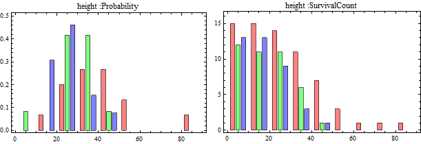
Use alternative height specs:

Row[Histogram[opdata, Automatic, #, ##& @@ styles, PlotLabel -> "height :" <> #, 
    ChartElementFunction -> groupedHistogram[][3, {.1, .1}]] & /@ 
     {"Probability", "SurvivalCount"}, Spacer[5]]

Mathematica graphics

$\endgroup$
8
$\begingroup$

Rather than Show, you can use Prolog + Inset with Scaled:

Plot[
 140 PDF[SmoothKernelDistribution[#], x] & /@ {S086, T086, X086}, {x, 0, 100}, 
 Evaluated -> True,
 PlotStyle -> {
   {Thickness[0.01], RGBColor[0.23, 0.42, 0.63]},
   {Thickness[0.01], RGBColor[0.29, 0.53, 0.80]}, 
   {Thickness[0.01], RGBColor[0.62, 0.73, 0.88]}},
 Frame -> True,
 GridLines -> Automatic,
 Prolog -> Inset[
   BarChart[
    Transpose[BinCounts[#, {0, 100, 10}] & /@ {S086, T086, X086}],
    Axes -> False,
    BarSpacing -> {0, 1},
    ChartStyle -> {
      Opacity[0.75, RGBColor[0.23, 0.42, 0.63]], 
      Opacity[0.75, RGBColor[0.29, 0.53, 0.80]],
      Opacity[0.75, RGBColor[0.62, 0.73, 0.88]]}],
   Scaled@{0, 0},
   Scaled@{0, 0},
   Scaled@1]
]

plot1

This is a little crowded to my eye, so if use permits it, you could stack the distributions:

Plot[
 Accumulate[140 PDF[SmoothKernelDistribution[#], x] & /@ {S086, T086, X086}], {x, 0, 100},
 Evaluated -> True,
 PlotStyle -> {
   {Thickness[0.01], RGBColor[0.23, 0.42, 0.63]}, 
   {Thickness[0.01], RGBColor[0.29, 0.53, 0.80]}, 
   {Thickness[0.01], RGBColor[0.62, 0.73, 0.88]}},
 Frame -> True,
 GridLines -> Automatic,
 Prolog -> Inset[
   Histogram[
    {S086, T086, X086}, {0, 100, 10},
    Axes -> False, 
    ChartStyle -> {
      Opacity[0.75, RGBColor[0.23, 0.42, 0.63]], 
      Opacity[0.75, RGBColor[0.29, 0.53, 0.80]],
      Opacity[0.75, RGBColor[0.62, 0.73, 0.88]]},
    ChartLayout -> "Stacked"],
   Scaled@{0, 0},
   Scaled@{0, 0},
   Scaled@1]
]

plot2

$\endgroup$

Your Answer

By clicking “Post Your Answer”, you agree to our terms of service and acknowledge you have read our privacy policy.

Not the answer you're looking for? Browse other questions tagged or ask your own question.